Tip: Low CRI 6000K… look how green the yellow cards look. I dont “see” any advantage in the blue from the Low CRI, and imo it makes the Silver look too blue.
TipCRI: look how much more realistic the High CRI 3500K makes the yellow card. Look at the Red, Gold and Silver too.
What was White Balance camera setting when you took these pictures? It is very difficult to make color accurate photographs under such light sources, i.e. make the photograph show the same colors you saw with your eyes.
I dont know, not my pics, I assume they are from an auto white balance cell phone you could ask the OP here
in my limited experience, auto white balance works well enough to show the difference between the two beams, particularly when you have all the colored items to compare in the photo.
Is there any doubt from the pics that the Low CRI is doing a worse job of rendering color?
There is real doubt these pictures show colors how they were seen by the human eyes. Just a note, setting “correct” white balance in camera under such irregular light sources as LEDs is not enough either. One needs to take a picture of Color Reference Chart under the same light and then adjust colors in post processing. When working with light sources which follow Black-body radiation curve more or less closely, like Sun or incandescent bulb, selecting correct white balance setting maybe sufficient. But when working with light sources like LEDs, whose spectral energy distribution curve looks nothing like Black-body radiation curve, a separate measurement at many different points is required to represent colors correctly.
you did not answer the question and imo you are making things way too complicated and creating FUD (Fear, Uncertainty and Doubt), to discredit a test that clearly shows the difference in color rendering between low CRI and High CRI
the comparison imo is totally valid, whatever discrepancy may exist to what the human eye sees is not relevant imo, the comparison clearly shows the difference between the two light sources…
maybe post some of your own photos, instead of criticizing my contribution and calling the example invalid
if you have a contribution to make to the original topic, please do so. Spare me your opinion about my contribution and just make your own contribution
Please don’t take this personally. I am not criticizing you or your contribution.
I am just pointing out that “green” in the cards we all see in these pictures and dislike so much, might have been seen as perfect “yellow” to the human eyes when the picture was taken. Or perhaps some other color. These two pictures were taken under two different light sources and neither was color calibrated. There is nothing to compare.
I think those pictures likely show what the eye sees when it comes to color fidelity. Low CRI cool whites do make colors look false and washed out. High CRI warm whites really do make colors look more vibrant, especially reds, orange, and yellows.
I’m not sure the green tint in the first picture is an accurate representation, though. In my experience, cameras really tend to over-emphasize the “ugly green” in Cree LEDs (both cool and neutral low-CRI tints). Cameras really do have a hard time getting the tint accurate in these cases, especially the balance between green and magenta.
The point is that CRI 100 at 2000K is very crappy light - a lot of colors are very poorly represented. While CRI 100 at 5000K is great light - all colors are represented properly. This subject is complex and poorly understood by many people. A lot of people here seem to think that CRI 100 means good color representation even at “warm” CCTs. It doesn’t.
My interests are varied, but include photography. Most of the time, therefore, I have a strong preference for 5000K light sources over ones at 3500K. I have some interest in the 5000K Nitecore TIP CRI. I have no interest in the 3500K version.
I am not a collector of flashlights. Since I do not wish to purchase a large number of flashlights, it is easy for me to limit my purchases (of small flashlights) to those with high CRI, CCT between, say, 4500K and 5500K, and neutral tint.
That’s a relatively new policy for me, and it has served as a good brake for my PayPal account. :money_mouth_face:
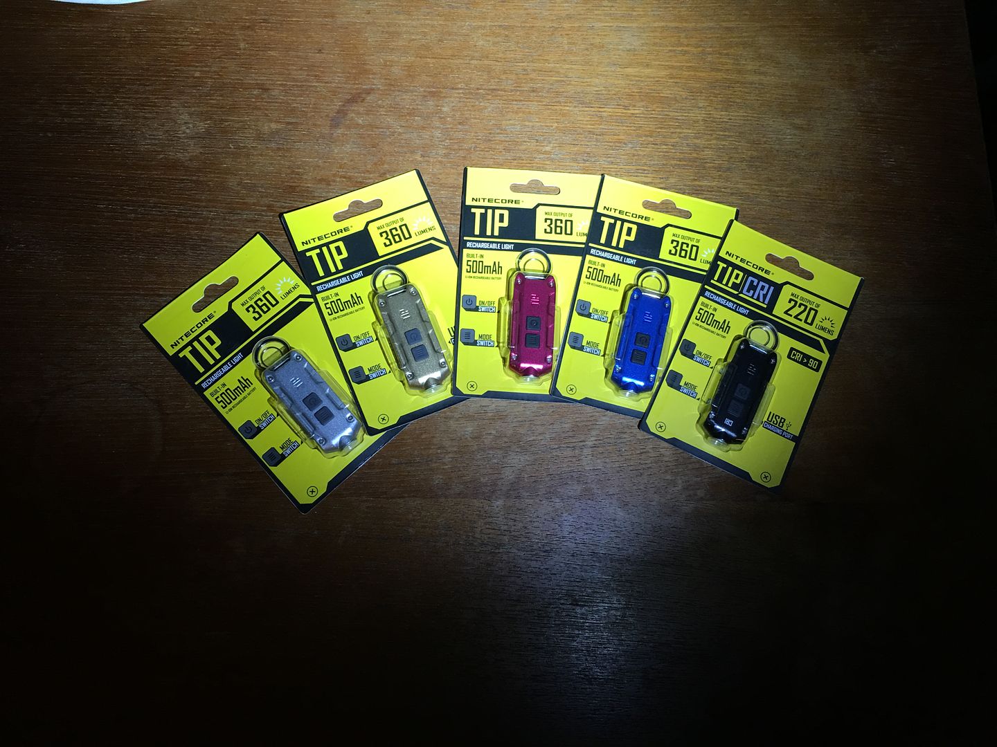
[Pictures posted by jon_slider] Pictures are from a Nitecore Tip and Nitecore TipCRI
Nitecore Tip / Low CRI 6000K
Nitecore TipCRI / High CRI 3500K
I am trying to understand this, so I have a question or two.
jon_slider posted two pictures, each lit by a different tint. I can see that by looking at the pictures & (in addition he told us).
Aggressor, are you saying the colors we see in the pictures now may not have been the same as the colors our eyes would have actually seen the moment the pictures were taken??
And this could be adjusted, in a way the pictures would accurately represent what our eyes actually see at the moment the picture is taken; by setting ‘White Balance’ & adjusting colors with the Color Reference Chart???
Am I anywhere close to semi-understanding this or am I still wandering around in “left field” lost???
Everything including time is relative; there is no absolute.
Even if all cameras were calibrated and too the monitor you are viewing the pictures, there is no way to be certain that your viewing, done by your eyes and nervous system, would be an exact copy of anyone else.
For most purposes ‘close enough’ is usually sufficient for making a decision on tints.
Except that simply adjusting white balance would have been good enough for light sources like Sun and incandescent bulb, while for light sources like LED using Color Reference Chart is required to get correct colors.
OK, thank you Aggressor; I am beginning to understand what you are saying then. :+1:
I appreciate your reasoning & explanations.
I have moved in from “wandering around lost in deep left field” to just semi-confused in shallow left.
And to complicate things even more, a camera’s sensor and your computer’s monitor can not reproduce the full color space that your eyes can see. For example, a red-green-blue sensor or screen (which is almost every one), can not capture a true yellow, such as a dandelion flower. The best it can do is reproduce a slightly green version of yellow. Your eyes will see a more vibrant/true yellow flower in real life.
Perhaps one of those days I will write a post properly explaining the whole situation with light and color, there is enormous amount of confusion in this area. It is not an easy subject to explain…
This is a good thread with a lot of good info so far. A big “thank you” to jon_slider, Aggressor, WalkIntoTheLight, techieman33, stephenk, and anyone else that has had provided knowledgeable input… it is appreciated.
I have two Convoy L6 lights a N2-3A and a N2-3C; both are 5000K lights. I checked them both last night outside and inside and with my eyes could not discern a noticeable difference.