as an fyi
one of the reasons CRI (R1-R8) is not the final measurment is because the test omits the range R9-R14. R9 is red and R13 is “flesh tone” did you know that R1-R8 are pastels?
as an fyi
one of the reasons CRI (R1-R8) is not the final measurment is because the test omits the range R9-R14. R9 is red and R13 is “flesh tone” did you know that R1-R8 are pastels?
When we speak about good thrower flashlight we must consider energy of foton and frequency of light.
In this case warm light has advantage when we have moisture, dust, smoke etc. in air.
I dont like angry blue
around 5K looks a lot better
but still between 1A tints from Cree there are differences
even if the light looks very nice there is always a bad tint around the hotspot on domed LEDs
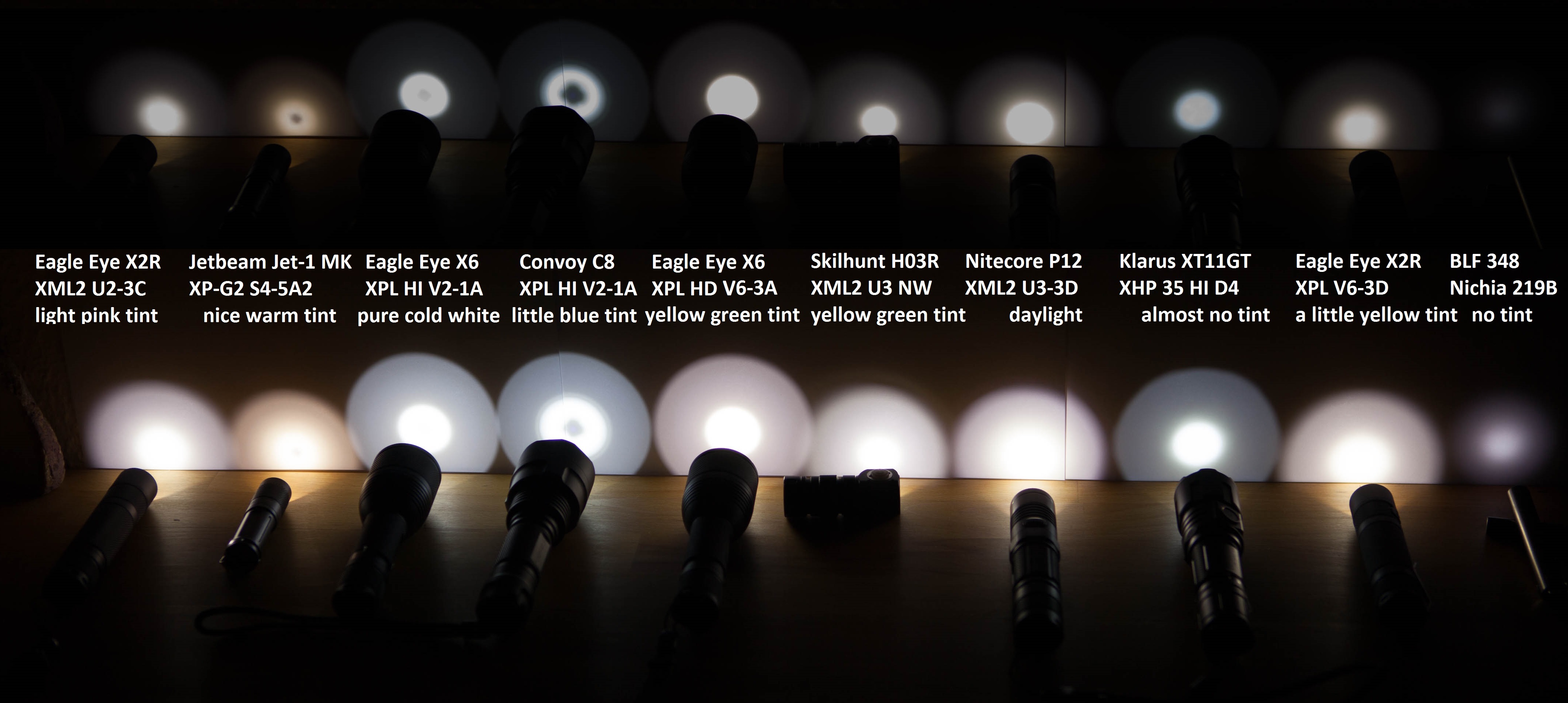
The pictures show perfectly what the deal is with low CRI light versus higher CRI light.
Maybe for colour blind people there is nothing to compare.
Hmmm…
Our perception is relative for sure, but our reality is consistent and common. ![]()
Unless photo was color calibrated, the colors seen in the picture are not the same colors seen by human eyes when the picture was taken. But people who can’t wrap their mind around this simple fact are welcome to go ahead and compare them anyway.
Actually, even color-calibration won’t capture the full color space that the human eye sees. For example, RGB monitors (or images) can never show a true yellow color, such as a dandelion flower. Yellow on a monitor will always appear somewhat greenish.
I also find that images tend to exaggerate the tint imperfections more than what my eyes see. Cree LED tints will look greener than they really are, for example.
That said, it’s still quite useful to see images of tints, side-by-side, for comparison. If gives us an idea what the color will look like in person, and if nothing else it gives us a worst-case.
It’s not a matter of getting your head wrapped around your opinion.
I think we, the customers should stop buying cool white lights.
We must teach companies what to put inside.
Unfortunately 90% from people are not familiar with this.
Yeah, but for some reason, newbies tend to actually prefer cool white. And non-flashaholics make up the vast majority of the market.
The best we can hope for is that good companies will produce some neutral tints (or warm), along with their standard cool white. Which is what we’re getting, for the most part. It’s certainly better than a few years ago.
Fo’ shizzle, my nizzle.
The human aye does have the ability to “adapt” to changing light conditions. Classic example being horribly blue snow. Snap a pic of a snowscape which looks like perfectly white snow to you when taking the shot, and yet the pic will pretty much show mounds of blueberry Sno-Cones.
Or anything in white (eg, a house) that’s in shade, when warm sunrise/sunset light makes everything look orange. Fascinating pic where directly-lit things are orangey, yet the white house in shade looks blue!
What I’ve personally experienced, though, is looking at woodgrain furniture and whatnot, under CW light, and to me it looks dull bluish-gray, but after switching to a 4300K light (non-high-CRI), those reds and browns just “pop”.
2000K (candlelight) makes for great mood-lighting. Yeah, everything looks orange, but at the end of the day, in the dark except for a 2000K emitter (or coupla candles), it just feels good.
Horrible color-rendition, yeah, but it feels good.
If you take a nice 50W halogen light, and put a light green filter on it (say 10%), when you walk into the room everything will look greenish, of course. But after being there a while (and adapting), you’ll see colors more or less normally, and will be able to discern blue from red from yellow just fine.
With a heavily saturated green filter, you might as well be lighting the place with a green LED, and everything will look green regardless.
That’s why in the previous example I gave, snow (in shade or even at night) will look just plain white, while pix of said show will show them to be horribly blue.
Because the damnfools want “LED” light, and to not look like Yet Another Incandescent.
Same principle applies to those blue headlights…
Truth.
And the reason is because our eyes prefer worm tint when lux (lumens) are at low levels.
A friend sent me what might become the ultimate tint snob's argument
Oh then they should have forbidden mercury and fluorescent tube lamps if blue light would be that dangerous
Also then daylight needs to be forbidden to look at
Those lights and the sun emit UV light which is far more dangerous for human eyes

High pressure mercury

Still like the tint of my 2014 D25C 219b (4500k?) nichia best. Just got my copper tool nichia and its maybe a bit to rosy, but it does suit the copper.
Realy hated the tint of the nichias in my S41, but after slicing the domes the tint is much better, now a bit yellow instead of fugly green.
I take it you are talking about a Low CRI LED?
some backstory on “tint”. color temperature, white balance, “neutral tint”, “neutral white”… etc:
from this thread
I also recommend reading this thread:
fwiw, the 219c tends to be Yellower, than the 219b which tends to be more Pink. That is, the tint of the 219c tends to fall above the BBL, and the 219b tends to fall below the BBL
however, there is no consistency. LEDs vary
here are 3 different lights with N219b, left to right, Astrolux M01, Astrolux M02, Lumintop Worm
