OK, for those downloaded the quiz answer, here’s the password: thepasswordisthepassword
ANSWER:
1. Maukka Calibrated Convoy S2 @medium mode(Cree XML2)
CCT = 6497K
CRI = 74,8
R9 = –11,2
Duv = 0,0012
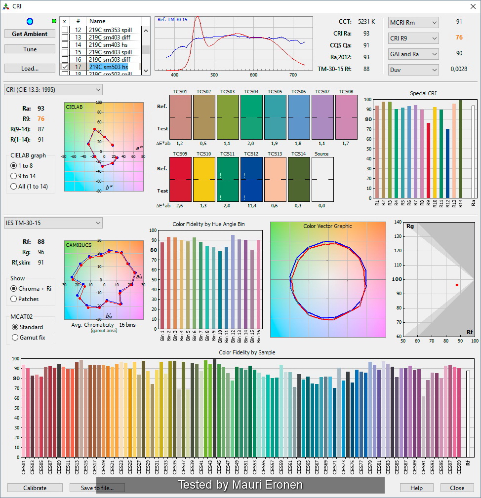
2. Maukka Calibrated BLF-348 (Nichia 219C)
CCT = 5025K
CRI = 92,5
R9 = 84,4
Duv = 0,0038
3. Jetue21a at 230mA (Nichia E21A sm503 R9080)
CCT = 5333K at 700mA
CRI = 97
R9 = 85
Duv = –0,0011 at 700mA
4. Jetusolis at 230mA (Nichia Optisolis sm503 Rfc00)
CCT = 4852K at 65mA
CRI = 99
R9 = 93
Duv = 0,002 at 65mA
My Observation:
As predicted, it’s harder than comparing R70 to R8000 or R70 to R9080. Because I used 3 LED with measured value above R9080. To make things worse I believe most people here still limited to LCD, LED, or AMOLED screen with RGB light source. Until there’s a full spectrum screen, reliable CRI proofs can’t be shared as images. Quantitative data such as Maukka’s test is the only valid reference point. In image 4, we can’t see how Optisolis makes green, blue, purple, and violet “glows” as E21A does on all red pigmented crayons (pink, orange, yellow, red, brown) because most monitors still can’t reproduce wide range cyan.
Most, including me, judge the CRI by the vividness of each colors. But it’s harder because the tint masks them all. Number 4 which was Optisolis has the most neutral tint (background) yet keeps the entire color vivid, the majority will choose it. Tint is dominant shades that covers the entire scene. Any colors will be affected by the shades.
High CRI LED will makes each color has their own personality no matter what tint/shades added on them. Easier to distinguish. This can be seen under very warm CCT such as Nichia E21A 2000K and low pressure sodium. In both cases, you will not find any white but you can easily distinguish which is which under E21A 2000K. Under LPS everything looks almost the same, sometimes false. The same goes for pink/rosy tint. You can see how everything looks reddish under E21A, blue looks darker and somewhat purple-ish.
Here’s my old picture under LPS lights. Can you tell the colors?
And this is a fresh picture using Maukka’s Jetue21a 2000K R9080:

Of course you can’t see blue violet purple etc… properly as under cool white because warm white light source even ultra high CRI such as very warm incandescent has very limited spectrum towards those colors.
Green and yellow shades relates to sickness and dizzyness for most people. Red - Orange shades relates to safety and comfort. Red/pink shades relates to cheerfulness, energy, happines, and….arousal. How about shades of blue/magenta? I find most people find it as cold and mysterious. IMHO, our brain evolved to welcome/accept positive and safe traits more readily.
We can easily adapts to different shades after a while (30+ minutes?) and find everything looks normal with time. But sudden change will confuse our brain. Test yourself by entering a room lighted in 3000K in the middle of a sunny day and you’ll get what I mean.
In above quiz E21A and XML2 were the tricksters while Optisolis was the honest one. Get a Nichia or Lumileds catalog and you will find how they tailor made LEDs to help lighting designer to trick their customers by offering different kind of spectrum sets for every needs. 219B sw45k and the likes was designed for specific target such as fresh meat in the grocery stores. But some also found it extremely good to increase baby population.
Check this link: Special CRI
- Clemence