SVG version with consistent metrics (not sure if it looks better, but all widths and spacings are identical).
I like where this is going. ![]()
here is what i did in vcarve, its vector free
! !
!
SVG is the de facto standard for vector graphics that is most often used in the web for scalable graphics, for publishing, printing and laser cutters. All professional programs should be able to work with it. I use Inkscape, but you can view it with a web browser.
Didn’t take that long, maybe 15 minutes. Tomorrow I will have a look at your other version and play with the metrics a little bit as well.
G0OSE yea my image does look off but on my PC it’s not lol, as for a badge do u mean like a necklace ? Or ?
This logo would also look good on BLF flashlights or boxes
I also thought about a PCB with that logo on one side and other with name and so on like a business card
Not to be contrarian, but I rather like the simple, lightly formatted text feel of the board. Not to mention that adding images increases bandwidth needs.
That said, I think it needs more flame.
Something like these quality babies. If I can find one more, I’ll be able to run my SP36 at full power for DAYS. ![]()

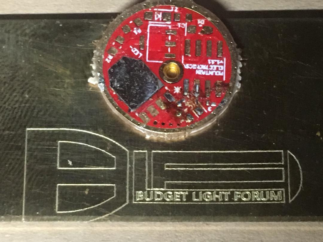
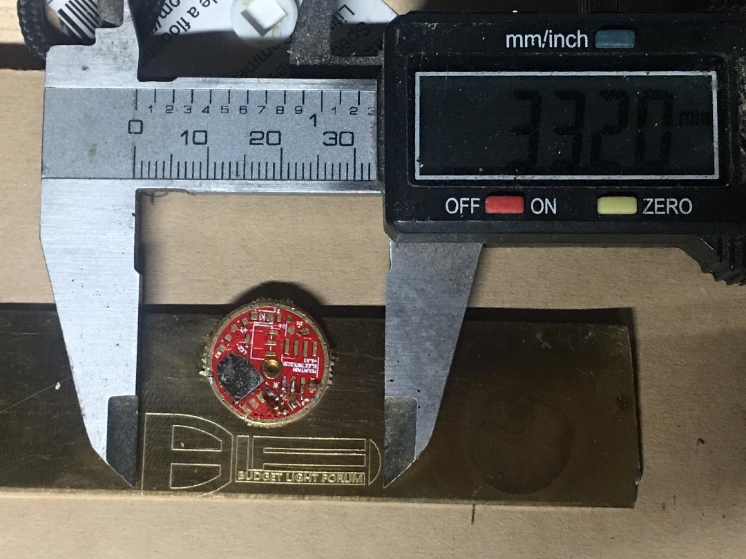
Here i have a piece of brass 1”x4inches and a 16mm driver for comparison lol
! !
!
33.20mm
! !
!
i can look into T-Shirts i have few near my house
What did you draw that logo in? do you have the .ai? or native artwork file? or perhaps you can save it as .pdf with line weight = 0?
Working for a manufacturing company, we waterjet really anything. I can convert raster to vector pretty accurately, but need a good artifact free file to start with. We do a ton of environmental graphics for true sign company’s…some very hi end, stadiums, lifestyle centers, etc.
I can help in a few different ways, converting your image to vector for cutting/plotting, and if interested can cut logos/emblems/art—whatever you want—in aluminum, stainless, titanium, carbon steel, tool steel, acrylic, foam, etc…
Just like the rest of you guys…love flashlights more than your average Joe, and have really enjoyed my time in this BLF community, would love to help if needs.


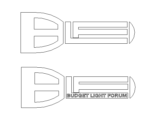
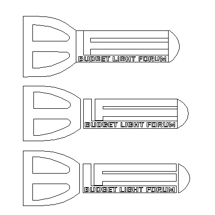
here is few more i came up with……
1st one is all together with smaller bezel
2nd is the same but spaced out
3rd its spaced out but the tailcap is not touching
! !
!
For cutting these, are we talking positive or negative? Positive = Black is the part, and would need connection points between entities to hold it all together. Negative = we need to make a border around the image and the Black drops away, the only geometry that needs to change would be the “drops” from the “B”. They need to be connected in some way, else the whole head of the light (and thus the “B”) drop out. See the font “Stencil” (among many others) for an idea of how we traditionally connect interior drops when cutting negatives and not using a backer to place the letter drops.
Personally, just looking at the images, this appears a positive to me all day, especially for use as keychain/bottle opener, etc. However used as we see in the OP’s parent image it would be a negative with a rectangular border that gets edge lit sitting in the LED tray witnessed. Since I’m not routing (only waterjets here), we can only cut all the way through or not at all. There is no way to stop 60-90,000PSI in a depth capacity, this is where I’d have to alter geometry to connect entities in some fashion, which for better or worse would alter the look of the image.
Let me know what you guys think, happy to help. If this is small scale enough I can cut rems we have here at no charge and ship collect.
Best,
Joe
Very impressive!
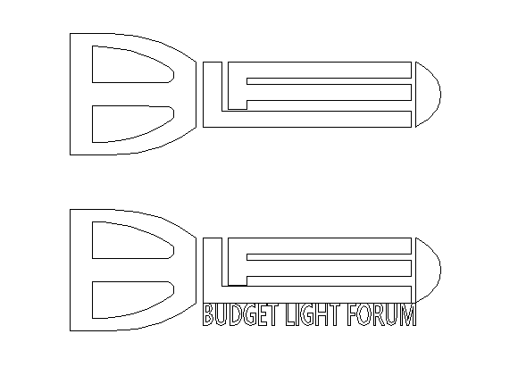
I prefer it with no text or the text below the image.
! !
!
To be honest, this is already causing me a bit too much stress. I think I’ll bail out here and let someone else who can please everyone take over.
It was a pleasure, now it’s a bit of a nightmare I wished I hadn’t suggested. So, I’m gonna leave it right there. Sorry, I tried.
Perhaps it would be easier to read if the the L and F were thinner? It would give the F a tiny bit more bottom.
Edit: Or make the LF body itself taller, to give the F a tiny bit more bottom.
G0ose,
You’re all good man, plenty of great ideas you’re bringing! This BLF, people are contributing free in their spare time, and thats all we can do. You’re never going to please them all, and too stressful to try.
I have projects I’m obligated to complete first to keep the lights on and my family fed, so when those are complete I’ll use my spare time to focus on stuff like this.
We’ll get some cool stuff out there, but from my end it won’t overnight.
Have a great day sir! onward and upward.
Trying to please everyone is a fool’s errand. Take a break and relax. I have a feeling this project will be here for a while.