Or even “…night into day”. My new one: “…no more darkness”
I like it (kind of Star Wars sign)
Mayby just few minor changes. What do you think?

How about keeping the box all black (just words) plus flashlight name and drowings

 +
+
Or even “…night into day”. My new one: “…no more darkness”
I like it (kind of Star Wars sign)
Mayby just few minor changes. What do you think?
How about keeping the box all black (just words) plus flashlight name and drowings
+
Does the Sofirn SP32A v2 has a timed stepdown on ramping mode if set to a high level or does it relies only on the temperature regulation?
Yes. This is very good.
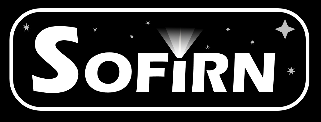
Yeah, that’s a cool idea! ![]() The drawings would only have to be inverted, i.e. white on black. I’m not sure if we always need a “TM” or “R” in the logo. If necessary, I would decrease its size a bit and put it closer to the top right corner of the “N”.
The drawings would only have to be inverted, i.e. white on black. I’m not sure if we always need a “TM” or “R” in the logo. If necessary, I would decrease its size a bit and put it closer to the top right corner of the “N”. ![]() I could image it would look nice to put the logo only on the face side of the tube or bezel and the actual model name on the tailcap. Corporate design is essential and should always look the same regardless of which flashlight you pick of this brand.
I could image it would look nice to put the logo only on the face side of the tube or bezel and the actual model name on the tailcap. Corporate design is essential and should always look the same regardless of which flashlight you pick of this brand.
rost333, maybe you have the right skills/tools to develop some kind of a 3D prototype cardboard box model? I like the KISS principle (keep it simple, stupid), so just a black box, the logo projected on the top side, the small sides of the box would indicate the actual flashlight model, e.g. SP33 and the long sides the slogan (e.g. “turning night into day” or whatever) as well as the 3D matrix code / UPC bar code etc… The rear side of the box could indicate the flashlight’s drawing on the upper half and some specs on the lower half.
This is how it could look like in my desired imagination… ![]()

That is superb idea! :+1: ![]()
I wish I had ![]() :cry: :weary: and I really hope that someone here from BFL with 3D project skills/tool could help us here
:cry: :weary: and I really hope that someone here from BFL with 3D project skills/tool could help us here ![]()
Wow. Even better. You guys are right on target! Very nice.
YES!! This is perfect! Simple and profesionnal and beautiful! This would make gifting Sofirn a no brainer!
Could you please make light rays a bit longer? You know, I mean better throw ![]()
I allowed myself to make some changes (We can have a poll about it :smiling_imp: )

I was imitating Aukey lamp box

As for “TM” or “R” in the logo - Sofirn is already using it, just see ” upper left corner here “:http://www.sofirnlight.com/
Anyway Sofirn needs to step in and tell us what they position is on all of this.
Question for Barry0892:
Would you be able to ask Sofirn’s current boxes supplier if Lux-Perpetua’s project can be easily adapted?
Another thing: Would it be possible to replace plastic holder inside the box with stiffer foam?
If it would keep the costs down I wouldn’t mind a plain (but classy) looking box like you see from Convoy and Astrolux
You guys are really going far with this package design!
Just wanted to caution that using gradients may not translate very well when being printed monotone on a flashlight.
(Non-solid colours in general make graphics a lot harder to reuse. Something worth keeping in mind!)
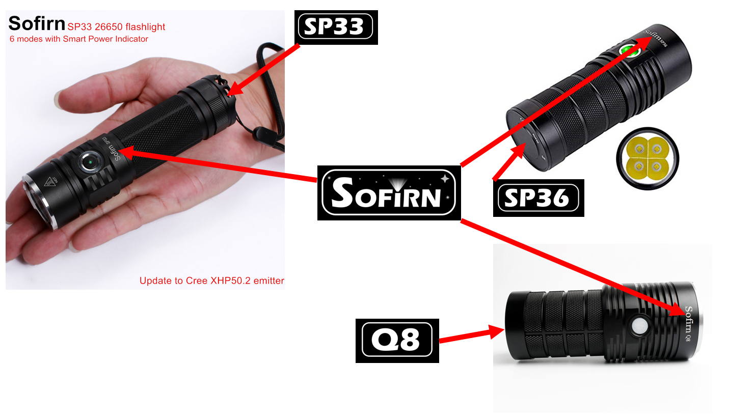
I have a Sofirn SF34 soda can.
It has 14 emitters.
I think it was a good deal for 20 bucks.
The only gold finish I have.
Does it count as a Sofirn?.
The only thing I’d change on the front there is have the light with the head upwards (so 180 degrees to that), and if they have all the raw design files, remove the labels so it’s just the light ![]() but I get what you’re getting at.
but I get what you’re getting at.
Jeez you guys have some talent!
Agree with dense foam instead of plastic
Thank you for your feedback. Serlite is right, I need to simplify the design and avoid gradient colors. I will incorporate your suggestions tomorrow and submit a new draft design.
Thomas, I hope you could include all suggestions from this poll:
I will gladly add your new design to above poll if you would agree.
Whoa…that’s fast, Artur. ![]()
Actually, I was gonna update the design tomorrow. The update will reflect all suggestions that were posted here today. I also think about an even simplier design that could match with those standard cardboard boxes used by Convoy, Lumintop and ThruNite. Maybe it’s worth to keep the poll on hold until I can present a design that could be used for a „user acceptance“ test?
Eventually, it’s all up to Sofirn whether they truly intend to change their corporate design or not. I would appreciate it if Barry were to let us know about his and Sofirn‘s opinion regarding this approach.
Cheers,
Thomas
Ok, I will close the poll for now. And… Done. Poll closed.
Below standard cardboard box used by Convoy

I hope you guys get a free light or something if they use any of this free labor
LuxP and rost333 for sure ![]()
I can’t help it. I just love massive… tails ![]()
Maybe Sofirn can use this tail design (it’s anty-rolling after all) for future 21700 EDC light?

Above YAGE YG-329D