Andúril 2 coming to Sofirn - The general Sofirn development thread

The only thing I’d change on the front there is have the light with the head upwards (so 180 degrees to that), and if they have all the raw design files, remove the labels so it’s just the light :wink: but I get what you’re getting at.

Jeez you guys have some talent!

Agree with dense foam instead of plastic

Thank you for your feedback. Serlite is right, I need to simplify the design and avoid gradient colors. I will incorporate your suggestions tomorrow and submit a new draft design.

Thomas, I hope you could include all suggestions from this poll:

Not finished box design for Sofirn with highest possible sale in mind. Which would sell best? Any suggestions would be most welcome.

I will gladly add your new design to above poll if you would agree.

Whoa…that’s fast, Artur. :smiley:

Actually, I was gonna update the design tomorrow. The update will reflect all suggestions that were posted here today. I also think about an even simplier design that could match with those standard cardboard boxes used by Convoy, Lumintop and ThruNite. Maybe it’s worth to keep the poll on hold until I can present a design that could be used for a „user acceptance“ test?

Eventually, it’s all up to Sofirn whether they truly intend to change their corporate design or not. I would appreciate it if Barry were to let us know about his and Sofirn‘s opinion regarding this approach.

Cheers,
Thomas

Ok, I will close the poll for now. And… Done. Poll closed.

Below standard cardboard box used by Convoy

I hope you guys get a free light or something if they use any of this free labor

LuxP and rost333 for sure :stuck_out_tongue:

I can’t help it. I just love massive… tails :wink:
Maybe Sofirn can use this tail design (it’s anty-rolling after all) for future 21700 EDC light?


Above YAGE YG-329D

Call it a reality check, cold water, counterpoint, whatever, but consider this…

…while the enthusiasm is great, and is probably appreciated by Sofirn, it has shown no public indication that it is seriously considering, never mind adopting, any of these suggestions. The efforts are fun to see, and the ideas fun to consider, but keep in mind they may all be for naught.

Even if they are under serious consideration, one has to walk before they can run.

As another poster said earlier in the thread, it would essentially be going from no marketing to full-on marketing.

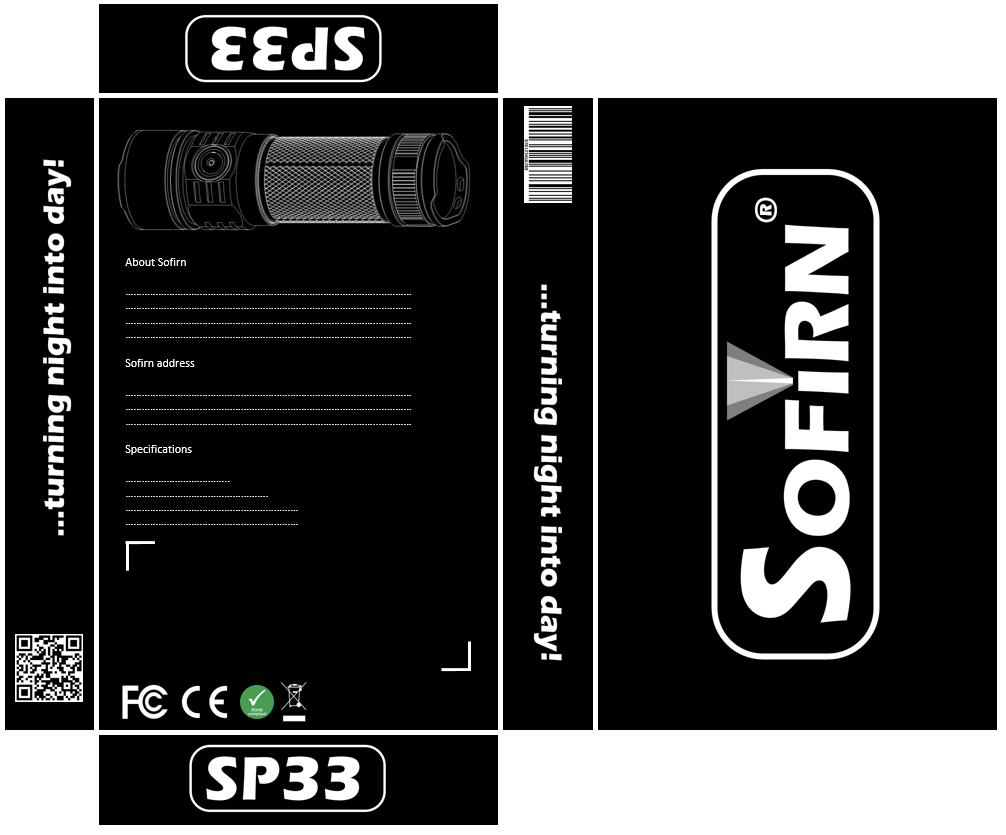
And to take an example of the current efforts, let’s consider these phrases from the marketing materials for the SP33:

“Gold plated thick string” (spring?)
“Sealed O-ring” (the o-ring is sealed? for what?)
“U shaped tail cap for easier operation” (on a light that lacks a tail switch)
“agressive (sic) curling for great grip” (self-explanatory)
“deep smooth refector (sic) brings decent beam” (only a decent beam? doesn’t it have an OP reflector?)

Obviously, these are the result of language barriers, but there are also the factual errors. Issues like these would be simple and cost nothing to rectify, and help avoid the stigma that many associate with cheap Chinese goods. Cleaning up the copy (and fact checking specs/proof reading) would go a long way toward making a better impression, especially on storefronts like Amazon.

A slogan? It can be helpful if it’s catchy, but it can also turned around to mean something disparaging. Slogans can convey a message or identity, but the product speaks loudest.

Logo — the current Times Roman may be boring, but it’s straightforward and practical. If there is a desire for something unique, hire a graphic designer to create one. It doesn’t even have to be a special commission; there are marketplaces where bids can be taken, candidates created by professionals, and one can be selected.

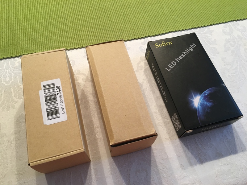
Packaging — Subjectively, the current design isn’t the most fashionable, but ultimately, it’s very practical and cheap. A couple sizes can accommodate most of the model lineup, in kit and non-kit form, with a simple change of the blow-molded tray. Frankly, packaging is just something to dispose of for most people, but if there is a desire to improve the unboxing experience, there are ways to get that effect without losing flexibility or increasing the cost too much, mostly by keeping it simple. No need to plaster the box with pictures, or features; maybe just enough to help identify the contents, but even that could accomplished with a sticker. Convoy’s gift box wouldn’t be a bad example to follow. At the higher levels, something like Olight’s packaging is nice, as it tries to mimic the packaging used by some high-end smartphones, but those products compete on a different price level. Fancy packaging is nice, but not essential. Spend the money on the product.

Ultimately, it’s the product that should attract buyers, not the marketing. Product is king, and it does the most to create a brand image. Sofirn hasn’t built its reputation so far based on the appeal of the box, the logo, or a slogan. Don’t forget that. Keep it simple, steady, and pick the low hanging fruit first. That won’t cost anything, and distract from the first priority.

Thank you TheIntruder for those words. I do appreciate each and every one of them.
But… well (for now) - as you pointed out - all efforts come from enthusiasm and fun of considering/sharing new things/thoughts.

I can’t speak for others, but as far as I’m concerned I don’t really hold my breath waiting for Sofirn to implement any of given suggestions/examples. Sure, it would be nice to see some impact, but I do understand that after all it’s independent entity run by people who have theirs priorities and plans.

Yes, I have to admit that there is a huge room for improvement on Sofirn side and for me it’s really hard to evaluate how big progress has been made on their side since Sofirn started to collaborate with BLF. It’s clear they do not want to unveil their plans and even current development is a secret. Obviously Sofirn don’t need BLF’s suggestions to develop new model of flashlight (new headlamp is a good example). It looks like they want to go harder way and launch possibly undeveloped product. Product which definitively could be better designed, constructed and programmed if only BLF’s suggestions were taken under consideration and implemented.

But hey, there’s no such thing like perfect product, right? There is always room for improvement. :wink:

I’ll totally put my hand up to proof-read things and make grammatical adjustments as needed; love doing it :slight_smile:

Slightly off topic given all the box discussion lately…

but…

How have I not seen this MS1 before?!

https://www.aliexpress.com/store/product/MS1-Scuba-Diving-Flashlight-4-Modes-IPX8-18650-Powerful-Cree-LED-Flashlight-800lm-Magnetic-Switch-LED/2933049_32800052982.html

If the LED and electronics in this were updated to something that could do 1000lm continuous and good tint like the C8F, I would definitely buy one. I love magnetic selector ring lights and the styling on this light just looks fantastic. I have an old, broken and sad Surefire U2 that I miss badly. Also, It needs a belt clip that is captured by the tail cap just like the U2 had.

Those magnetic rings require a special driver. The typical clicky and e-switch drivers won’t work. That’s why they’re not popular with modders.

It also seems fairly new considering the oldest review is from October 2018.

I just googled a bit and I couldn’t find any reviews.

I must admit that when I saw it said that it used an X-ML I was thinking of the OLD X-ML that only did about 100-200 lumens. Either way, I’d love to see this design improved a bit.

It looks like it wouldn’t hurt if the body was a bit longer too. Maybe switch to a 21700?

It really needs the removable belt clip so it can double duty as a dive light and a “rough service” light. I would totally EDC it if I was still in the military. I just took some photos to post of how they secured the belt clip on the old U2.

The reviews are right there in your link. Scroll down to where it says Feedback.

It also says XM-L2. I don’t see XM-L anywhere.

Surely you’re joking.
.
And I think you know that I mean REAL reviews not the “twitter” reviews on the product page.


This clip design is pretty nice because it both captures the clip so it can not pop off of the flashlight and it also prevents it from twisting on the light while still being easily removed if you take the tail cap off. My only gripe with it is that they should have made both sides of the wire have the same width of gap so that it could be installed on the light in two orientations. If a designer was feeling really clever, they could machine the same grooves on both ends of the battery tube so the light could be carried either bezel up or down.

the MS1 is an old model with some design issues. Sofirn want to update it but would rather design a new different diving light after a meeting.

And prototypes of a new diving model SD05 (if I remember correctly) will be the next step.

Thanks for all the ideas, designs on new sofirn logo, slogan, box design. You guys are amazing! I totally agree with TheIntruder’s words.

I transferred all the ideas, and sofirn will take it into consideration. I believe the boss will make the best decision for sofirn.

I look forward to seeing the new design.

I don’t know much about dive lights but I know what kind of light is useful on a nuclear submarine. :wink:

I’m sorry you misunderstood me. Another way to say it is “It also seems fairly new considering the oldest feedback is from October 2018.”

I wonder why there is no older feedback if it’s such an old design? IDK.

The listing says XM-L2 and the picture shows an XM-L2. You can tell the older XM-L by their green background around the die.


Thanks for taking our ideas into consideration, Barry! :THUMBS-UP:

It would be fantastic if you take new BLF ideas to your boss on a frequent schedule.

I guess I can speak for all of us BLF'ers here that we want to help Sofirn being more successful and more competitive on the flashlight market. Competition is always a good thing and as far as I can evaluate Sofirn's collaboration with BLF and their story of success it always resulted in valuable mutual benefits, such as the Q8, SP36 with NarsilM and many more items to follow (C01S BLF edition, Q8 extension tubes, neutral/warm white emitter choices, etc.). I do agree with TheIntruder about the priorities of product management - there's no doubt about the truth in his words. However, I also agree with rost333 that there's quite some potential here that is worth picking up. While Sofirn's corporate design can of course be kept simple it still lacks some kind of USP (unique selling proposition) and isn't there a saying "appearances matter"? ;-) I have no hard feelings if all these ideas will end up in Sofirn's trash bin - that's fine. But in my opinion it's better to have tried than being sorry for not having tried.

Apart from all this, I'm happy to offering my help to Sofirn in order to rectify factual errors, spelling and translation mistakes.

For anyone interested, here my updated drafts about the logo and box design. I have tried to consider all your input.

The logo:

Two reworked cardboard box design drafts:

Supplemental:

I will try to work something out for a paper colored draft and for the Convoy box "casket" design. The Convoy casket design is much more sturdy than the weak and thin cardboard boxes of the C8F 21700, SP36 and Q8.