I was too engross in finishing this mockup, till i overlooked their updated head design. 

I was too engross in finishing this mockup, till i overlooked their updated head design.
Something about this revision looks much better. Can't put my finger on it, but it's an improvement. Let's say step 2 in this direction would hit the right spot.
Can they change the pineapple knurling for something else?
Edit, I put the final production design next to the new design to see the changes better, I notice that the space under the switch has been changed, wish they change the pineaple knurling to this.

I agree, this mockup looks better. The head is nicer and a slightly shorter bezel(?) improves the look imo.
Different knurling would get a big ![]() from me but I fear it’s too late for that now.
from me but I fear it’s too late for that now.
I would also like it if the lanyard holes were integrated into the tail opposed to extending the tail just to accommodate the holes.
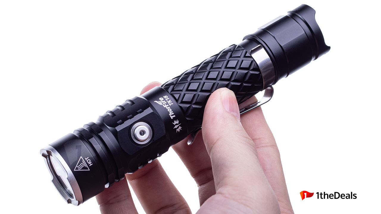
Pineapple is good. They feel really grippy in your hands.
I will discuss with BG on Monday. Hopefully, factory has not started making the shells yet.
I’m OK with the body. The head though… your green mockup looks sooooo much cleaner than the black sample. I can understand a desire to maximize surface area and thermal mass. The tapered head though… it just looks much more refined.
Also, please keep the slight crenelation on the bezel ring. I see it as a safety feature.
agree… :+1:
and i also said cheap, like mortuus said, cheap means alot of different in mind…maybe my english is to bad.
Im in for two totaly @ freeme…
i see nothing wrong in the original design, for this price its ok imo…
Too late for changes right now as factory has already started manufacturing the parts.
The knurling seems a mix of Throfire and Thrunite.
I’m not sure I’ll be in, yet, but at least try to give them a word about aligning the “striking bezel” with the button. That seems a bit off for me and actually non pleasant :zipper_mouth_face:
About the shape, your design is much better than this one, but the overall shape of the “final” version isn’t completely awkward…
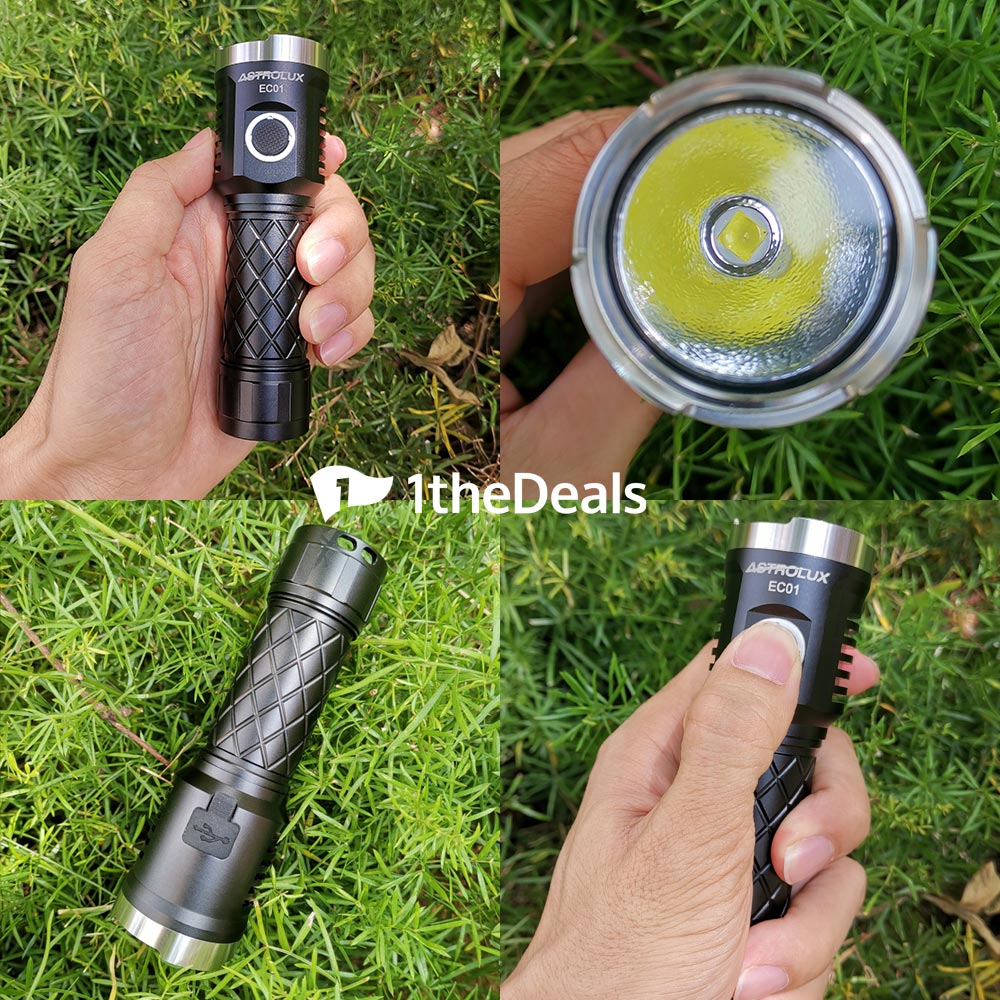
For me it is fine. The head bezel is SS and the manufacturer is Sofirn, right?
So will there be a pocket clip then? If not I’m not buying it.
Who decided to put a doorbell on the head??? Freeme’s version looks soooo much better.
I will take one freeme
Could you please confirm the throw distance on this one.
TY
the sandy is very impressive
 They should consider making a few.
Hi freeme.
Interested.
Interested. Thanks.
Interested.