
Best movie ever!
Best movie ever!
it really is one of the greats. But then again I'm a huge Peter Sellers fan. Last week I watched Dr. Strangelove, Being There, and The Mouse That Roared all in one night. It's nice not having a life. lol!
Friend of mine created a new flashlight line, I made a poster with a pic I took of his little light. Thus my avatar is born! ![]()
Got mine to work. My avatar is me, wielding a 30 pound Concrete hammer I made in my third year apprenticeship. Little did I know it has lightening powers once I coated it with sealer ![]() (I’m not the best at photoshop)
(I’m not the best at photoshop)
Looks painful.
Are you Thor ?
I’m his Carpenter Cousin, god of lighting
God of Lighting :bigsmile: ![]()
10 points if you know my new one :

One off the undercover local police? 
Porco Rosso!
10 points to the Miyazaki fan !
I’m going to keep my avatar as the latest torch I’ve bought
Mine is a manta ray and I face to face in 60’ of water at Roca Partida.

I put again the image of the explanation of my avatar. I changed a long time ago the site of “support” of the images, but I did not realize that the “old” had vanished.
Very clever, last Katun !
that is veerrryy cool Katun! 8)
I am impressed!
I was thinking about starting a thread, "Your BLF Signature"
...but most people's signatures are self-explanatory. :p
(everyone loves big image signatures) :evil:
Old sig:
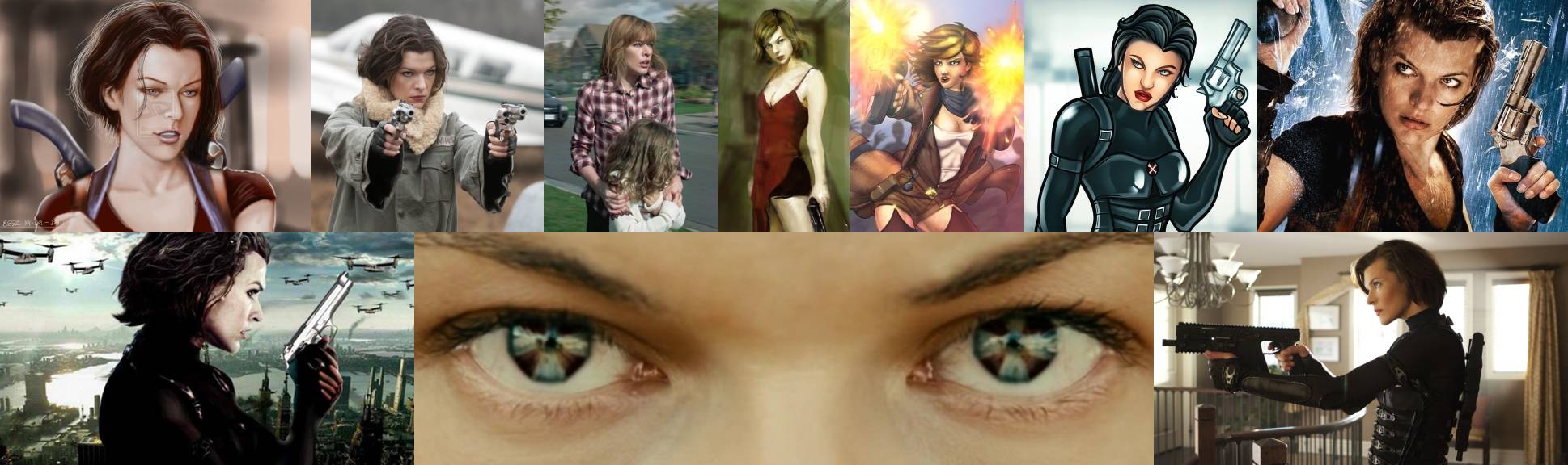
New sig:

I think the new sig looks a lot better. What do you think?
A refresh is nice.
I miss the dramatic red dress pic (middle, old sig) but it seems your going for all new.
Did you want honest thoughts?
Skin tone on the ‘eyes’ looks better to me in the old sig. The higher pink/red makes it look more real and then by extension the eyes are more effective to me. You might want the less ‘natural’ look tho since she is enhanced.
In the new sig, the pinkish background pic (4th from left) throws off the balance to me. Something darker would bring more balance / symmetry. Would be more pleasing to my eye.
This! And the same thing applies also to bottom row left & right images. Symmetry rules! :)
The new image is also 23% more lightweight, which is good!
That was a nice dress, but out with the old and in with the new!
[quote=Helios-]
Did you want honest thoughts?
Skin tone on the ‘eyes’ looks better to me in the old sig. The higher pink/red makes it look more real and then by extension the eyes are more effective to me. You might want the less ‘natural’ look tho since she is enhanced.
[/quote]
Even though her old skin color looked nicer, it was actually due to poor image compression. Her new facial hue should now be identical to the movie.
[quote=Helios-]
In the new sig, the pinkish background pic (4th from left) throws off the balance to me. Something darker would bring more balance / symmetry. Would be more pleasing to my eye. [/quote]
It might not look like it, but I think the background is white. (Like it matters. :p )
I didn't even think about color symmetry. Thanks for the input! 8)