tint photography

I know there are many pitfalls in tint recording and reproduction but I'll ask the question anyway.

First a six-barrel white wall shot:

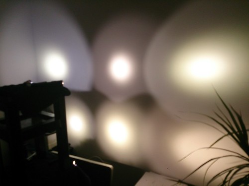
This is six flashlights with six different (all non cool-white ) emitters, FYI:

top left XP-G2 3C top middle Nichia 219 top right XM-L2 5B1 80CRI

bottom left XM-L 4000K bottom middle XP-G2 ? bottom right XM-L2 6A1 80CRI

So you think you can look at this picture and have an actual idea of the tints? Very wrong!

First your and my monitor are not calibrated, so you see the tints in this picture a bit different than I do. But actually it is not so bad: my phone display (Sony, brand new), digital camera display (Sony, 4 years old) and Apple Mac monitor are not too far apart in how the tints are reproduced.

Second, who says that I perceive the tints the same as you do (the old thought-experiment that if I could look through your eyes I might perceive red as blue and blue as red, who knows: it is just what you are used to). But this is more theory than actually affecting my problem.

Third and this is the real bottleneck (and it is really annoying me): None of my digital camera's in none of the white balance settings -preset or custom adjusted- manages to actually registrate all tints correctly. When the photograph is displayed next to the original beams on the wall it is very different. One white balance setting that reproduces the Nichia quite correct (in the picture above that setting is used) gives too much blue in the 3C (the actual tint is more purple) and far too much yellow in the beam on the bottom middle. And another tint is correct the first one is horrible, etc. Most obvious is that you can not reproduce the blues correctly without getting too much yellow as well. In the above picture the Nichia (top middle) looks redder than the unknown tint (bottom middle) while that bottom one in real life has more red, but there is just so much yellow displayed that you don't see it. Etc., etc., etc.

I have not tried to correct the pictures with Photoshop but I suspect that that will not help because there is color information missing. It is just not registered by the camera in the first place (I guess the camera uses a quite different color determination system than our eyes).

Now to the question: my camera's are not remotely state-of-the-art professional camera's and I am not planning to buy one, but out of curiosity: does anyone of you know if there are there camera's around that can do this trick more correctly?

that is awesome! too bad you can not properly represent all the tints with camera though

i think you´ll need a camera which let you shoot in raw, so no info should be loss due to compression, and then in your computer you must adjust the color/tint/WB (or whatever adjustment yo need to tune) to match what you are actually seeing

Great points made regarding tint, since it’s the best we can do it still gives us some perspective.

Wow that XML2 6A1 80+CRI looks just like the Nichia 219, is that how you see it in real life?

EDIT: Have you tried just 2 or 3 tints at a time?
Maybe that would render tints more accurately?

Or take shots of tints separately and use animated gif or mouse over to display differences.

Nope, real life is different: the XM-L2 6A1 (as expected from the tint number) has more red and more yellow than the Nichia219, the Nichia looks really white next to the 6A1.

Hmm, this might be a way to do it: take one beamshot at a time, and correct the tint with the white balance setting on the camera and further with Photoshop on your monitor, with the real beam next to it. Then combine the separate pictures. Thanks for the inspiration .

A better test might be to light a colour checking chart to show how CRI and tint affect it. Also calibrate your monitors.

Interesting topic, djozz. Please allow me to offer my 2 cents worth :slight_smile:

Assuming that your camera’s white balance is set for daylight (5500K), and your monitor is calibrated etc. that should ensure that all tints are represented accurately.
However, it’s a bit more complicated than that. The brain tends to compensate for what it ‘remembers’ should be correct. For example, under fluorescent lighting (cool daylight) we will see a white sheet of paper as white, because our memory tells us that white paper ought to look like that. In actual fact the colour of ‘daylight’ lightbulbs is off by quite a bit. Take a picture under fluorescent lighting with your camera set to daylight (no flash used) and you’ll see a horrible, green-ish hue. Our brains fill in the blanks, so to speak. And you are right, my perception of colour and yours might be a little different.

Another thing I’ve noticed is that in the beamshot pictures I’ve taken, the camera records a higher contrast than I remember was actually there. While processing the beamshot images I took in the park, this became apparent to me. The images I took looked more contrasty than I remember. Try as I could to photoshop the image I couldn’t get back the exact same image that I saw (in the park and in my mind) while I was taking the photos. Again, my brain was ‘filling in the blanks’, I reckon. And so it goes… I think the best we can do is achieve some sort of fair representation of the tint/contrast, of our lights when taking beamshot photos. With a bit of care and attention to details (like white-balance settings), hopefully we can get close.

your camera either needs to have a custom white balance setting then you can dial it in to whatever you want, or you need a gray card that you can set the white balance to in post.

I have not tested it, but I doubt it. I have been using/owning the whole range of Canon compact cameras and basically the whole range of DSLRs from low to high-end at the same time. Im not aware of any cameras that will “do the trick more correctly”. I doubt there will be a noteworthy difference between a entry-level DSLR and a high-end model. I don’t see how the dynamic range can do much. Dynamic range in a camera vs the eye is a subject that can be debated… a lot. Light temperature and tint too. In the “tint department” the main difference between decent to good cameras seem to be how they set the white balance and exposure in various situations.
I have heard people say they like the colors in one type of camera brand are more likable than others. The differences are really really subtle! So subtle that i would love to have performed some blind tests on some people… Either way, most good cameras are pretty much the same as far as I can tell if taking a shot of various lights pointed at a wall. Sure, some would adjust the exposure and white balance a little differently. But when taking pictures in RAW both of those things can be fin tuned. Especially the white balance (temperature and tint) which you have full control of in post production.

As some have said. Using RAW (and playing a bit with temperature and tint) and a high-end calibrated monitor will get you a little step close to a more real representation on the monitor, but I don’t think you will come anywhere near what you perceive when you put a bunch of different tints in one shot. Most likely you will be able to adjust a certain tint quite well, but then you risk that other tints are more off than they were in the beginning.
Like Banglabob was into here, the brain have a tendency to make up things, and we perceive things differently. Each and every one of us. We also perceive tints (or various light sources) different depending on what light the eyes have adjusted too.

Id like to comment on the tints too in the pictures too.
The 3C is how I often perceive it, only that in the picture, there is not the yellow, sometimes green-ish tint you sometimes see.
In your picture and on my monitor I see it as pure white in the middle with CW looking spill light. This is why I don’t like 3C that much for general purpose. Its kinda like having a NW that says, Im NW, as long as you don’t look at the spill. This is partially why I prefer the other less cool NW tints, they are more true to being NW in both hotspot and spill.

The 5B1 also reminds me a bit of real life. (I just have to try and avoid the place where the spill mixes with others and the unevenness due to light angle) It does not have much red-tones at all. In real life, its a really nice neutral that leans towards the yellow side of things. Not much red-stuff in the picture, nor in real life.

When going straight from a 5B1 to Nichia 219 I can easily notice the red-tones in it in real life. But if go from darkness to Nichia 219, the Nichia is just pure white.
If I go from a typical 3000K WW to a Nichia 219, it looks very white, almost like a “cold neutral white”. So it depends where you are coming from. I would consider the Nichia a pure NW white that has some slight rosy-browinsh tint at times.
If you showed me that picture in the OP and I were to guess, I would not have guessed Nichia 219 on that tint. It does not look white enough, and have too much red color tone in it.

The 6A1 is just a bit too “rosy” looking to me in real life, kinda like the tint chart point it towards. The only resemblance I see between the picture and real life is the lack of yellow and that its slightly less neutral white looking compared to the others (warmer). If you eyes adjust to the 6A1 and you put on the Nichia 219 I can not see any red-brownish looking tint at all in the Nichia 219. Reason being that the 6A1 just have that much more red-rosy looking tint.

On the picture, I think the best NW looking tint is the bottom left. But I also like the bottom middle due to its slightly warmer look without blending in too much yellow or red that pops out of it. Those are the ones that look best for me. I wonder how others perceive them on the pictures and in real life.

If I had not seen the top row of lights in the picture , I would have guessed bottom left to be Nichia 219 (its quite pure white). The bottom middle could be a 5B1 (its warmer than the Nichia, but also more yellow), and the bottom left would probably be more like a 6A3 (its warmer, and has more red in it than the 5B1.

In the picture I can see some resemblance to real life. But for someone who have never tried various tints in the NW range, I believe a picture like that does not say that much in terms of what a person may or may not prefer. I mean, the Nichia 219 and XM-L2 6A1 are worlds apart in real life.
Another thing with tints, the type of reflector used can have impact on tint… The amount of current also seem to change tint/color temperature a little.

I do not own one but I know of the existence: the color checker is a great device but it gives different (more) information, namely not just about the perceived tint but it also it gives an idea of the balance of the different colours in the output spectrum (e.g. the Nichia 219 is the only emitter I have ever seen that reproduces the reds very well and at the same time puts out enough blue to show blue things as blue instead of purple. Just describing the tint of the Nichia does not tell that story).

The question in my post was just how to reproduce the tint, and that already appears to be difficult enough .

When having so many tints close to each other they will all bleed into each other more or less.

Having so many LED tints turned on at the same time will create an unreal perception of the colors. For example the eye always looks for a complementary color to another color, for example if one color is strongly red, another one that is just slight green will be perceived as clear green to compensate for that red.

Leaving white balance aside, lenses matter in color saturation and color reproduction, which more say they do not care so much, but these are white tints so any small difference will matter for more accurate tints.

I like the pic, djozz.
It may not look exactly how you saw it, but it does show “a difference” - at least to my eyes.

It is an interesting discussion going on though.

This afternoon, the light was just magnificent where I live - I call it “happy-sad” light.
It’s melancholy for some strange reason to me and yet makes everything bake a beautiful golden glow at the same time.

And sight perception changes with age. Oh, how it changes…

Better make some individual shots, and put them together afterwards.

I think the best you could do is to leave the camera’s white balance at sunny, there is less colour manipulation done by the camera at that setting than the others, again the amount varies between camera’s, even models of the same make.

Cheers David

I make some photos of tint's by mirrorless camera, RAW+ ACR/Photoshop , and I see "real" tints on calibrated monitor.

Photos can be converted with few CT options for better view, especially we speak about comparing few flashlight's or lamps.