I also tried to make them more visible by giving links a black dropshadow, but it’s still a bit odd with blue. Human eyes have difficulty focusing on pure blue light.
How do you want it to look instead of the current appearance?
Also, as a side note, you don’t have to use the “after dark” theme in order to get the blacklist function. But if you do want to keep the “after dark” part, the code is all editable. Look for this part, and uncomment/edit the second line:
    /* Make hyperlinks brighter, for DanielM */
    /* color: #0094d9 !important; */
Additionally, to make signatures bigger, look for this part and change the font size:
/* signature at the end of each post */
div.clear {
    /* display: none; */ /* in case you want no signatures at all */
    margin: 6px 0 0 0 !important;
    padding: 0 !important;
    font-size: 80%;  /* make the text smaller by default */
    ...
Just IMNERHO, but I absolutely LOVE the way hyperlinks work in this theme!! On my system, they change to White & quickly-but-gradually increase in apparent brightness, just like the CFLs I used to appreciate.
Just one of many wonderful features!!
I don’t even mind that the Search Results pages look really weird.
I updated the main theme file just now, with one tiny change:
Styled the new “Rude!” button. (actually, all “flag” actions)
I’m not sure about styling the rudeness meter on the left yet… haven’t seen it with a non-zero number. Then again, I think the feature only landed like ten minutes ago.
Ahhhh, that works. Text I had long since memorized no longer appears every time.
Now, to program my glasses to filter out certain billboards and t-shirts …. oh, wait, that’s science fiction ….
And nobody has invented not-hearing-aid filtering either, just yet.
TK, Which line do I edit to change the color of the “NEW” and “UPDATED” markers that show next to thread titles? It currently shows as deep red and I find it hard to see, probably due to my partial color blindness.
Ah, interesting. Those only appear in a part of the interface that I don’t use. Hadn’t even noticed those were there.
The “new” markers I configured are bold black text on a red shadow. Thin red text on a grey background was probably inherited from an earlier version a few years ago, before BLF’s code got updated.
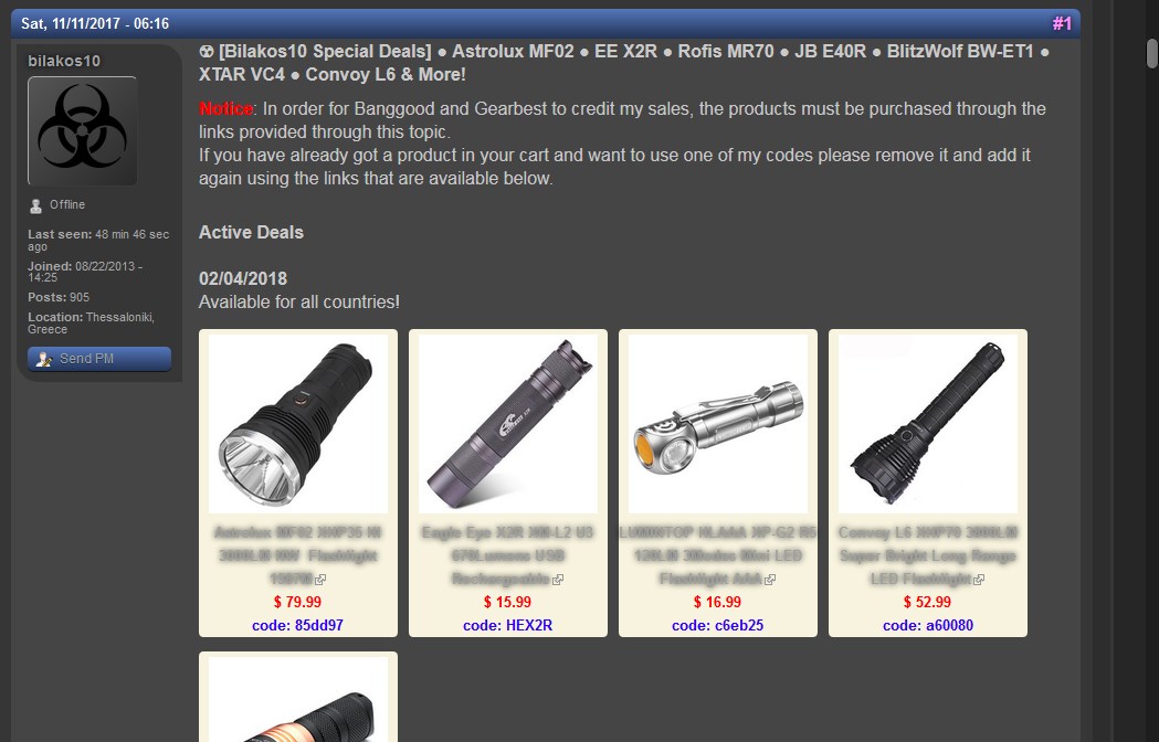
Another question: product descriptions below images in the screenshot below are unreadable. They do become readable when I hover my mouse over them. How do I change that font color in your CSS?
Thanks!
Link to that specific thread, although it’s not the only one with that issue:
There are still a few bits here and there which aren’t re-styled correctly, but it mostly works. Some of the table border lines, in particular, haven’t responded easily to overrides, and I haven’t tracked down the reason why.
I also have a few little extras locally, like to remove the search box. I had kinda forgotten it’s even there, since I’d rather type a bit more during a search than have the widget always taking up space.