Just IMNERHO, but I absolutely LOVE the way hyperlinks work in this theme!! On my system, they change to White & quickly-but-gradually increase in apparent brightness, just like the CFLs I used to appreciate.
Just one of many wonderful features!!
I don’t even mind that the Search Results pages look really weird.
I updated the main theme file just now, with one tiny change:
Styled the new “Rude!” button. (actually, all “flag” actions)
I’m not sure about styling the rudeness meter on the left yet… haven’t seen it with a non-zero number. Then again, I think the feature only landed like ten minutes ago.
Ahhhh, that works. Text I had long since memorized no longer appears every time.
Now, to program my glasses to filter out certain billboards and t-shirts …. oh, wait, that’s science fiction ….
And nobody has invented not-hearing-aid filtering either, just yet.
TK, Which line do I edit to change the color of the “NEW” and “UPDATED” markers that show next to thread titles? It currently shows as deep red and I find it hard to see, probably due to my partial color blindness.
Ah, interesting. Those only appear in a part of the interface that I don’t use. Hadn’t even noticed those were there.
The “new” markers I configured are bold black text on a red shadow. Thin red text on a grey background was probably inherited from an earlier version a few years ago, before BLF’s code got updated.
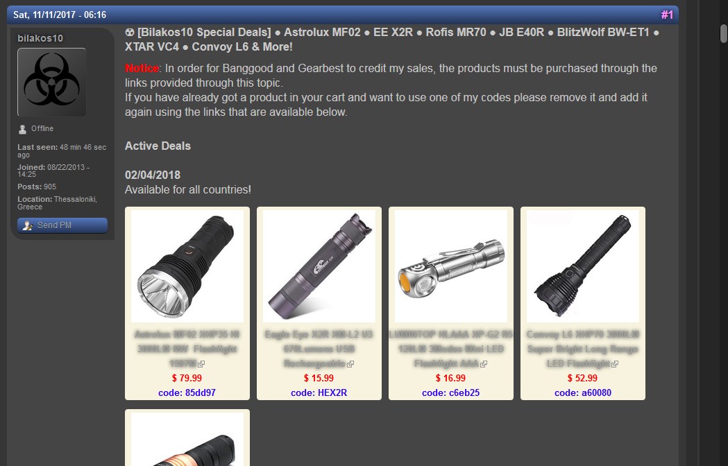
Another question: product descriptions below images in the screenshot below are unreadable. They do become readable when I hover my mouse over them. How do I change that font color in your CSS?
Thanks!
Link to that specific thread, although it’s not the only one with that issue:
There are still a few bits here and there which aren’t re-styled correctly, but it mostly works. Some of the table border lines, in particular, haven’t responded easily to overrides, and I haven’t tracked down the reason why.
I also have a few little extras locally, like to remove the search box. I had kinda forgotten it’s even there, since I’d rather type a bit more during a search than have the widget always taking up space.