Polar plots (for those who don’t know) are a way of graphing data that is directional. The chart is a circle and the degrees go around the circle, like a compass. Signal strength is zero at the center and goes outward as it is stronger.
Loudspeakers and antennas are examples of things that are directional and usually have polar plots to show their performance. Imagine looking down on a loudspeaker from above and seeing which way the sound is loudest.
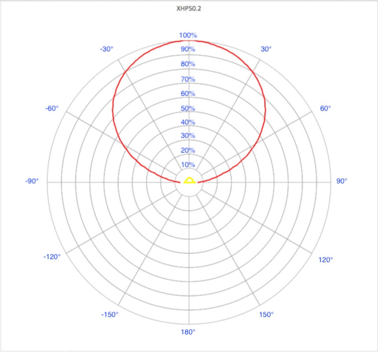
The Cree datasheets have graphs showing the intensity vs angle, but they are XY graphs, which don’t look like reality at all. This data is perfect for a polar graph, and I decided to try and make one.
To get the raw information, I took a screenshot of the spatial distribution chart of an XHP50.2, and started counting pixels of each point on the graph and entered the XY coordinates Excel. Then I scaled the XY info to 180 degrees and 100%. So at this point I had used a picture of a chart to back into the original polar data (degrees and strength) Cree used to create the chart.
Here is the screen grab from the XHP50.2 datasheet:
Excel doesn’t have polar charts, but I found a website with a very clever hack. He modifies a Donut chart to create the polar grid, then a formula to plot polar data to XY. Polar Plot in Excel - Peltier Tech
Using this process, here is the end result. The below chart is 0% to 100, with each ring representing 10. I like it because it really illustrates how rapidly the LED output diminishes as you move away from 0° (top) to 90° (left and right), and interesting that it comes out looking like a circle.
I added a little picture of an LED to make it more visual.
Edit, the op has been edited. I read this three times and I think I understand 3% of what you are trying to show. I believe subsequent readings will produce diminishing returns. With that out of the way, it would appear that altering the shape of the reflector could put a lot more light down range. (Assuming that is the goal.) Possibly a reverse hourglass shape? Basically the middle distance of the reflector needs a bit of a curve and out toward the end of the reflector the angle should probably be near 0. That’s probably hard to follow. Something along the lines of a wine glass shape rather than
a perfect cone (martini glass).
If there was ever a job for a 3D printer it’s making curved reflectors. I don’t know how you’re going to chrome it at home? Paint? It seems like a lot of trial and error. And you’d have to spend a lot of time on the puta in 2D to even start getting close to maybe 20% or higher down range.
Around 60 ° seems to be the crossover to below 50% relative intensity, is there any benefit to trying to collect what’s left below that, or is it getting to the point of diminishing returns?
edit op edited We can’t do anything with the reflector plot above because we have no dimensions for that reflector. Not that it would help a whole lot. I have been thinking about curved reflectors for a couple of years. Mostly to concentrate the beam and get more throw.
Haha, I’m always accused of being unclear at work too!
The plot is not of a reflector, it’s just a different way of looking at an XHP50.2.
I’ll update the original post to try to clarify.