Yes, I wasn’t talking about chromaticity chart. CRI by definition describes how close a particular light source is to the closest black body radiation curve. Which may not be the curve with particularly good color rendering properties.
If a particular light source perfectly corresponds to some black body radiation curve, it is said to have CRI 100, even if the curve it corresponds to is 2000K which has very poor color rendering properties.
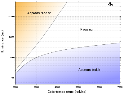
And important explanation:
For example, natural daylight has a color temperature of 6500 K and an illuminance of about 104 to 105 lux. This color temperature–illuminance pair results in natural color rendition, but if viewed at a low illuminance, would appear bluish. At typical indoor office illuminance levels of about 400 lux, pleasing color temperatures are lower (between 3000 and 6000 K), and at typical home illuminance levels of about 75 lux, pleasing color temperatures are even lower (between 2400 and 2700 K).
Actually you are write, 5000K with high CRI is good light, but when it is over 500 lux, which is much more than usual office illuminance of 80 lux.
Thank You for incorporating brightness into the discussion of preferred color temp, it mirrors my experience that I prefer lower color temperature at lower lumen levels. And it correlates with many posters who prefer cool white at high lumen levels.
My fantasy light would have different color temperatures at different lumen levels, for example
low of 5 lumen at 3000k
medium of 50 lumen at 4500k
high of 500 lumen at 6000k
all with High CRI
Of course, since my smartphone's luxometer would easily be overwhelmingly stomped at daylight, I had to check that out. Fixed: 10K to 100K lux (can reach above 100K in fact).
I can also understand now the reason behind the pleasurableness of my kitchen lamp retrofit, with a colour temperature of ≈5600K and an illuminance grossly between 200 to 1000 lux (400/500 lux over the table).
There are many physiological and psychological reasons why a particular light source will subjectively appear to be more or less comfortable or pleasing to an observer. The Kruithof experiments, for example, were run with ambient lighting and no other light sources present, so it makes a lot of sense that most people found more comfortable luminance and CCT level combinations most often present in natural sunlight.
But firstly, this has nothing to do with color rendering properties of a light source. I too, before I go to sleep, find most pleasant the light from incandescent bulb (3000K CRI 100), even though it has quite poor color rendering properties. And secondly, this subjective preference is likely to be very different when the conditions of experiment are different, like non ambient light (flashlight beam), other light sources present, etc.
Kruithof is Right!
The 60w 3000k Incandescent light that puts about 100 lux on my dining table, is very pleasant, and I have no complaints about the Color Rendering:-).
Im a little unclear, how pleasant and poor go together for you. How many Lux are you getting, and why is pleasant poor?
When I care about color rendering properties of a light source, I don’t find incandescent bulb light pleasant. But I don’t care about color rendering properties of a light source when I am about to go to sleep.