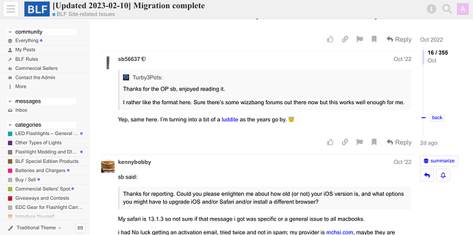
[2023-02-17] *OPTIONAL* traditional theme preview screenshots

Hi everyone,

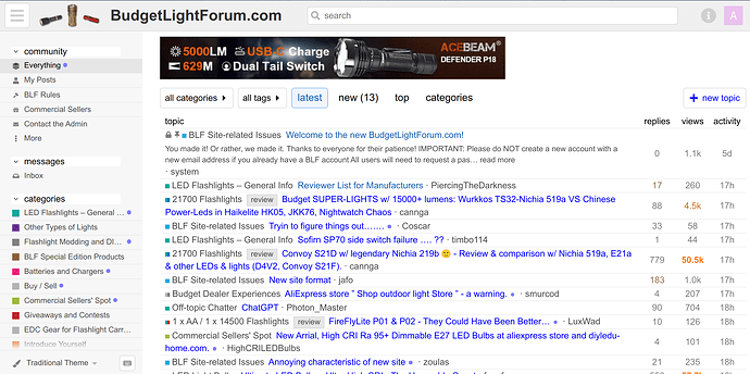
For those who want a more conventional and information-dense theme, I’m testing this theme and color scheme, which would be an additional option for those who might prefer it. I haven’t spent much time yet on the color palette, and that can be changed. First I’d like get feedback from those who might choose to use it:

6 Thanks

Honestly, I wouldn’t know how well I liked it . . . until I used it for a while. But the more options the better.

1 Thank

nice! streamline and dense!

for better visual scanning on the “everything” homepage, i suggest topic title should be the first element on each line, followed by author, then category. folks most interested in category are better served by the categories pages.

the color-coded bullets could remain as as subtle visual cue for folks who know green means general info, light gray means buy/sell, etc.

suggest truncating long topic titles and category titles to avoid rolling to a second line. otherwise, suggest indenting the rollover text to avoid interrupting a visual scan down the list.

what’s missing compared to the current theme is the identity of the most recent poster. maybe this can be displayed by hovering over reply count, or maybe it’s not critical info?

seems like a great start!

edit: i’d like that search bar on the main theme if possible.

edit 2: can you add separate columns for author and category? if so, density would be preserved, visual scanning dramatically improved, and rollover from long titles a nonissue.

topic | author | category | replies | views | activity

You can just type “/” and the search opens, no need to click anywhere first =)

4 Thanks

thanks for the tip! doesn’t work on a tablet though.

+1, thanks for the tip!

A very good start; I like it.

I would give the topic list a little more padding for more breathing room. It doesn’t have to be quite that dense. As well as the tiger stripes already discussed.

Author and views aren’t things I usually look at when choosing what to view, but I don’t object to them being present. But the view counter does take up space that I think could be better used to present the tags and authors in a more orderly fashion, instead of being lumped in with the rest of the subject text, and making it more cluttered.

If all else fails, you could just replicate the old forum table setup and I doubt people would object. :slightly_smiling_face:

I’m also reminded that, likely because of social media influences, or places like (eww) Reddit, there is a shaded blue box appended to the first post in every thread, with created/last reply/# replies/views/users/thanks/frequent posters, their avatars, popular links, and even an estimated read time. It’s collapsible, but can’t totally be eliminated.

A lot of that information is redundant, the rest can consume a lot of space, and on the whole, it strikes me as something to cram in social media-like information, and disruptive to the conversation.

Coming from the viewpoint of someone not invested in social media, or wanting to always know who posted, posted most, when, or what their avatars look like, I find the whole thing an element of unnecessary clutter.

The links may be useful, particularly for a commercial poster to utilize, or some form of wiki, but I don’t know if it’s editable, or strictly machine generated and can’t be user altered.

Within the thread, I’ll again advocate for strong distinction between each individual post, though it doesn’t have to be as severe as the old forum.

I’m also good with the overall color scheme, but the shading of the headings in the sidebar might not strictly be necessary, a minor point.

Otherwise, I can already see this being my default choice.
1 Thank

I like it; would very likely use it.

1 Thank

Not my “cup of tea”. But I see that some like it.
Just too congested for me. On a PC anyway. Maybe decent for a phone… if the links are not too small to be easily clicked. , These damn clumsy fingers of mine… :slightly_smiling_face:

1 Thank

If you introduce this option, could you also add an option to use the Material Design theme as requested in another thread?

SB, Is this format optimized for a desktop PC, or does it auto-adjust to small screen mobile devices, including portrait view?

I ask because although I’m getting used to the current format, this new one looks more visually user-friendly to those of us with compromised eyesight.

I know you mentioned wanting feedback form those who would use the alternate format, but the way I work I would have to actually use it for a bit, especially on a tablet or phone before making a decision. Just looking at the screen shots is not enough to decide.

1 Thank

Hi.

I’ve been test-browsing this new site for a few days now, and I seemed to read about ‘Themes’. I’m interested on this compact-and-information dense theme, but I don’t know where to change or update this.

I was able to change my avatar under ‘Preferences’, but I’ve not been able to locate ‘Themes’. :face_exhaling:

1 Thank

Hmm, it’s possible, but I really don’t see the Material Design as significantly different from the current default aside from a bit more of a 3D look and therefore slightly better demarcation between elements. (Or maybe it’s the Material Design color scheme that many prefer? :thinking: ) My preference would be to add a few more CSS tweaks on top of our current default theme to improve the contrast and demarcation a bit, and leave one other option that is very different for those who prefer it. But nothing’s written in stone yet, just my current plan.

Hi there, @KnotSoMuch , yes it is, all Discourse themes are designed for both mobile and desktop support.

Yep, I understand, I’m just getting a feeler first to see if there are a lot of strong negative or positive reactions to the screenshots. I’ll probably enable this one during the next few days before investing too much time into it so everyone can try it out first.

Hi there @akula88 , great to see you here. You’re correct, there is no “Theme” control yet for users because I only have one theme currently enabled. Aside from themes there are also color palletes, and there is currently a dark color scheme you can enable here:
https://budgetlightforum.com/my/preferences/interface.

2 Thanks

@sb56637

I’m a bit conflicted about adding this option. While it’s visually appealing, and will work on small screens, I also recognize how much time, energy, and overall commitment you have already expended on this forum upgrade. After several days of getting use to the current format, I can say that I’ve become comfortable with things as they are. Since my career in the medical industry never required much use of I.T., I’m sure that has much to do with my flexibility. So whatever you decide, I will support 100%.
Thanks as always for your hard work & dedication to the forum as a whole. - JC

1 Thank

Better readable for sure!

Personally i prefer the dark mode, it’s much better, i would like an orange them for the highlighted section, links, buttons, etc… , but it’s good enough as it is !

I know the Stylus plug-in was mentioned in a few threads. If you want to get a darker (or lighter) horizontal line between posts, try this (should work on both light and dark modes):

.topic-avatar, .topic-body {
    border-top: 2px solid var(--primary-low-mid)
}
4 Thanks

Hey @quahog , thanks a ton for that! That’s what I was looking for, I was poking around with the Firefox HTML inspector but couldn’t figure out which of the borders was which. I just added your tweak to the default site theme. :+1:

2 Thanks

@sb56637 No problem.

However, it seems that the whole topic-avatar and topic-body CSS was replaced rather than just the border-top being changed. It looks like the margins/spacing was lost (horizonal line now touching the avatar, at least on mobile).

Is there a way for you to modify the CSS for a class rather than it being replaced. For example, my Stylus plugin section only modified the border-top.
If you can only replace, then you might need to copy all the previous entries (margins, etc.)