They were both too complicated— ![]() but— I was able to make them both do what I wanted them to. ( You’re not supposed to end a sentence with a preposition) Maybe we need to switch to A I…
but— I was able to make them both do what I wanted them to. ( You’re not supposed to end a sentence with a preposition) Maybe we need to switch to A I… ![]()
You’re not supposed to end a sentence with a contraction either, but that’s the kind of person I’m.
2 Thanks
Just don’t! ![]()
1 Thank

![]()
I wondered if that post might be bothersome. Apparently it’s.
3 Thanks

Y’know what’s sad?
I was taught in school what a preposition is, but I have to Google “preposition” to know what one is. ![]()
1 Thank
![]()
I’d’ve’f y’all’d’ve. ![]()
2 Thanks
Oh no she didn’t! ![]()
Dd y knw tht y cn mit th vwls nd ppl cn stll ndrstnd vrythng? ![]()
I didn’t know that you shouldn’t end a sentence with a contraction until Toykeeper mentioned it.
I must have skipped school the day they taught that! ![]()
1 Thank
I like the new one better.
My favorite feature is the ability to post pictures where it’s less time consuming and so much easier.Right to my files.
No need for Photobucket, Postimage .org…ect
3 Thanks
I was thinking I would like this better after time, but I still struggle to perform basic tasks lol…
Hey there, could you describe a bit more what aspects you find difficult?
Sure. This isn’t a complaint, I can’t imagine how hard it would be to build a forum. But most all of the issues I have stem from things that don’t seem intuitive. Earlier I spent like 30+ minutes trying to figure out how I could see all of someone’s posts. When I click on their name, or their profile picture a window pops up. I see a “message button” and several things on the bottom that are blue but not hyperlinks. Tried searching their name, and going to messages and then clicking their name etc. Finally after about 20 circles of that I figured out that I can get to it by clicking their name or profile picture, and then the name or profile picture inside that window a second time.
A lot of my issue could just be me and not an issue with the site, but I even have to stop and think hard about it sometimes to be able to post a reply. Since the reply window is not already open I scroll all they way down and eventually find it. When I looked at the old system things seemed clearly defined and laid out. When I look at this new one it feels like everything bleeds together, in one font, color, style and text size. Sort of like a programming window where you’re supposed to type commands, but with way more text crammed into the screen.
I do very much enjoy having a like button, and I see there is an upload arrow that I assume is for posting images directly to the site vs using a third party.
I’m super grateful for all the work you put into making this forum a functional place. None of this will detour my love for BLF!
1 Thank
Thanks a lot @Lumencraft-Matt for the details.
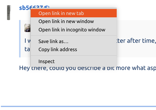
That’s a legitimate point regarding lack of intuitiveness. If this helps this might be a faster way for you by right-clicking on the username (the text, not the avatar):
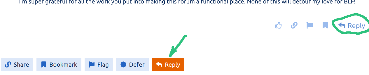
Gotcha. So I’m not trying to defend whether it’s intuitive or not, but if this helps you have a Reply button after each post as well as at the end of the thread:
Also notice that you can reply with a quote just by selecting text (intuitiveness notwithstanding):

Have you tried @ToyKeeper’s themes? They’re available in the theme switcher at the bottom of the left sidebar, specifically designed to address user preferences for more definition between different UI elements.
3 Thanks
TK’s themes are amazing!
I use TK’s Dark Theme, but I think TK’s Light Theme is very similar.
3 Thanks
I also use Toykeeper’s Dark Theme. I think it helps with the visual issues you mention
1 Thank
Thanks SB, I had not seen TKs themes before. That definitely helps. Having some color contrast, and the boxes drawn around things like the the button set (like, link, etc).
I had seen the reply button at the corner of each post, but I guess I assumed that was for quoting the post.
EDIT: Also this means I don’t know how to quote people and 6 minutes of looking didn’t solve that. I think maybe posting on forums has gotten out of my league ![]()
3 Thanks