The width appears to differ by four or more text characters, depending on the width of the character. The left window (editor) is not as wide as the right. (preview)
It’s enough so that when a full paragraph is typed, sometimes a single word is not on the same line in either window. The longer the paragraph, the more times this will happen, which is to say that the error is cumulative. I tried your theme and the default theme and the results were similar.
Yes, the updates aren’t on the server yet. I just uploaded the update to Github like an hour ago, and I don’t know when sb will have time to apply it.
When I looked at the details though, I found a few things which contributed to uneven-ness:
- The editor’s internal padding was bigger than the preview’s padding. So I fixed that.
- The editor’s button bar eats into the text area space. So I reduced the button height a bit and made it less prone to wrapping (multiple rows of buttons).
- The “flex” layout tried to position the left edge of the preview at exactly the center, meaning the gap between was subtracted from the editor’s width. This isn’t really fixable properly, but I did 2 things to improve it:
- Changed the flex weight, making the left window 1% “heavier”. This gets it closer to true center, but the placement varies with browser size.
- Reduced the gap, to make it eat less of the editor’s space.
To explain it a different way, the browser’s “flex” layout engine can put an arbitrary amount of items into columns. Assuming the flex weights are the same, each item is given the same amount of space. That space is used for the item itself plus the gap before the next item. So they all end up the same size… except for the final item, which has no gap on the right side.
column a |
column b |
column c |
column d |
|---|---|---|---|
| a | gap | b | gap | c | gap | d |
In this example, a/b/c are the same size but d is wider… because a/b/c all have a gap subtracted from the space available to their content, while d can use its full area. But in the case of the editor, it has only 2 columns so the pattern is less obvious.
It seems to just be a weird quirk of how “flex” layouts work.
Even without that though, the editor and preview cannot be made to match exactly. The editor contains source code, while the preview is a rendered interpretation of that code… and the whole point of that duality is that they are different.
2 Thanks
Excellent explanation, thanks TK. I wonder if the browser’s zoom level and/or DPI setting are also affecting what Hoop describes?
The difference between left and right columns scales with zoom level and window size, because the browser’s internal formula is a certain number of pixels multiplied by zoom level plus some percentage of the viewport (browser) width. I picked coefficients which keep the difference relatively small under a variety of different browser settings, but it’s still not great.
I think I may have just found a better solution though… and I updated the repository again with something more reliable. It uses the calc() function to run a formula which uses mixed units to figure out the right sizes. So the zoom-related parts scale with zoom, the viewport-related parts scale with the viewport, and it seems to keep the two widgets more reliably the same size.
It’ll still be a bit off sometimes, when the content of the two widgets are inherently different sizes, or when there are scrollbars present. Like, if you put 2 spaces after a sentence in the editor, it shows up as just 1 in the preview, which can throw off the spacing. Regardless, the balance is a lot closer than it was before.
SB,
I set my preferences to track threads immediately, instead of the default 5 minutes. That explains the inconsistency I was seeing.
1 Thank
Thanks @Sk9 for confirming that, glad you figured it out.
So in summary:
- Latest topics (threads) are sorted by latest posts, just like in the old forum.
- It will show the Unread tab when there are new posts in the threads that you have set as “Tracking” or “Watching”.
- It will show a yellow dot next to New threads that you haven’t seen yet, and these will appear in the New tab.
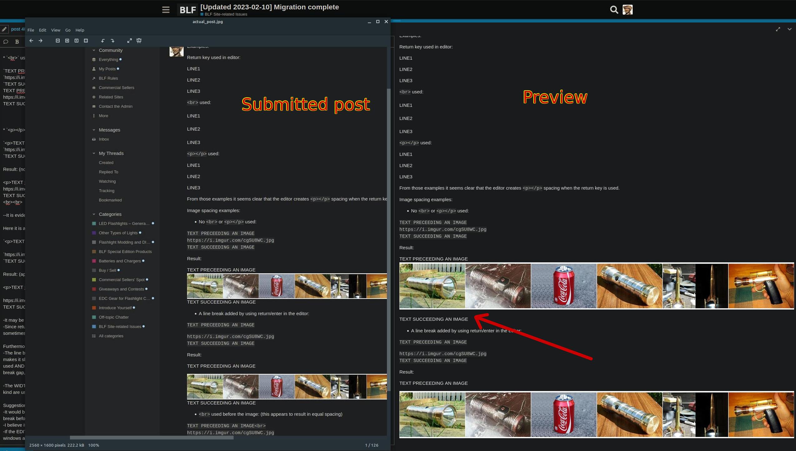
Here is an illustration showing a possible bug in the preview pane, where the preview shows a gap after an image which should not be there, and in the final post, is not present. This contributes quite a bit to the vertical misalignment between the edit and preview panels, and makes it harder to format a post to achieve a certain appearance since the end result differs from the preview.
Well, I’m back again. Bought myself a new laptop, because my Win-XP steam powered PC couldn’t cope with the new BLF. No more need using the computer of my better half. My youngest sister said she was very glad there was a decisive incentive that caused me to stop struggling on with my old equipment.
1 Thank
Hey there @Henk4U2 , really appreciate you making an effort to stay with us!
Good lord, never use an operating system that’s not receiving security updates anymore on the InterNet. Your machine probably was infected by … everything. ![]()
2 Thanks
No. Not ever. I think the reason I never had trouble with malware is that malware also evolves, and my old laptop stopped coping with new HTML and scripts a long time ago. Maybe computers are like people. If you skip your health checks long enough, bad boys gradually lose all interest (just kidding).
I also never used a virus scanner on this one. Why? They took so much resources regular programs just stopped working. But I ran CCleaner at the end of every working day. To get rid of electronic lint.
Thanks SB, really appreciate it. I plan & hope to become more active again, with new flashlight & lantern projects. ![]()
2 Thanks
Nice!!! Thanks a lot for saying so. We’re happy to have you here.
1 Thank
I think I found a bug. I haven’t been able to reproduce the bug though; it only happened once, and now it seems … stuck.
I bookmarked a PM from Bort, to remind me to respond. Then I responded, and deleted the bookmark. A day or two later, I noticed a weird icon by Bort’s name in comments, but I assumed he just added a unicode symbol or something. Didn’t really pay it much attention, and I don’t know when it started.
Now that I’m looking at it more closely though, it’s not part of his name… it’s a server error. It shows me this if I hover over the icon:
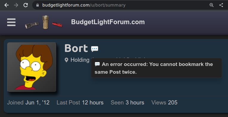
I’ve bookmarked (and unbookmarked) PMs and posts from other people, and didn’t run into any issues. I also tried bookmarking multiple posts in a single thread, both public and private, and didn’t get any errors. I even tried re-bookmarking the original post, and then deleting that bookmark again, but it didn’t seem to affect the sticky error.
The error is visible regardless of which client I connect from, so I think it’s a server-side issue.
So, not sure how it happened. Maybe I made (or deleted) the bookmark on an old browser tab with an outdated version of the client javascript, and now I can’t reproduce the issue because I only have current versions. Maybe it’s something else. Not sure. Regardless, I guess something weird got into the database, and Bort now has a speech bubble following him around.
Or maybe it’s not related to me at all. I still see the error when I’m logged out.
Edit: Not an error, I’m just a Discourse noob. The error was inside me all along. ![]()
2 Thanks
Are you sure it’s an error and not a “status message” set by the user?
It’s not just you; I see the same message.
For “fun” I’ve set my status to the same message.
2 Thanks
i asked sb about this earlier:
1 Thank
Thanks. I guess it was just coincidental timing, then… an “error” (er, custom status) about bookmarks showed up right after I tried the bookmark feature for the first time, and it was coincidentally attached to exactly the user whose post had been bookmarked.
In other words, I R noob. ![]()
1 Thank
That is just my current status ![]()
Sorry about that.
I got that error after bookmarking a post but also already having it open in another tab and forgetting i bookmarked it, so i tried to bookmark it again. Its a bit of a gag from another forum i visit, setting statuses or signatures from website/forum error messages.
Like error, failed to verify referrer or you can’t upvote the same post twice and so forth ![]()
It appears to be a feature not included, when new posts are posted a thread autoupdates as does the numbers in the top right avatar, but bookmarks do not.
Time for a new status
3 Thanks
Sorry @Hoop for the slow reply. Thanks a lot for the detailed analysis of your findings.
Right. It just doesn’t create multiple line breaks with multiple <Enter> .
Yes, I would agree there’s no point in keeping <p> for manual edits , they were mainly maintained to prevent run-on lines and paragraphs in the un-edited imported posts.
Test preceding text
https://i.imgur.com/cgSU8WC.jpg
Test succeeding text
Test preceding text
https://i.imgur.com/cgSU8WC.jpg
Test succeeding text
Ok it looks like it does add a <br> . Edit: The final published post does not show a vertical space. This is the HTML code that it generates:
<p>Test preceding text
<br>
<a href="https://i.imgur.com/cgSU8WC.jpg" target="_blank" rel="nofollow ugc noopener" class="onebox" tabindex="-1">
<img src="https://i.imgur.com/cgSU8WC.jpg" loading="lazy">
</a>
<br>
Test succeeding text</p>
This is an interesting point.
This might be worth me applying it to the default BLF Theme too and/or somebody submitting an upstream PR.
Yep, this is an important point. In this aspect of editing web content and also text/word processing in general, there has always been a debate between two paradigms: WYSIWYG (“What You See Is What You Get”) and WYSIWYM (“What You See Is What You Mean”). Usually WYSIWYG is more of an ideal, and in practice it’s quite unpredictable and tends to lead to the user micro-formatting elements that will break if any later change is made. In the old forum, the Advanced Post Editor was supposed to be WYSIWYG, but even there the final published post could look significantly different from what the preview showed. So what Discourse uses here is WYSIWYM, because instead of saying “I want this heading to have 18pt bold Verdana font centered” you simply put a # in front of the heading text to say “I mean for this to be a heading”, and then the site defines how headings are supposed to look. I understand that there are strong user preferences for both editor paradigms. But generally WYSIWYM is preferable for composing large amounts of text, because it favors content over presentation and lets the author concentrate more on the actual information instead of tweaking individual aspects of the formatting that will later get out of whack if the document changes.
1 Thank
This post is dated september 13 2021 in the middle of August 2021 posts ![]()