Thanks, ToyKeeper!
The themes make the forum at least a bit less cluttered and confusing.
Would like a non-blue, maybe orange version as well.
Is there a way to change the blue to a dark orange?
With that amnipresent blue LEDs and blue screen themes, I got a bit allergic against blue. Anyway, the new themes are way better than the original and I vote to set the light one as default for new visitors and the ones who have not chsen a default theme yet.
Thanks to everyone who is contributing ideas and work towards the new themes!
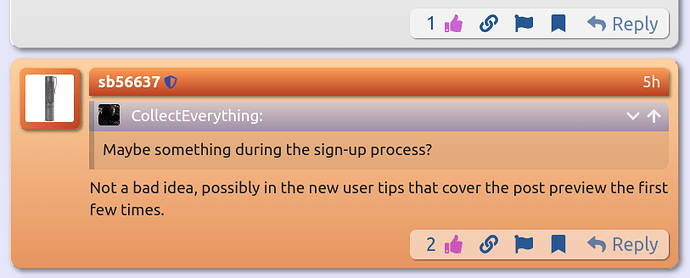
Is there any way for @sb56637 to highlight the theme options for new users? Maybe something during the sign-up process?
Not a bad idea, possibly in the new user tips that cover the post preview the first few times.
‘New user tips’. Is there a thread or is this just something that new users see when posting something new. As usual, Im confused. Ive been making a list of things I cant find or dont understand on the new site although I prefer to discover things on my own … it makes it easier for me to remember them.
Fwiw … really like the work done by everyone on the alternate themes. Thanks
Interesting. I’ve never heard of that before. I haven’t spent much time with any Red Hat GUIs.
I was hoping this sort of thing would be feasible. The idea was to make a single CSS theme which could have many different color palettes plugged in so people could choose from several nice color sets.
In addition to “BLF Light” and “BLF Dark”, I figured there would probably be…
- flat light (TBD)
- flat dark (TBD)
- flat grey (LuxWad’s ko-Z theme)
- 3D light (my light theme)
- 3D dark (my dark theme)
… plus any others people contributed. Orange, for example.
But I’m not sure that’s going to happen. It mostly depends on how many themes sb is willing to put up with. ![]()
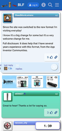
I was also wondering if sb wanted his posts to be orange instead of green, since he used orange as one of the widget colors in the themes here. I didn’t know what color he’d like, so I picked green somewhat at random.
It works pretty well on desktop, but still has a few bugs for mobile users. For example, the “topic map” at the bottom of the first post spills offscreen on mobile. I should have it fixed soon, but there may be other little issues too, which aren’t present in the upstream themes.
Users can switch between mobile and desktop on a phone though… click the hamburger menu, then click the screen icon in the bottom right.
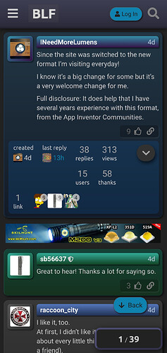
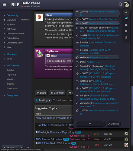
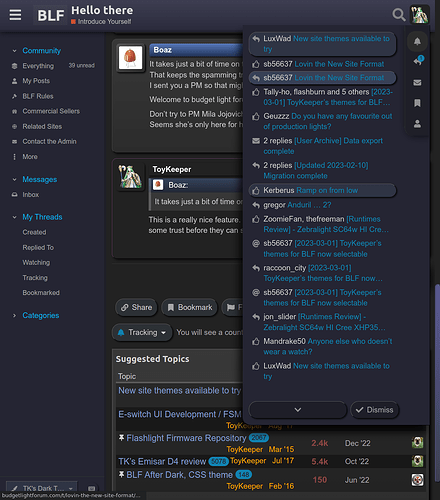
Here’s how it looks after enabling desktop mode and switching to the dark theme:
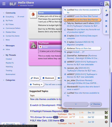
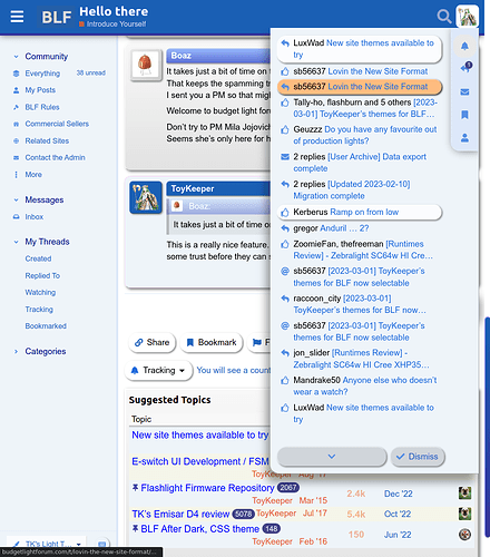
If it helps, I took some screenshots which can be flipped back and forth between to see differences easily.
The changes I think would help are:
Both themes:
- Copy
--post-me-top,--post-me-bot, and--post-me-hlcolors from the--post-def(default) flavors, to make the background consistent with other posts.
Light theme:
- Probably set a darker page background, to leave some headroom for elements to look brighter. I.e. so white elements (like buttons) look white instead of clear. This is in
--secondary: #e6e6fa;in my version of the theme. - Instead of alternating blue and yellow table rows, I set them to clear and translucent white. The definitions I used were:
--table-even-row-bg: #ffffffd0; --table-odd-row-bg: #00000000;
Dark theme:
- It looks like
--post-me-bar-topand--post-me-bar-botaren’t set yet, so they’re transparent. - Maybe set
--quaternary: #ca4b92;?
These are, of course, entirely up to you though.
I have some other things fixed in the base theme too, but to avoid wasting your time, I’ll wait until I have a bigger batch ready.
Hey there @ToyKeeper , sorry it took me so long. But if I understood correctly I think I implemented all of these suggestions, and I also applied the latest version (as of 44 minutes ago) of your style.css too.
To my eye it’s looking great, thanks a lot for your hard work!
Thanks for this awesome work!
Thanks!
I see a couple small things to fix on mobile, but things otherwise seem good. I’ll get those in a later update.
Did you have any thoughts about what color you want your posts to be? I picked green somewhat at random, but I got the impression you might like orange, so I tried that as an experiment too. Here are the orange colors I used in light mode:
    --post-admin-top: #fcd1a2;
    --post-admin-bot: #e6955f;
    --post-admin-hl: #fec998;
    --post-admin-bar-top: #fc9f57;
    --post-admin-bar-bot: #b93f21;
Dark mode is a bit harder here, since “dark orange” tends to look brown-ish. Here’s what I got when I took a stab at it:
    --post-admin-top: #5d3301;
    --post-admin-bot: #471c02;
    --post-admin-hl: #594721;
    --post-admin-bar-top: #b5692e;
    --post-admin-bar-bot: #521e11;
Great, thanks TK. Green works for me, thanks for asking, I could probably set it to a lighter minty green in the light theme. Also I kind of liked the distinct --post-me-* colors for normal users, so maybe I’ll set those again to something unique.
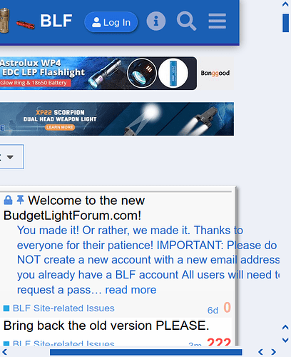
The mobile mode works surprisingly well overall. You probably already noticed the overflowing text of the pinned post:
I did find a stranger error on a real mobile device, Android tablet with a custom ROM running Firefox, for some reason with these tweaks the AJAX loader thingy doesn’t appear in the topic listings, and it won’t load any additional topics. This only happens when I switch it to the mobile mode while using the “TK” theme, it does work in desktop mode with Firefox mobile, which is still the Discourse default for tablet screen sizes. And this bug doesn’t happen with Chromium-based browsers on my tablet.
I also tweaked the progress slider text color when it’s in space-saving mode for small screens, the black-on-blue was a bit hard to read when the thread was scrolled toward the bottom and the progress was mostly full. Not sure if my current choice is any better, but it might be good to use your own variable here instead of the Discourse color variable:
#topic-progress {
...
    color: orange;
...
Yup, it was the first thing I noticed. Topic list excerpt overflow.
There’s also a very similar (but smaller) overflow in poll results, probably for the same type of reason. (parent theme set a fixed width, assuming the element would be in a specific location, but the location and/or padding or margin changed, so it no longer fits)
It also looks like, when I reduced the left/right page edge margin, only the left side worked. So there’s still a gap on the right side of posts in mobile.
Mostly, I’m happy that the selectors I used for ?mobile_view=1 mode also work on actual mobile devices. I wasn’t sure if that would work.
Yeah. I used a lighter color there, so black was easier to read. Yours is darker, so black doesn’t work as well.
Ditching the primary/secondary colors would definitely make it easier to fit into the theme. There are a few places like that, where I didn’t feel like adding yet another variable, since the parent schema seemed okay enough. But I should probably abandon the parent schema entirely, to avoid issues like this.
I think it’s useful for users to see their own posts in a distinct color. On a forum which is almost entirely guys though, I don’t expect that the pink or purple colors I used are very popular. ![]()
Lol, I found the culprit:
/* topic-list.scss:491 */
.topic-list .topic-excerpt {
    width: 120%;
}
I have no idea why the upstream theme did that. ![]()
Anyway, it’s fixed now… along with a couple other things.
Working great! My weird bug on Firefox mobile with the topics list loader is fixed now too.
For the narrow-mode progress slider I changed it to color: var(--progress-text-color); with an according variable in the color definitions part.
The only little issue I see now is the advanced search area, which overflows to the right in mobile mode. But I’m not too worried about it, it doesn’t look good on narrow screens/windows even on Discourse Meta with the vanilla theme where the search button gets justified to the right with no border.
Oh and BTW, a very nice tweak to the default BLF Theme as well, 100% courtesy of @ToyKeeper :
/* topic list table cells, make tables more compact */
.topic-list .topic-list-data {
    /* remove the crazy amount of padding in parent theme */
    padding: 2px 0 0 5px !important;
}i normally prefer compact design. and yet the default BLF Theme now feels a bit too dense, lacking visual separation between topics. can you add back just a bit of padding to the top or bottom of topics on the homepage/latest? it’s good to have options. so one theme should have “breathing room” between topics. otoh, if you can add zebra striping it might be ok as-is. (viewed on firefox/ipad.)
From another thread:
If you like compact design and want zebra striping and more visual separation, you might like the “TK’s” themes. They’re compact, striped, and full of visual separation between elements.
thanks for the suggestion, and for the work to give us options! i’d still advocate for at least one less visually dense theme for those who need/prefer it.
it looks like @sb56637 is experimenting with stripes and padding in the default theme right now….
Yeah. My stripes keep changing colors. ![]()
I wonder if I should see a doctor about that.
