Yup, it was the first thing I noticed. Topic list excerpt overflow.
There’s also a very similar (but smaller) overflow in poll results, probably for the same type of reason. (parent theme set a fixed width, assuming the element would be in a specific location, but the location and/or padding or margin changed, so it no longer fits)
It also looks like, when I reduced the left/right page edge margin, only the left side worked. So there’s still a gap on the right side of posts in mobile.
Mostly, I’m happy that the selectors I used for ?mobile_view=1 mode also work on actual mobile devices. I wasn’t sure if that would work.
Yeah. I used a lighter color there, so black was easier to read. Yours is darker, so black doesn’t work as well.
Ditching the primary/secondary colors would definitely make it easier to fit into the theme. There are a few places like that, where I didn’t feel like adding yet another variable, since the parent schema seemed okay enough. But I should probably abandon the parent schema entirely, to avoid issues like this.
I think it’s useful for users to see their own posts in a distinct color. On a forum which is almost entirely guys though, I don’t expect that the pink or purple colors I used are very popular.
Working great! My weird bug on Firefox mobile with the topics list loader is fixed now too.
For the narrow-mode progress slider I changed it to color: var(--progress-text-color); with an according variable in the color definitions part.
The only little issue I see now is the advanced search area, which overflows to the right in mobile mode. But I’m not too worried about it, it doesn’t look good on narrow screens/windows even on Discourse Meta with the vanilla theme where the search button gets justified to the right with no border.
i normally prefer compact design. and yet the default BLF Theme now feels a bit too dense, lacking visual separation between topics. can you add back just a bit of padding to the top or bottom of topics on the homepage/latest? it’s good to have options. so one theme should have “breathing room” between topics. otoh, if you can add zebra striping it might be ok as-is. (viewed on firefox/ipad.)
If you like compact design and want zebra striping and more visual separation, you might like the “TK’s” themes. They’re compact, striped, and full of visual separation between elements.
thanks for the suggestion, and for the work to give us options! i’d still advocate for at least one less visually dense theme for those who need/prefer it.
it looks like @sb56637 is experimenting with stripes and padding in the default theme right now….
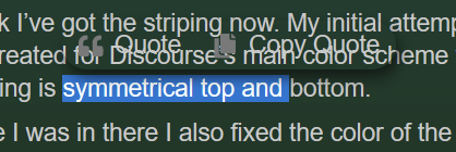
I think I’ve got the striping now. My initial attempt a week or two ago failed because I used absolute values and forgot about the dark theme. But now I found some of the variants that get created for Discourse’s main color scheme variables that seem to work good with both the dark and the light theme for striping. Also added 2px of padding at the bottom so the padding is symmetrical top and bottom.
While I was in there I also fixed the color of the review tag in topic lists with the dark theme.
Hi @sb56637 and @ToyKeeper - I just noticed this gap on the side and that blue bar thing on the right. Is the gap and the blue thing supposed to be there? Is there any way to extend the text column all the way to the right?
@ToyKeeper Sorry for the hassle. As soon as it’s practical to switch branches I’ll migrate to a slower moving Discourse release channel to reduce the frequency of these snafus.
As a quick fix I commented out the customizations to .d-toc-main . I tried to use the .d-toc-main:empty selector but I couldn’t seem to make it work.
Also the --topic-body-width for some reason is not being obeyed, that’s a global problem and not specific to your customizations.
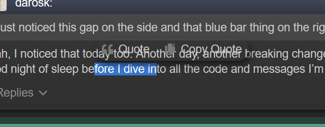
Yeah, I noticed that today too. Another day, another breaking change in the upstream Discourse markup or stylesheets. I’ll try to get to it soon… but for today, I’m le tired and need a good night of sleep before I dive into all the code and messages I’m behind on.
@sb56637@ToyKeeper I have recently noticed a bug with the TK-dark theme, the popup for selected text is transparent. Makes it hard to quote text, especially if there is more text above it.