We have no way to line up wht ebody tube or the head with the switch, so the only place that we can make sure it is always lined up in the area below the switch. This is the planned location for first logo with another one on the tailcap with the CE/rohs logos.
Why does it need to be lined up? It’s just a logo.
Almost every other flashlight has the logo somewhere on the body tube, regardless of it lining up with anything.

The “giggles” was on the body tube too.
logo definitely needs a smiley
Updated versions, font as in Q8 logo, some improvements…


2 versions, one with larger bunny symbol.
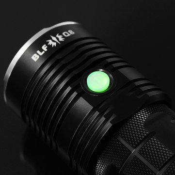
Q8 logo (version E) for comparison.
Now i’m going to sleep, it’s 4:31 AM here…
nvanlaar wrote: I like this. Create consistent BLF logo/branding that goes on all BLF custom lights. I like the Q8 logo.
Agree
Uh, there is no need for a vote, ‘giggles’ was just a joke and is not going on the final light, stop taking it so seriously…giggle a little ![]()
Either of these with GT in the ZozzV6/DEL font. Also leave the battery tube with no flats, would look much more professional and less commercial. As for Giggles, absolutely not, would never own anything with giggles written on it. OP was not joking when he made it a choice, there was discussion about it in the GT thread by some members. Giggles just seems a little childish to me and not something a man should carry around.
It is perfect! +1 votes for this design. :+1:
If I’m honest I don’t really love that logo.
Looks great but it looks like that the bunny is the logo of ‘BLF’.
We know that it’s the logo of lumintop but other doesn’t know that.
Also I think lumintop’s name has to be on the light, they where crazy enough to work with us on this project.
They are even selling the first 555 at a very low price so they definitely deserve to be named on this light.
That’s why I like your earlier logo with the bunny on the left of the text.
I had proposed that to the team via the mail yesterday, just before you had put it in the thread :D.
Either lumintop or BLF GT on top, both the same color and ‘BLF GT’ sized so they are the same length.
Also, it might be a big ass light but there is limited room on the tailcap due it’s design.
There is only 28mm in diameter room to put some text or a logo on there.
Good grief, talk about having a masculinity crisis. It’s a bloody flashlight, you don’t have to be a man or a woman to use it.
Any of these designs proposed by Jerommel look great, I’m itching to get my hands on one of these so don’t really care too much which specific one is chosen.
I’ll upload some more today, like the one with bunny on the left, text on the right.
You could try your latest logo (which i really like, since it uses the same lay-out as the Q8) with Lumintop printed above or below your latest logo.
Something like this

Another thing:
The logo on the Q8 itself does not have the frame around, like it has on the image
Just Giggles or BLF GT
No Lumintop branding please.
Quote from the first post of the GT:
BLF GT (Giga Thrower or Giggles Thrower)
…………… Marking/logo
We submitted some LOGO ideas, part of the low price being able was that Lumintop wants their logo on it. We have not seen it but expect just the LT Bunny and name.
Well, they are the manufacturer and they are giving this thing away at the initial prices, I think they deserve to have their name on it.
My vote is for Jerommel’s first design or something similar. http://i66.tinypic.com/4kze60.jpg
Must have missed that somehow, thanks for pointing it out.
[quote=Zulumoose] I think the naming should be left to those responsible for the project, after all, it is their baby. Having said that though, there are far too many serious things in this world, Giggles have their place. [/quote] +1
I was about to point this out. I still maintain that consistent BLF branding should be adopted and I like the Q8 logo. The way this group is pumping out customs, why not? (Not that my opinion counts for anything).
Edit: I am OK with the Lumintop logo on it somewhere just not as a pert of the BLF logo. They are building the darn thing and they deserve some recognition for that. (Again, not that my opinion counts for anything)
Ah… :person_facepalming:
I’ll make one without also then…
New:

Used the Q8 font again, but i’m not a huge fan of that font.