Can anyone recommend a different flashlight forum ?
One where it is easy to read, navigate , understand ? sort of like the old BLM forum
3 Thanks
Eh, give it some time. The change is jarring at first, but it really is a pretty decent forum platform, and sb is making it better by the day. It’ll just take some time to learn where things are now, and how it works.
19 Thanks
I am not a fan of this new format either but i ain’t leaving over it.
I do hope we can fix it though and SB is busy working on things.
2 Thanks
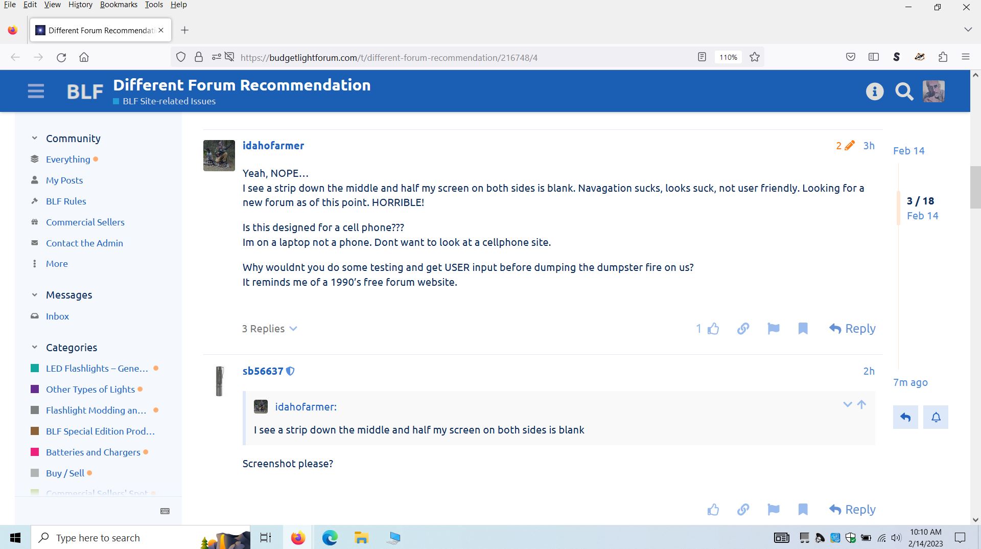
Yeah, NOPE…
I see a strip down the middle and half my screen on both sides is blank. Navagation sucks, looks suck, not user friendly. Looking for a new forum as of this point. HORRIBLE!
Is this designed for a cell phone???
Im on a laptop not a phone. Dont want to look at a cellphone site.
Why wouldnt you do some testing and get USER input before dumping the dumpster fire on us?
It reminds me of a 1990’s free forum website.
1 Thank
Screenshot please?
There was as much blank on the side before, if not more.
There was a testing site for like 2-3 months before migration.
4 Thanks
deploy the left side menu, for starter.
Why? I still see a strip down the middle of what I WANT TO look at. The actually thread or post.
I dont want to look at the menu on the left. I usually only read ONE category. LED HEADLAMPS
Because I thought you were comparing to the older website, which has the same left menu (since the new one tries to emulate the older one). On a 2700px window, same amount of zoom, 420px of blank on the older website, on the present one 600px, so I was wrong there is more blank now but the difference is pretty small.
1 Thank
While there are a couple other english speaking flashlight forums BLF seems to be - by far - the largest and most active one, so you will be missing out.
I know the switch from a classic forum to Discourse is quite the shock (I was pretty much like “wtf is this?!” when it happened to me a couple months ago on another forum) but I now think that Discourse is actually better, it has so many features (which you will discover over time) that make this a much more modern and pleasant experience - once you get used to it. This will take a couple weeks, though.
4 Thanks
Works perfect on my Note 20 Android.
I assume you’re using Windows and have a 4K monitor? What scaling factor do you have set (Windows settings)?
I can see similar if I set the scaling factor to 100% (whereas my default is 225%). However, at Windows scaling of 100% and a 4K monitor the text is hardly readable.
Either try bumping up the text size (BLF site prefs or zoom factor of your browser) or change Windows scaling factor.
I have a 4K TV, but I have the Windows scaling factor to 200% and my browser set at 125%
It works pretty well.
(I also have the font size set to 16.
Sometimes I have to shrink the font size for certain sites, but not BLF.)
I agree on the fact the screen usage isn’t that optimal on horizontal screen, maybe it could be possible to increase max width of the central section.
The new layout is perfect on mobile.
It was obviously unsettling at first, but that’s more because we are used to bad UI/UX of old forums and website, not because the new layout is bad in itself.
3 Thanks
1 Thank
I have younger siblings who use their phones for everything. The fact is that younger generations see the smartphone as the default computing device. As a result, present and future websites will need to at least be conscious of the smartphone user-base. The alternative is fading into obscurity.
If OP wants this website to fill his entire screen then they could use the zoom feature in their web browser.
I actually didn’t notice the blank space because I do not use my apps in fullscreen. I always have windows in a side-by-side configuration. (or in quadrants, depending on the size of the screen)
3 Thanks
I’m not sure if sb is willing to install more themes, but there are some themes specifically designed to increase the width. You can try them at https://meta.discourse.org/ , and the theme switcher is in the bottom left corner. Try the “Light (full-width)” theme, for example.
It may also be sufficient to just press Ctrl-Plus a couple times to make the browser zoom a bit.
Or people could potentially make their own themes since it’s an open platform. I’ve been tempted to try to port my old “BLF After Dark” theme to the new site, but it’s not really a priority since there’s already a dark theme.
7 Thanks
![]()
![]()
Help smooth the transition, or get out of the way.
2 Thanks