I like white. Pure white. No greenish, bluish, or other ish tint. Just pure white. Neutral or warm white isn't white. I think they are only pleasing to most people because it is familiar.
A few nights ago I looked at a NW(Xeno E03) and CW(Tank E07) beams on a patch of dirt and plants/grass. Because I wanted to really find out if I want NW or CW DQG III AAA. I noticed the NW is really pleasing to my eyes and easier(faster?) to see with. But with the CW I was able to see more small details(contrast?). Color rendition CW gives the real color as what I can see in daylight, the NW makes it yellowish(warmer).
So for me pure white lights, those beams that mimics the sun, are better. But what do I know....
...100 being the color rendering abilities of a black body radiator at a given color temperature. midday sunlight = 100 for CRI, ~6000K for color temp. xenon bulb = 100 for CRI, ~3000K for color temp. both are 100 on CRI, but actual color rendering abilities of sunlight and xenon bulb are very different due to differences in color temp.
say you have a 65 CRI 6000K LED vs 85 CRI 3000K LED; neither will be more natural or accurate strictly speaking. the 3000K emitter has a higher CRI and may be closer to reproducing a 3000K black body radiator than the 6000K emitter is to reproducing a 6000K black body radiator, but if your baseline for accuracy is midday sunlight, then the higher CRI of the 3000K emitter doesn't make it any more accurate because its color temp is way off the baseline.
it really depends on your point of reference, and ultimately, your preference.
just like many others here, for LEDs, which generally have CRI between 65 and 85, i like neutral (4000-5000K) for flood and cool white for throw/output. anything less than 4000K can look super orange and anything above 5000K in a flood can make landscape features kind of hard to immediately recognize. if i want throw, i find that cool white offers higher contrast on landmark type objects and so serves that function better.
For throwers, I can see two situations where each tint is probably suited better.
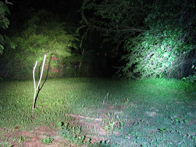
As others have stated CW is probably better in more open areas, (open field, sparse trees) where something that is out of place or has higher contrast is easily identified by the higher beam intensity of the CW. I think this is probably because 75% of what your looking at will have a very tight color range to begin with and its easy to identify the outlier.
In a heavier wooded situation where there is a wider color range and more random placement of saplings, trees bushes, etc, I've discovered the cool white made everything look 2D and around the same color and it was very hard to identify things from a distance. They all kind of blended in. I noticed this phenomenon when at a relatives house and we noticed 2 deer on the property and we were looking for the buck just to be sure he wasn't near us and wouldn't charge. It wasn't until 10-15 seconds later that we noticed there were in fact three other deer because they had blended in so well and hadn't been moving. This was 50-60 yards out
So I think for open areas and high contrast item identification in a thrower, cool white is probably better due to its higher intensity but in a wooded area where there are more variations in color and you're trying to be on the lookout for wildlife the neutral white is my choice.
Oh no, now I have to differentiate between having an openfield thrower and wooded thrower in my collection and shop accordingly
What we need is someone to develop a variable tint LED technology so we can turn a dial on our lights to adjust the tint to our preference whenever we want.
In practice not too cool white. I have excellent colour vision (learned the hard way making colour prints for money when that was hard 30 years ago) and can adapt to most things.
In terms of the beams I like, a sort of vanilla ice-cream tint is my personal preference.
In terms of CRI - just use daylight. Seriously - just use daylight.
I can colour match under mercury vapour lights (which are essentially monochromatic) or sodium safelights which are monochromatic but have had an enormous amount of practice and always prefer to use daylight when I can.
I cannot use any light of over 7000K for anything requiring depth perception as I don't have any. HID projectors on my car would be very dangerous as I'd be completely incapable of judging distance.
CRI at that point is irrelevant.
The world essentially looks like a set of cardboard cutouts in blue light.
Cool white is fine but given the choice i would take a neutral as well. I had a Terra Lux Lightstar 80 penlight. It had the high CRI led and it was actually way too warm. It was a sickly yellow/orange color that put me off. I got it because it was supposed to show colors more accuratly but there was so much orange tint, that it made seeing true colors harder than just a cool white would have been. They went too far with the tint on that one.
Don: "I have excellent colour vision (learned the hard way making colour prints for money when that was hard 30 years ago) and can adapt to most things."
Wish I had a quid for every hour I've spent in the darkroom! But I was the exact opposite - lousy colour vision and used to hate colour printing! Became something of a b/w 'expert' by default, and ended up hardly shooting or printing colour at all.
Because of the many months I spent chained to the enlarger (Think wage slave here), I still find B&W pretentious. I can do both and accept that the dynamic range of B&W is way better. And I drank the Ansel Adams Kool-Aid.
I've spent decades in the darkroom - I made my first B&W print 40 years ago. And my first colour print 34 years ago. And have done both for money - at times silly money.
Retouching which I am very bad at - in the days when that involved scalpels on negatives - got paid at 25x the average wage in the 70's. Even when you were very bad at it.
Last did it years before Photoshop appeared.
I have shaky hands - that sort of retouching can be done by anyone with a photo editing program nowadays.
I like neutral. Cool is pretty harsh to my eyes and doesn't give great depth of color outdoors (to my eyes at least). In some cases, warm if even better, especially indoors. When I lost power from a recent storm, I was reaching for my warm Cree XRE over my other, brighter lights simply because it was easier on my eyes.
That comparison is exactly how my new neutrals look. What I'm finding however is that I need white power underneath a car. (did I just say 'white power?') I like neutral at night around the house but when I need lumens, it seems I need CW.
The picture is brteds from his earlier thread about building a neutral p60 xpgr4 4b ? or 5b drop in ..
I'll second foys statement that it's exactly what I see when I go from neutrals to cool whites outside ...Cree even calls these tints outdoor whites . In the woods they are outstanding since they kick up the tans of the tree trunks , the browns of the dirt ,the green of the leaves and I think they also kick up colors in flowers as well like the reds ..you can see it in those pictures too.They make red ,yellow,orange .red,green,brown,tans burst to life ..The only thing the cooler whites do better imho is blues and greys ...
If someone can show me numbers of real colors that cool whites make truly pop , I'll gladly convert .At this point I'm a believer in neutrals ..only thing I'll give ya is .....they look a little dirty on the wall and they look like an incan .
He knows, dorp, he's just getting back at me for suggesting that we change our name to 'Budget Torch Forum'. I still think that has a nice ring to it. Maybe I'll start a poll..
Far be it from me to criticize. but... you missed a great opportunity to have Miami Vice themed signature on this one. I think that Vanilla Ice lives in Florida, however, so I'll give you partial credit. :glasses:

 Wish I had a quid for every hour I've spent in the darkroom! But I was the exact opposite - lousy colour vision and used to hate colour printing! Became something of a b/w 'expert' by default, and ended up hardly shooting or printing colour at all.