Hi everyone. I wanted to share an idea I have been working on regarding runtime graphs and get your feedback.
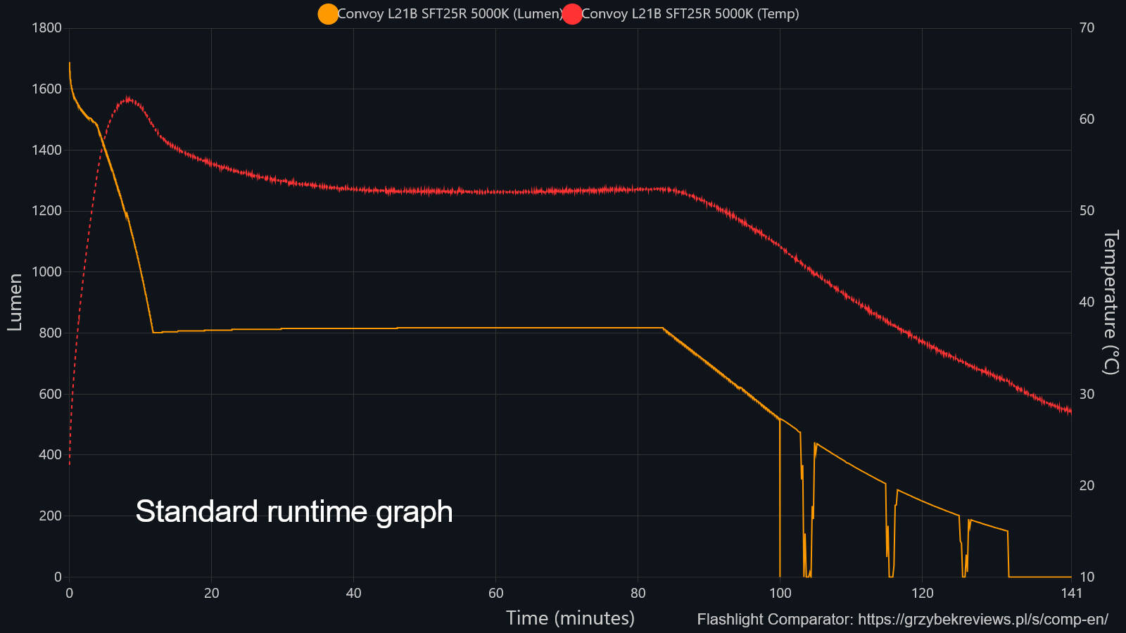
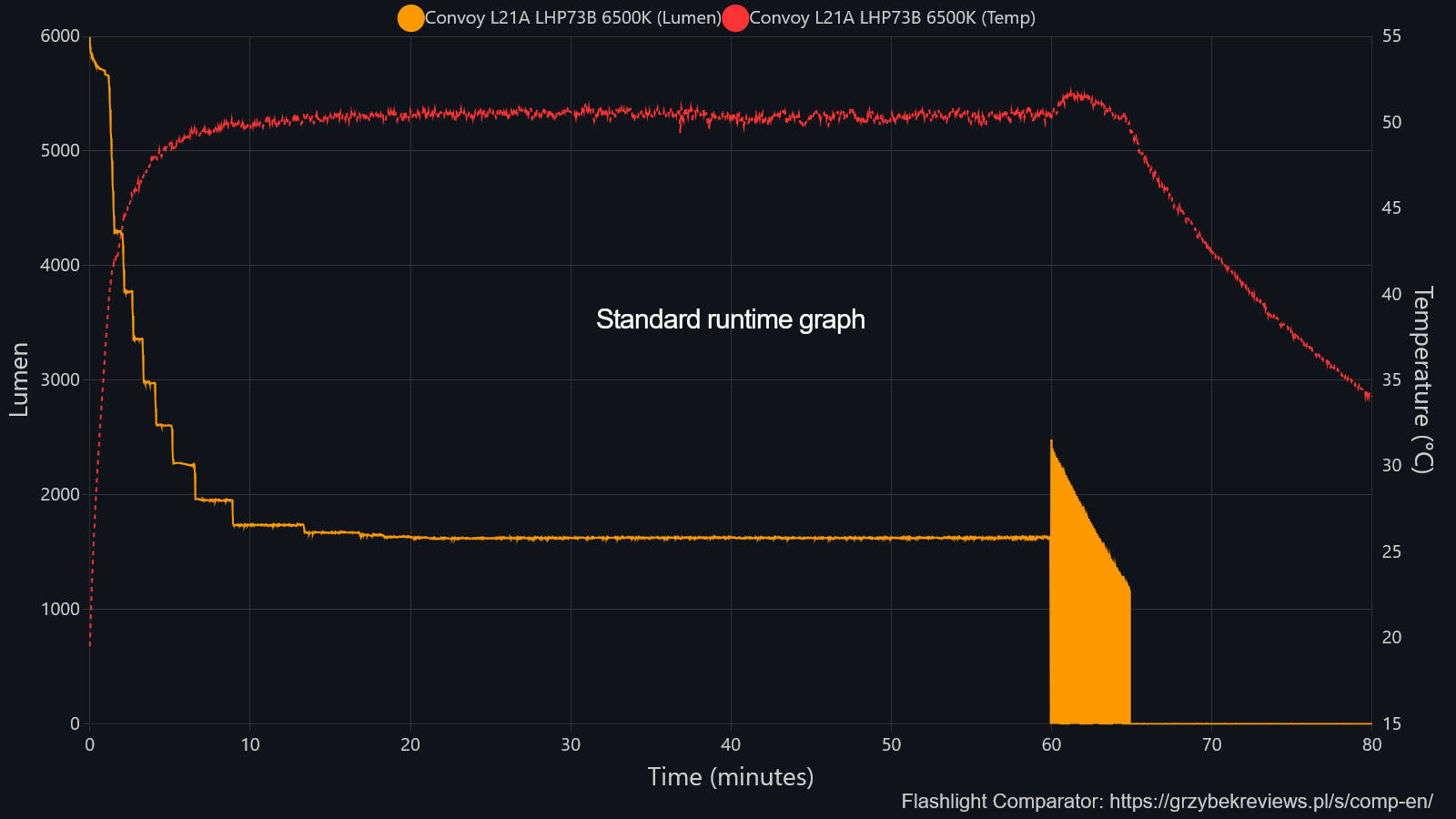
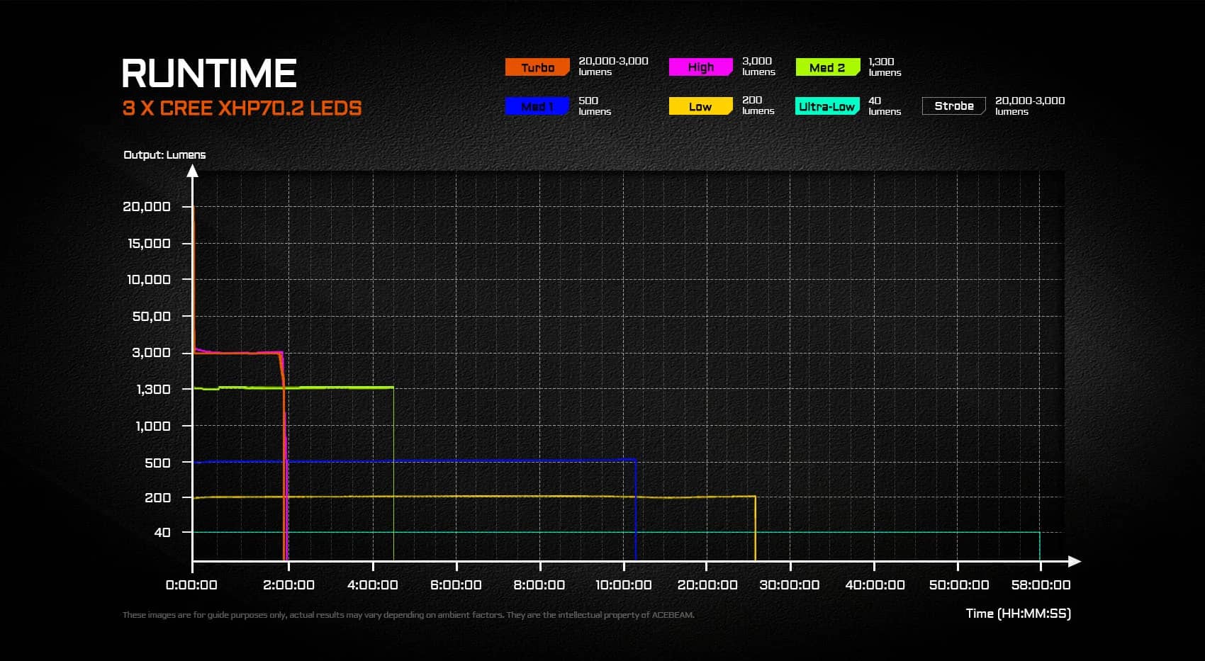
For the past 5 years in this hobby, I have noticed that standard lumen runtime graphs can be visually misleading. The Y axis is plotted in linear lumens. However, human vision does not perceive brightness linearly. To make a light appear twice as bright to our eyes, we actually need four times the lumens.
This means a massive 75 percent drop in measured lumens only looks like a 50 percent drop in brightness in the real world. Because of this, on paper, thermal stepdowns look extremely drastic. In real life out in the dark, they are much less impactful.
The underlying science here relates to Stevens’s power law. It explains how our biological perception of physical stimuli is nonlinear.
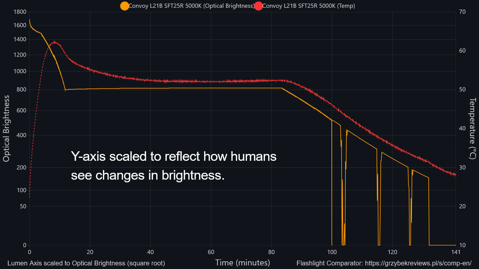
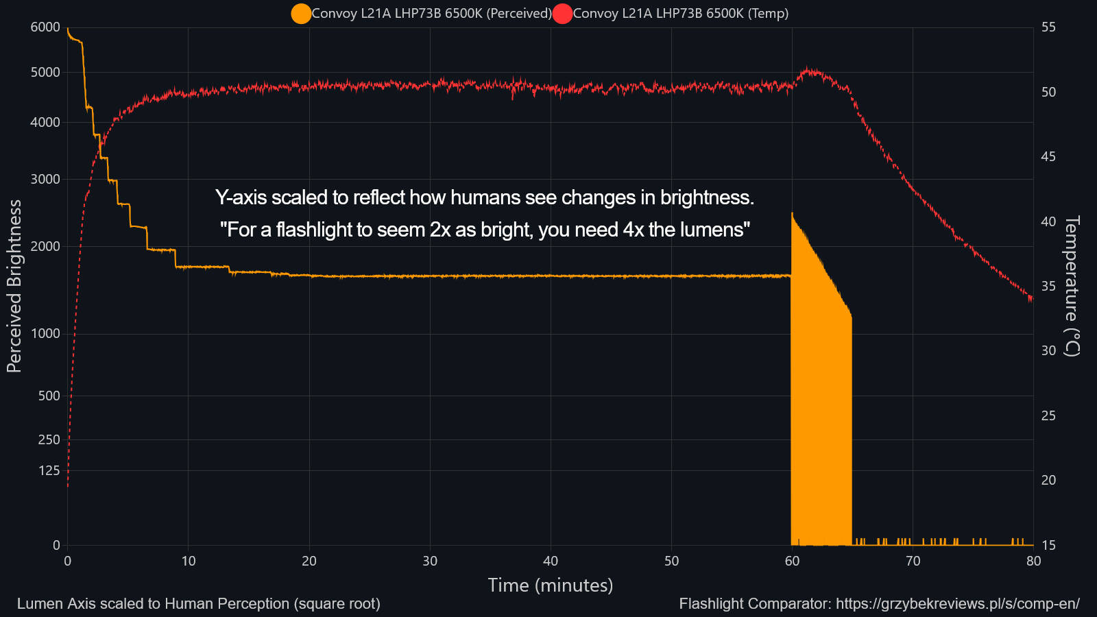
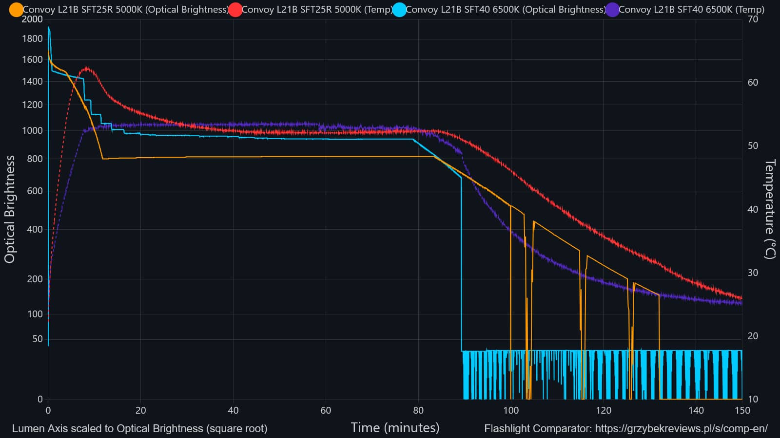
To fix this visual gap, I aim to implement a setting in my graphing tool in my Flashlight Comparator that scales the Y axis to the square root of the lumen values. I am calling it the “Optical scale” (thank you Tom Charde for the suggestion). It plots the lines exactly as our eyes perceive the changes while keeping the standard lumen numbers on the side for easy reading.
I built a custom interactive page where you can test this out yourself with a few different flashlights. You can toggle between the Standard and Optical views to see the difference firsthand.
What do you guys think? Is there any merit in my idea?
I thought of starting to draw runtime graphs in my reviews this way so that people new to the hobby will not get tricked by the visual trait of standard lumen graphs. Technically there should not be any problem comparing this kind of a graph to a standard one because you are still going to look at the numerical values anyway.
Another example:
If it helps any, The Map uses √lm scaling (output index) for the same reason. The practical problem is that it’s an unfamiliar scale, but in your case it shouldn’t matter as the values stay in straight lumens, only the scale gets transformed.
I really like this approach and that’s what I tried first.
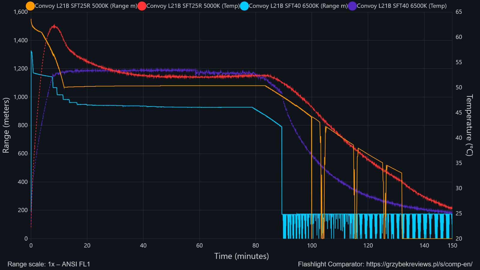
You don’t need to use any weird scaling as the ANSI FL1 throw calculation already corrects for the non-linearlity. Additionally, this sort of a graph shows you how effective the flashlight is at illuminating objects at a certain distance. Meters is a much easier metric to imagine than lumens, too.
Only issue I had was when comparing flashlights of different beam intensities:
Range-time graph:
Of course, there’s good reasons to compare flashlights throw-wise too.
In my comparator I will have an option to generate both either way (although probably close to 1% of people will actually use any of this).
Sorry, went all TLDR for now, but that’s why so many annoying lights would have so many modes bunched up towards the top end, like 50%, 75%, and 100%, when visually there’s fairly little difference.
They do that to double the runtime at 50% with only a fairly small hit in visual brightness.
Which only works if you measure the intensity, exactly the opposite of a light integrating device. Otherwise a 2000lm mule and a 2000lm thrower end up with the same results.
True enough, but for the runtime graph of a single light it should show the relative magnitude of stepdowns wrt time more realistically than straight lumens.
I think this is somewhat oversimplified and meaningless.
If we’re starting with more light than is necessary for a given task then I guess the statement is relevant.
If we’re just scanning the backyard that’s 50m deep looking to see if big foot is running through we can do with less light. If we’re trying to determine if that is him crouching down 10m into the wood line behind the first few trees beyond the backyard then any step down is problematic.
There’s a difference between just casually throwing light down range and actually trying to focus and see things.
I generally like the idea of making the graphs match people’s perception better. I’ve tried to make the ramp steps visually linear, and doing the same to the graphs makes sense. If I make more runtime graphs, and if I remember to, maybe I can scale the axes.
The main question is what exactly to use for the scaling function. I’ve found that x^2 isn’t generally quite right, and usually the exponent should be a bit higher. However, I’ve also found that different exponents work on different lights. I end up adjusting the ramp shape for each light differently… usually somewhere in the range of x^3 to x^5.
So I’ll have to try a few functions on graphs of several lights to see what works.
I like the idea of scaling it by what we can perceive. The range plot is super useful when comparing actual performance of different lights. However, I don’t know if scaling OTF lumens like that is all that meaningful.
The distribution of lumens (lux) affects perceived brightness more than lumens because perceived brightness depends on how much light actually reaches your eye or falls on a specific surface, rather than the total light emitted at the source.
It would be much more meaningful to scale the lumens this way if you were comparing different output levels of the same light, rather than different lights
Lux scaling would be more apt, as theoretically you can “convert” lumens to lux if you know the beam angle. We perceive intensity, not volume. @SammysHP and @Probably already mentioned this, I’m late to the party
When generating ramps, I typically use an exponent of about 3 to 5. Brightness then follows a curve shaped like lumens = (rampLevel/10)^3. But it depends on the specific light and its unique characteristics. I’ve used anything from 2 to 9 before, and sometimes multiple segments with different exponents.
A perception-based scaling is a good option to have, but IMO should not be the default. Even just scaling the axes (without changing the labels) introduces computational issues.
For example, if someone is interested in comparing the efficacy of two lights, they might estimate it off a runtime graph by integrating lumens against time, with unit lm*hr being a measurement of how much light gets squeezed out of the battery. However, the human eye does not perform integration numerically by reading the axes, but by eyeballing the area under the runtime curve.
Normally, the same light should pick up about the same area under the runtime curve regardless of which mode it’s on. Under a square root scaling, the amount of area under the runtime curve does not stay constant, but blows up to infinity as the output approaches 0. For this reason, a low-power FET-driven light can accumulate much more area than a high-power buck/boost light, suggesting the wrong conclusion about efficacy. Such a scaling also visually rewards other problems like premature stepdown.
Additionally, introducing another notion of brightness (other than lumens) obfuscates discussion. When someone says “Light X is twice as bright as light Y”, it’s no longer clear whether they meant 2x the lumens, or 4x.
Weirdness may be an issue, but one can argue that it may better represent how much illumination may be squeezed from a charge, and the areas will work.