Nice job SirJohn. Other than a BLF logo like John made, it has to have:
BudgetLightForum.com
...where Frugal meets with Flashlight!
Nice job SirJohn. Other than a BLF logo like John made, it has to have:
BudgetLightForum.com
...where Frugal meets with Flashlight!
that makes it very long to be used as a logo...
Thanks. I don't really have the skill to do it up right so if people like the concept, someone more skilled than I can flesh it out and clean it up.
I imagine on some stuff, you could put budgetlightforum.com underneath the logo in a small font.
So other than having a cool t-shirt or hat, it should also be able to advertise BLF at the same time. Something like this perhaps.
BudgetLightForum.com
...where Frugal meets with Flashlight!
Okay, here's a couple. I'm no graphic designer :)


nice job weiser!
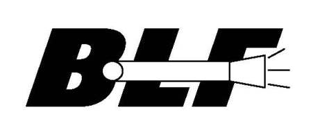
stick guy with a flashlight.


Because making something will hopefully result in something good eventually, this logo might suit CPF better as i see it now :p

+1 love it
BudgetLightForum.com
...where Frugal meets with Flashlight!
Don't exactly know yet what the story behind this picture could be. Could be interpreted in a lot of (wrong) ways i guess :d
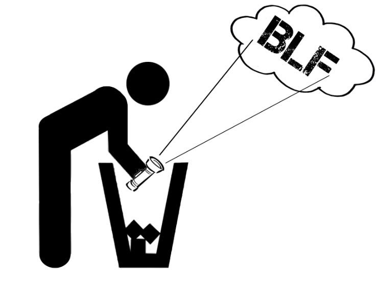
Yes it would! :D
How about just a very large BLF with a very small Budgetlightforum.com underneath?
:)
Not too small so people can still read it without coming within inches of you. :bigsmile:
I can already imagine it on the back of a t-shirt! It will be at least 1/2" to 1" tall under the LARGE blf part!
Well.. there can be two versions of logos:
1) Just an image (i.e. "BLF" in some sort of design). This is like the trademark stamp. An example would be the Ford logo and then they have their tag lines "Built Ford Tough" and such that they can rotate in addition to the logo. But the oval Ford logo (or Chevy, McDonald's, Pepsi, etc) is their stamp they can put on anything. Simple is best.
2) The "BLF" logo (above) with the trademark description added to it.
Alright, here's a more simplified approach:

winning design has to get a tattoo!