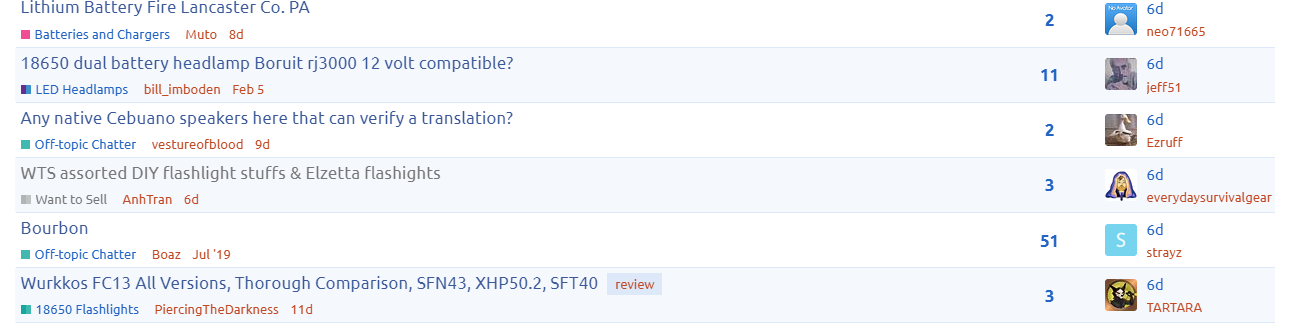
Hi there @Mocarny , with width: 160px or width: 170px it looks like this:
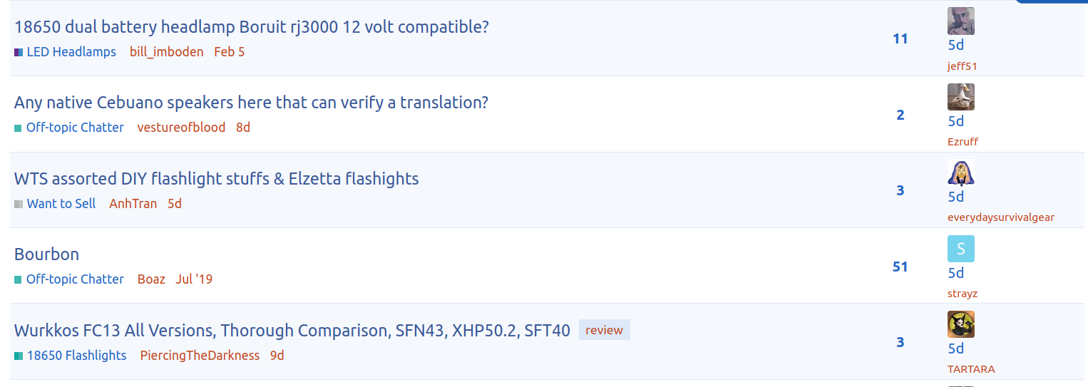
I guess it’s consistent that way with each of the far-right elements on its own line, but not a very good use of vertical space.
Hi there @Mocarny , with width: 160px or width: 170px it looks like this:
I guess it’s consistent that way with each of the far-right elements on its own line, but not a very good use of vertical space.
That’s interesting, thank you…I had no idea that standard even existed.
I can’t stand animations on screen, especially in places like BLF which are kind of informational forums to a large degree. Makes it feel like Myspace or some kiddie site, and I do find it distracting when I’m trying to read comments or a thread that may require a little more concentration vs. scrolling through brief twitter-length causal comments. It’s not as bad as sites that go crazy with animated ads (and thank goodness we aren’t doing that here!).
Very strange, because it works for me.
Please check if everything is set as here:
In file “theme_15.scss”
set
.topic-list .editor {
    overflow: hidden;
    text-overflow: ellipsis;
    max-width: 126px;
And in file “theme_2.scss”
set (it should be in line 85)
.topic-list .topic-list-data.last-post,
.topic-list .topic-list-header .topic-list-data.activity {
  width: 170px;
  .relative-date {
    color: var(--primary-high);
  }
}
Be sure the website is using updated files and if that does not help, then it is really…well…programming-like 
There are several reasons why it might work for one person and not another. The active styles change conditionally depending on window size, zoom settings, and browser types. Elements scale according to pixels, em, rem, viewport size, and parent element size… and these things don’t have constant-ratio relationships to each other. And the upstream theme has things which are arguably bugs, or at least, aren’t very robust or amenable to changes.
Sometimes it can be pretty difficult to figure out which units (or which combination of units) should be used, to work reliably. Sometimes it even requires combining units into a formula.
In this case, it looks like pixels are probably not the right unit. The parent theme may work that way, but that doesn’t mean it’s the best way to do things. It might need a completely different way of specifying (or calculating) the spacing.
Hi again @Mocarny.
Ah, sorry, I was using a single block of code:
.topic-list .editor {
    overflow: hidden;
    text-overflow: ellipsis;
    width: 170px;
    max-width: 126px;
}
I don’t directly edit the .scss files. Rather, the forum has an interface that lets me add blocks of code that override the default JS and/or CSS of the active theme.
Now I understand what happened. You set width to 170px in the wrong class.
If you delete this property from .topic-list .editor (so no width here, only max-width) and leave everything as posted, and then override this class as showed
.topic-list .topic-list-data.last-post,
.topic-list .topic-list-header .topic-list-data.activity {
  width: 170px;
  .relative-date {
    color: var(--primary-high);
  }
}
it should be fine. That was the reason why all names were below avatars, and not next to them.
If it is impossible to override
.topic-list .topic-list-data.last-post,
.topic-list .topic-list-header .topic-list-data.activity
then the easiest way is to set “max-width: 116px;” in .topic-list .editor
.topic-list .editor {
    overflow: hidden;
    text-overflow: ellipsis;
    max-width: 116px;
}
Ahhh! Very nice, that was it. Looks good now! Thanks very much.
@everydaysurvivalgear Look, your name looks even greater than before 
@Mocarny
everydaysurvivalgear single handily breaking website since 2023 lol.

Nice feature to be able to unpin the threads !
You mean to unpin threads that are always on top of everything in different categories?
Yes. Click the pin icon next to the title in a topic list. This should turn the pin upside-down and unpin it so it won’t stay at the top any more. Or I think the site may also unpin topics automatically if you read the whole thing.
That means you can unpin my post in headlamps section 
Hey there Mocarny, the unpinning is only for the user that unpins it, not global.
Yeah especially in the front page… !
@Mocarny and @ToyKeeper
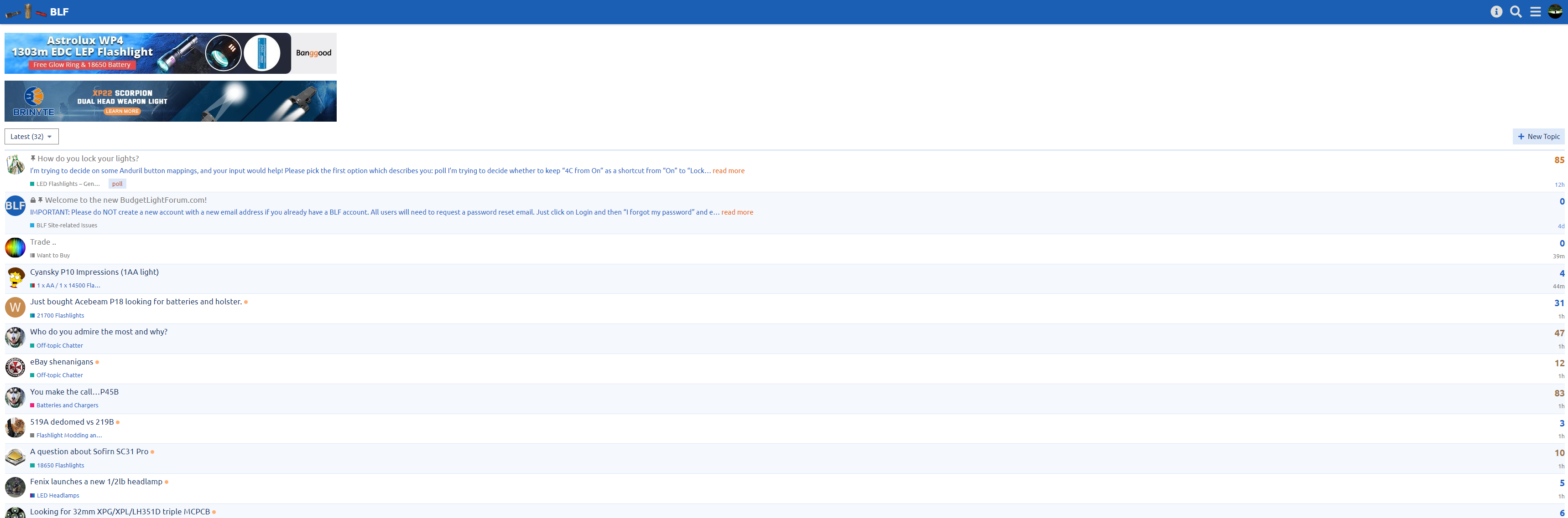
Just if you have a bit of time to troubleshoot, can you think of any way to prevent it from reverting to Discourse’s default width during the time that it takes to load a new chunk of posts with the time slider?
There’s this custom width that I added:
:root {
--d-max-width: 1300px;
}
But there’s also this theme tweak:
I have additional_post_width set to 700px and min_screen_width set to 1260px.
in this file “base.scss”
:root {
    --topic-body-width: 1244px;
set this thing to that value. I don’t guarantee it won’t have any side effects on other parts of the forum, but we can test it 
Hey, very nice! Looks like that worked and it doesn’t seem to have broken anything. Can you confirm that please? Thanks!
Also @ToyKeeper it looks like the same issue can be fixed in your themes by changing
--topic-body-width: 100%;
-to-
--topic-body-width: 1244px;
…which I also applied server-side.
Looks good so far 
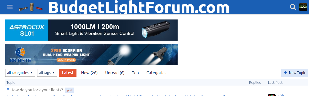
I found something! Most people won’t notice it, but I have an ultrawide monitor, and when on full screen, the title looks like this:
If someone has a Samsung 49" Odyssey, it gets even bigger
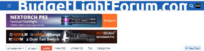
@everydaysurvivalgear you have pretty wide name, maybe you also have the 49" Odyssey? 
You can override “theme_7.scss” like below:
.header-text {
    font-size: xxx-large;
}
@media screen and (max-width: 1000px){
    .header-text {
        font-size: 4vw;
    }
}
Wait what happened with the forum