New site themes available to try

Updates

The themes have been installed on the server since sometime in 2023-Feb.

Screenshots below were an early version. Newer screenshots are scattered throughout the thread, or you could just try the themes yourself. To try them, click the theme chooser at the bottom of the sidebar.

The server’s versions of the themes aren’t identical to mine, but they’re pretty similar. SB changed a few things to suit his taste, especially in the light theme. So if you want my version, or if you want LuxWad’s versions, or if you want to change anything, follow the installation instructions below.

Original post below:


About

I’ve been working on some themes for the new BLF. They’re not quite ready to install on the server yet, but they’re at least ready for people to preview and test.

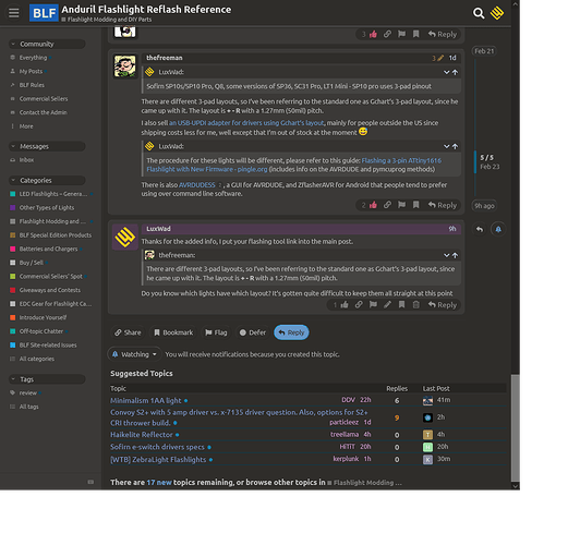
There’s a “TK Dark” and “TK Light” theme, based on the “BLF Dark” and “BLF Light” themes the site provides.

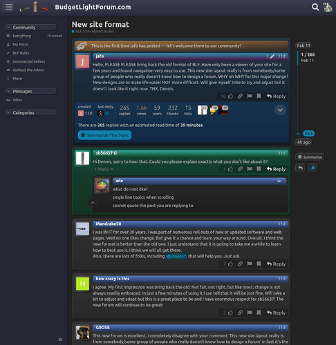
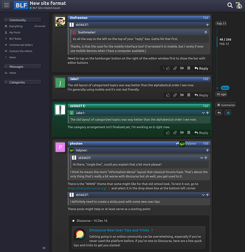
The themes reduce blank space to fit more information onscreen. Also, visual elements are more explicit in their own widgets, instead of being displayed as if they’re printed on a continuous sheet of paper.

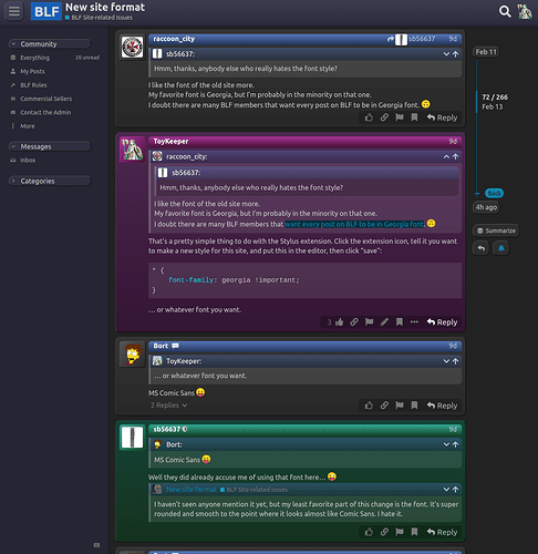
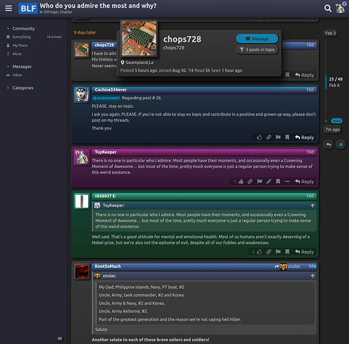
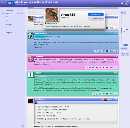
Thread posts come in 4 flavors, to make it easier to tell at a glance which posts are by you, which posts are by the thread author (OP), which are by an admin, and which posts are from everyone else:

  • Your posts: purple
  • OP: blue-ish
  • Admin: green
  • Regular: grey with a blue title

Screenshots: Dark

The dark theme looks like this…


Screenshots: Light

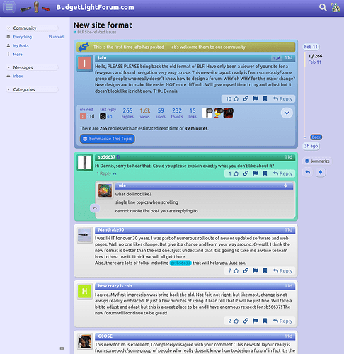
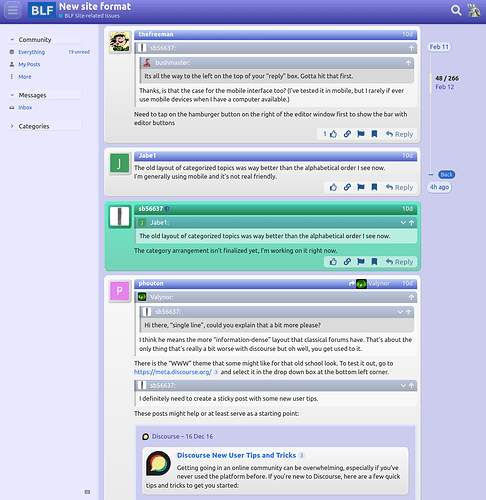
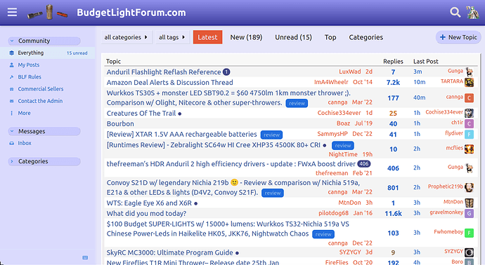
… and the light theme looks like this:


Installing

This requires the “Stylus” browser extension. So it’s desktop-only for now.

  1. Install Stylus, if you don't already have it.
  2. With BLF open, click on the Stylus icon.
  3. Under "Write style for", click "budgetlightforum.com".
  4. Add a theme title, like "BLF TK Base".
  5. Paste in the contents of the matching CSS file linked below. Ideally, do the `style.css` file first, since the others depend on it.
  6. Save.
  7. Repeat for the other files, one per color palette.
  8. Turn on BLF TK Base and one of the color palette files. Turn off the other theme files.

The three theme files are on GitHub.

Helping

The purpose of releasing these theme files here is twofold:

  • Give people early access if they want it.
  • Find the bugs, so the themes can be finished and eventually installed on the server.

So, please let me know if you find problems in these themes.

Also, I haven’t tried it on mobile at all yet, so I expect that to break. At this point, I’m mostly looking for desktop issues, general feedback, and additional color themes. Feel free to change the colors and share your results!
10 Thanks

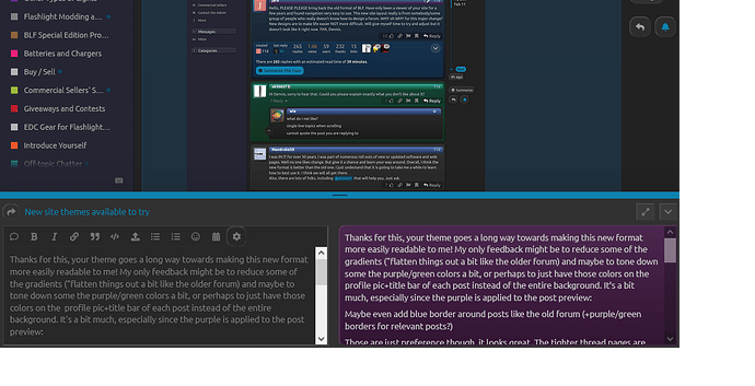
Thanks for this, your theme goes a long way towards making this new format more easily readable to me! My only feedback might be to reduce some of the gradients ("flatten things out a bit like the older forum) and maybe to tone down some the purple/green colors a bit, or perhaps to just have those colors on the profile pic+title bar of each post instead of the entire background. It’s a bit much, especially since the purple is applied to the post preview:

Maybe even add blue border around posts like the old forum (+purple/green borders for relevant posts?)

Those are just preference though, it looks great. The tighter thread pages are especially nice!

2 Thanks

Hey! I resent resemble that remark!

It applies the “current user’s posts” style (--post-me-*) to that, since the current user is the one writing a post. If you change that part of the palette, the editor gets updated too.

Some of the old site’s styling isn’t really possible on the new site, due to structural changes in the markup. Like, making an info bar go across the entire post… I tried, but the new site doesn’t work that way. It would be possible to use plain flat borders, but went for a raised “outset” border instead, to make things look less flat. I also put rounded edges on almost everything, to make it look more like a 2020’s site instead of a 2000’s site. (not always though; round-vs-square corners are used sometimes as subtle cues, like how blockquotes are square on the left and round on the right)

I went through several experiments of trying to make new-site comments look more like the old site… but I didn’t like any of the results. Perhaps someone else will have more success with that.

Anyway, the thread post colors configurable per user type are:

  • container gradient top
  • container gradient bottom
  • container border
  • info bar gradient top
  • info bar gradient bottom

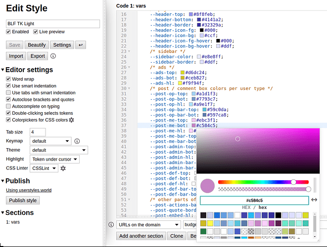
Pull up some of these in the Stylus editor (the light and dark theme files are just color definitions), and try changing the colors to your liking. Post screenshots of what you come up with, along with the CSS for those colors. After a few people do this, @sb56637 can choose the set he likes most. Mine are, as you said… a bit much. For the most part, I went for pretty vivid colors.

Basically, just click a color, choose a new one from the hue/saturation/value widget, and hit Ctrl-S to save. It should apply the colors immediately so you can click, ^S, click, ^S, click, ^S until you’re satisfied with how it looks. It also helps, of course, to have a BLF page open in another window where you can see it.

3 Thanks

I started my computing life on a green monitor, but for whatever reason, have shied away from dark theme options, so I can’t really comment on that in particular.

However, there are elements common to both the light and dark themes that bear comment:

• For my taste, the light theme is overwhelmingly blue, with some grey mixed in.

• In the topic list, separating the subject text from the OP and post date is cleaner and easier to read than SB’s proposal.

• Making the tag into a badge also helps with contrast, but their use should have limits in place, to prevent overload and dilution. Tags for reviews, admin notes, or similar to help them discernible is nice, but only selected tags should receive priority, not every tag.

• In the Last Post column, the poster’s avatar, if retained, should be paired with the name, and not separated by the time elapsed. Given that the topic list is presented based on that time, as well as serving as a quick link to the last post, the column with the sort criteria should be placed at the end, as it is with most forums, which also makes it easier to target without hunting in the middle of the list.

• Within each post, quotes, and especially nested quotes, are going to be a visual mess if each one has its own raised bar gradient so similar to the one that serves to separate each individual post. Add in shading of the quote boxes, and it becomes even harder to discern the different elements, and excessive overall. Each post should avoid the potential to appear like a Matryoshka doll that has to be disassembled to determine what is what. Cues to help distinguish elements are most welcome, but those used to signify each level should be clear, and distinct from each other.

That, to me, is the dichotomy of Discourse’s UX. Some elements are too spare, and barren, like the timeline slider, to provide enough visual clues as to its functionality.

Others like the post content, are overloaded with elements like the Summary box, Please register box, and other clutter, and insufficient distinguishing cues to separate posts from each other, and controls from content.

Responsive design is great, and a necessary part of modern web design, but it seems they built the whole thing on top of a bunch of elements that are adaptable, but don’t come together in a cohesive fashion. I suspect that variability in screen sizes also affects the consistency in the placement of controls, which is not a good thing. Squeeze harder, and stuff gushes out wherever it happens to have room. There should be a balance between flexibility, and structure.

I messed around with it real quick, here’s a slight modification to your theme:

I removed all of the gradients (just by setting top/bottom colors the same) rounded the corners of the buttons at the bottom of the post, and made the colors more subtle. By making every post the same grey color, it’s a bit more readable to me, but the borders have been left alone

Here is another quick variation, this is based on a color scheme I apply to WIN10 and all other programs I use, it’s intended to be very soft on the eyes for prolonged use:

I’ll probably make some more changes and share the CSS if anyone wants it

4 Thanks

Yeah, I don’t generally use light themes and don’t know what’s good for folks on the light side. I went with blue to follow the old site’s theme, and tried to make the individual posts look somewhat like paper. But I’m guessing a true light theme would probably be brighter and less colorful. More on that later.

I didn’t know until just this moment that there was such a thing as selected tags. I’ll have to see if there’s a way to distinguish selected tags from others.

Since I only have CSS to work with, changing the layout ranges from difficult to impossible. I don’t think all of that is possible in a stylesheet. But maybe I can at least get the avatar to stay next to the username? Not sure. It’s marked up to be 2 lines per table cell, and I was only able to reduce it to 1 line by floating elements. Float is great for that, but it also means giving up quite a bit of other controls.

Yeah, nesting gets messy. All I can do is try to visually make the structure clear to the reader. So I made it lighten or darken each nesting level, with a single continuous border shape around the header+content pair to hold them together, and a bit of margin within the parent element.

I haven’t made the quote header theme-able yet though, so I plan to do that today, along with fixing a list of a dozen other issues I noticed since I last uploaded.

In particular, I think I should put this on github, since that might make things easier to coordinate.

2 Thanks

Awesome, those look great! Certainly more disciplined than my palettes. Not everyone wants the forum to look like an explosion in a candy factory. :candy: :boom: :sweat_smile:

Now that sb explained how the theme system works (1 base theme + multiple color palettes), I’m thinking I may want to take a slightly different approach than I originally planned. I think I’ll probably submit a pack with several files…

  • Base theme CSS
  • Themes / palettes…
    • Light (TBD)
    • Dark (based on your 1st theme)
    • Grey (LuxWad Grey?)
    • Sky Candy (my light theme)
    • Night Candy (my dark theme)
    • … maybe others?

Thanks! That would be helpful!

2 Thanks

:laughing:

2 Thanks

Good stuff in here. I’m definitely going to try some of these out later.

1 Thank

More updates…

I put the sources on GitHub. Feel free to clone the repo, fix things, add themes, send patches, etc.

It shouldn’t be necessary any more to set the theme on your user account; just setting it in Stylus is sufficient now. This means it’s much closer to being usable on the server, since it’s not depending as much on the parent theme’s palette.

Since my two themes are probably more colorful than most people want, I renamed them. I’m bad at naming things, but for now, they’re called “Night Candy” and “Sky Candy”. I also hope to include a “Light” theme, “Dark”, and “LuxWad Grey”.

I fixed a bunch of things too, detailed in the git change log. Lots of little details improved.

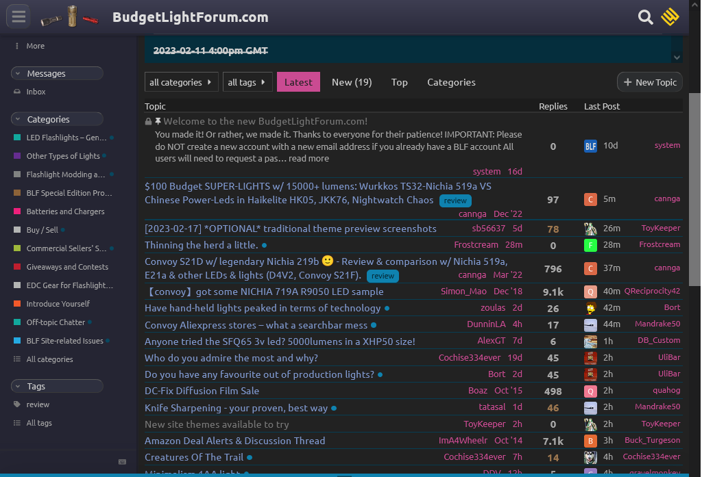
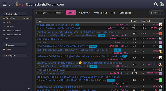
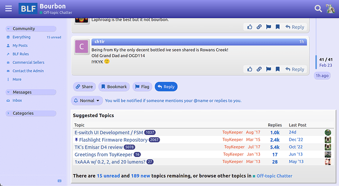
In particular, there are improvements to tables, like the topic list, suggested topics list, private message list, user list, etc. Here are some shots showing the current state of things:


Also, @sb56637, is there any chance of maybe modifying the “BLF” image which appears in the header while scrolled down into a thread? Instead of white on blue, it’d help if that was white on transparent to make it blend into the theme. (or if there’s some other non-rectangular logo, pretty much anything could go there, but “BLF” seems like a good choice)

1 Thank

Ah, sure, I think I can do that. That BLF logo was just a quick screenshot of some text that I tried in the header.

1 Thank

Now we can argue over what font the three letters should be :smiling_imp:

1 Thank

TBH, I’m surprised there hasn’t been more bike-shedding. I figured people would have more to say about the colors. I guess most of the complaints have gone to sb instead, in the complaint threads about the new site.

Regardless, I’m leaving fonts alone. I might override it locally at some point, to switch to something with serifs, but that’s not going into any of these theme files.

1 Thank

Comic Sans, of course! :yum:

4 Thanks

@ToyKeeper @raccoon For some reason I imagined the logo in “Old English Text MT” and the thought of arguing for that struck me as funny :smiley:

To address what you said more directly, I hope the lack of feedback in here isn’t a result of a decrease in traffic hear post-update.

I don’t know if traffic is down, but I hope that making the new site look more like the old site, and more visually appealing in general, will help encourage people to stay. That’s why I’m making themes.

Discourse is really bland by default, and people had some difficulty figuring out how some things worked because there weren’t enough visual cues. So I hope this will help.

However, I have attempted to measure the post rate on BLF, CPF, and /r/flashlight. I don’t have all the data totally up to date, but here’s how it looks with some sources incomplete:

(ignore the weird part at the far left edge… CPF had a database corruption or something in the early 2000s, and it messed up the post IDs so they don’t go in order during that time)

4 Thanks

Here are three different color schemes I put together, they’re still a bit unrefined. There were a few minor additions made to the style.css in order to allow different rounding values to buttons and border widths in the different themes. I am trying to figure out a way to chaneg the hover behaviour for the sidebar but haven’t found something I like.

ko-Z is the soft grey theme, based on the ko-Z Win10 theme by niivu, which is what I’ve been using for years: Windows-10-themes/ko-Z at main · niivu/Windows-10-themes · GitHub (it’s his original design, I’ve been adding to his theme group to cover more programs) - I can change the specific colors to better match BLF if preferred

Flat-dark is just another dark theme with less round edges and fewer gradients. It should probably be renamed though as it’s not that flat.

Reddit is designed to closely mimic the Reddit dark theme, it’s a good base for a modern dark website I think, and maybe could be considered blasphemy.

2 Thanks

Looking good! I look forward to adding these when they’re ready.

… or maybe adding them now, since you have sources online.

I think the cozy grey theme in particular may be popular, since it’s a nice flat medium dark theme, and medium low-contrast themes are sorely lacking in most sites/apps/etc. But yet, they’re by far the easiest on the eyes for long sessions.

Also, given the current state of my themes, I suspect people are going to want some flat alternatives. Mine are very not-flat. :sweat_smile:

1 Thank

I pushed several fixes / changes / improvements to github today too… fixed a bunch of things in the base stylesheet, added some new optional features, and updated both of my themes.

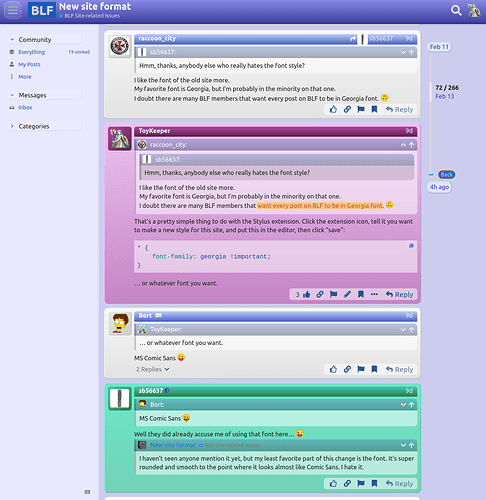
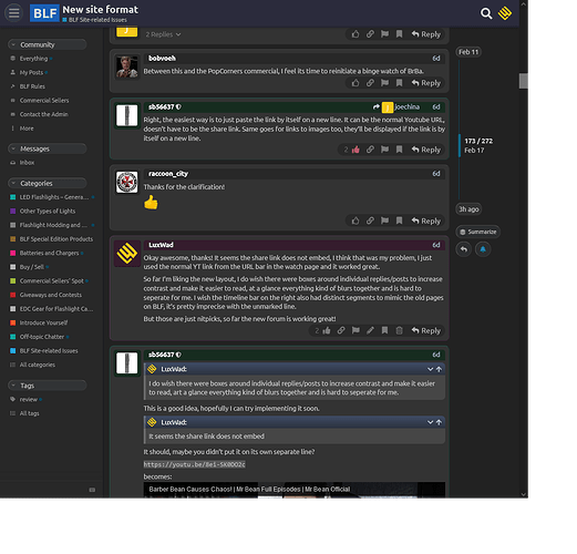
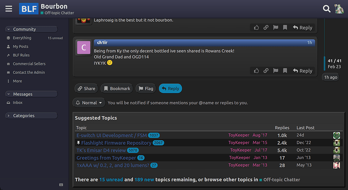
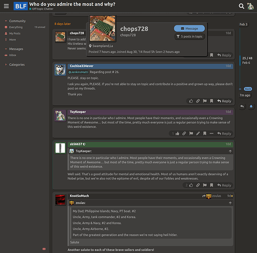
Here’s how things are looking at the moment: (I picked this page because it has all 4 user types right next to each other, so they can all fit in one image)

Click on one then press the left/right keys to compare images directly.


(edit: added LuxWad’s ko-Z theme, which is a really cozy dark brown)

2 Thanks