I like D the best. E second best.
1 Thank
Would you consider a merge between D and E, where the horizontal groves match with the heat sink groves on the head, but the vertical groves follow the bezel? High where the bezel is high, low where the bezel is low
1 Thank
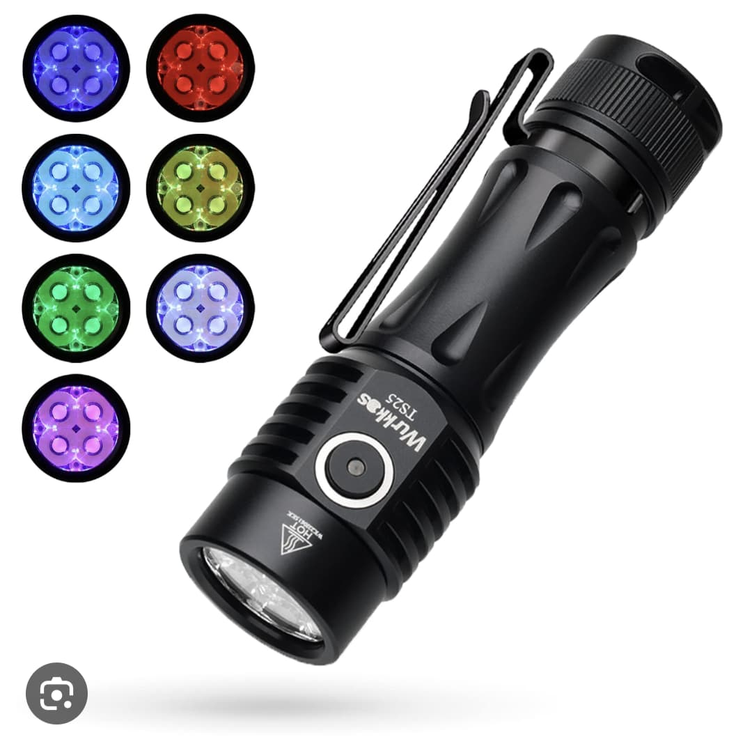
Dont mean to sound negative but they are all ugly. The current TS25 is a wonderful design.
4 Thanks
2 Thanks
The current TS25 design is hideous.
I am glad you are changing it and very glad you’ve included us in the process!
Thanks Terry!
7 Thanks
D for practicality (best grip surface), some of the others would win for styling/ standing out from the crowd (e.g. A, F, G. )
1 Thank
Looks like I’m in the minority, but I actually like C better – no frills, down-to-earth and matches my FC13.
1 Thank
My order of preference:
- A (best)
- G
- F1
- F
- D
- C
- E (with a 1-way clip, not 2-way)
- E1
- B (worst)
I generally prefer to not have sharp edges and corners. Also, I like to be able to clip onto things without damaging the fabric, so vertical details work better for me than horizontal details.
I’d probably make the clip a bit longer or shorter too, to make it easier to fit fabric into the gap when clipping on. With the clip landing just short of a wider section of the host, the opening there is very small.
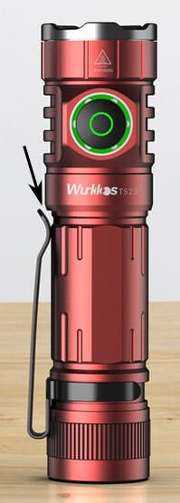
The opening there would be wider if the clip was longer or shorter.
Or, even better, if the clip was at the head end, the light could be carried with the button at the top. This avoids the need to flip the light around after unclipping it.
7 Thanks
Didn’t notice the one-way clips, super glad to see that change. Imo two-way clips only (barely) make sense on very tiny lights (14500, 16350, etc) - for everything else they’re just invitations for the light to snag on something while it’s in your pocket
Def would lengthen or shorten like TK said
2 Thanks
I’d like to vote for the one with a Lume X1 driver ![]()
4 Thanks
I agree completely, horizontal details grind on fabric, so I would also choose A, for the smooth clipping action
The opening there would be wider if the clip was longer or shorter.
also completely agree,
I like shorter clips
1 Thank
I like D for the look and grip but the snag factor came to mind the moment I saw the options.
1 Thank
And they looketh up at Terry Lee and chanted:
Hereth is it decided, by virtue of the holy poll,
We want the D, and the boosteth,
Henceforth it shall be nameth TS26 the Pants Grater,
And all rejoiced in aux illumination.
4 Thanks
i like D. matches better between head and body. but they are all better looking than the current. i think slim waist is best for tail switches for easier grip between fingers.
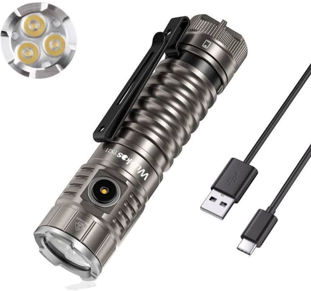
it would be cool if you made the shortest 18650 and 21700 flashlights but pound for pound most powerful. short as in under 90mm. kind of like the ts10 is the shortest 14500.
edit
i wanted to add. in paper printing, there are different coatings for protecting the ink. there is matte, gloss, satin, soft touch and a few others but if you double the coats like soft touch, it makes it extremely matte and soft feeling. very Premium and expensive. can anodizing do that? the coating of the flashlight makes a big difference along side the design
1 Thank
I voted for D or E, but I really like my current TS25 better than any of the proposed new designs. Any particular reason that you feel the need to change it?
3 Thanks
Never could get excited about the looks of the TS25. The body and tail are fine, but the switch and the fins ruin the slenderness. The TS10 carries off the slim theme better, and looks more cohesive as a whole
Of the proposals:
F/F1/G - F might be ok, but in general, I’m not a fan of blank flats like that, which appear like they are awaiting some signing that may never appear. Take a ubiquitous design like a C8, which needs the blank flat for the branding needed to distinguish one example from another. But then there are sellers that are too cheap to put any signing on their examples, so they look generic, unfinished, and missing something.
B - dimples don’t match the theme
E/E1 - too busy, and trying too hard, like the FC13
D - like the look, but the sharp edges make it a bit unpleasant to hold in a bare hand, like the TS22. The Es may also suffer from this.
That would leave A or C my preferences.
But a nice driver would go a long way toward overriding any aesthetic dislikes.
Glad to see a return to simpler, and less bulky clips.
And I like the colors. The unwritten rule that flashlights have to be black, or at least first introduced in black can be broken. If all of them were on the table in front of me, A would be the one I’d probably steal. Don’t forget to make orange an option.
Oh, forgot to mention that I hope it doesn’t have that silly slim charging port opening that won’t accept a lot of cables, because their overmolds are too large to fit into the opening. Especially dumb on a light like the IF30 that has more than enough room to accommodate a larger port, and a battery that is more likely to need to be charged internally.
1 Thank
Really glad to hear it. Good regulation is something i care about a lot. Will you also implement better regulation on the smaller lights?
1 Thank
YEESSSS! The smooth slope would be super nice for pocket carry lol
We are considering adding a regulated driver to it. But if the cost exceeds the expected too much, we will choose to give up. The psychological expectation we can accept is that the cost rises by $3-5 ![]()
3 Thanks
Yep, too high repetition will make it lose TS25-self. Although the old version is not excellent. But the design of the bowling bottle made it looks special ![]()