When the forum was moved to this new site using a different software ? This
Became an unnerving issue for many people I spoke with in private messages. Suddenly you’re freaking out wondering if you are spewing personal information all over the internet instead of privately messaging.
I’ve talked to numbers of members who feel exactly the same way .
Do you have the same concerns and or do you have a suggestion on how to fix the problem ?
Never thought about it. Was the interface much different between topics and PMs on the older forum software ? I dont even remember.
There’s a enveloppe icon before the title of the discussion in PMs, it’s ample enough for me.
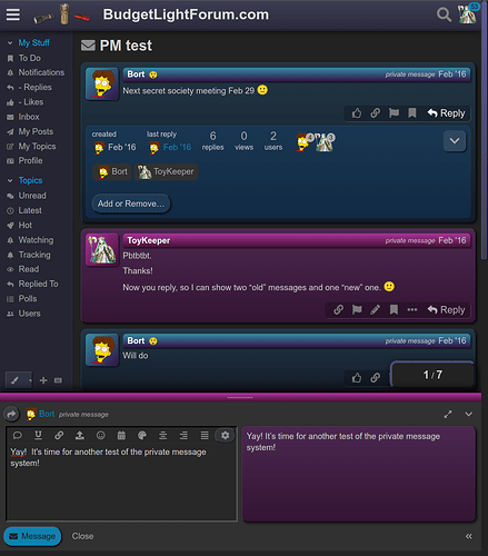
Hi there, there are indeed quite a few visual cues to differentiate a PM thread from a normal thread:


Right, the " ![]() Message" button below the text box shows quite clearly one is typing a message and not a public reply.
Message" button below the text box shows quite clearly one is typing a message and not a public reply.
I have experienced that panic and confusion…
I have to focus on the little picture of the Envelope at the top of the page, to know when Im in PM instead of posting in thread…
sometimes I even cancel a message, and restart it from a new PM window, just to be sure… lol
Edited:
I see the the message button now too .
***. Thanks Mr admin for trying different ways to make this more clearly differentiated.
I see that the button at the bottom of a message thread says “Reply” for the recipient, but then the submission button below the editor says, “Message.” That is a little weird.
No I do get “message” below the text box in any situation.
Edit : before starting a reply in a PM thread, the button does says “reply”, but then it does says “message” below the text box before sending it.
Makes sense to me, you’re replying, with a message, so you hit “reply”, then hit “message” to send it.
I think we’re talking about two different things, the “Reply” button to open the message composer panel:

And the “Message” button below the composer to actually send the private message:

FYI this was the old interface (this is the only screenshot I could find and it has TK’s old CSS tweaks applied):
Both with the old software and the new software most of the UI elements are shared between public posts and private messages (the code is re-used so as to not have to create two different UIs), and both solutions offer/offered some fairly subtle visual cues to help differentiate between the two different functions.
If I recall correctly, it’s possible to make the private message widgets look different… but I made them look the same in my themes. There are already pretty reliable indicators about which threads are public vs private, like in the thread title. It displays a mailbox icon for private messages, or the forum name for public posts.
Ah really? I was thinking that some sort of post background color might be good in PM threads. They actually already use one of the defined light colors from the color scheme (#ffefe3 in the case of the standard BLF theme) for your own replies in the PM thread, but it might be good to color the ones from the other participant(s) as well.
Okay, I did some quick changes… how does this look?
I just added a text indicator in the info bar for each post in a private message thread, and in the title of the reply widget:
Here’s the code. If it seems okay, I’ll add it to my theme repository:
.archetype-private_message .topic-post article .post-infos::before,
.archetype-private_message .reply-to .action-title::after
{
    display: inline;
    content: "private message";
    margin: 0 0.5em 0 0;
    font-size: 80%;
    font-style: italic;
}
Very nice! I added a background color too and bold weight:
    font-weight: bold;
background-color: var(--tertiary-medium);Very nice
Now …Can I get private messages with ramping and RGB candle mode?
Well, believe it or not you will see a gradient color transition (ramping) as you click into the first message in a new PM thread, it only lasts about 1 second. ![]()
I thought I just saw it when replying to a comment in the thread about opening up a blue Loc-tite Lumintop flashlight … but now I’m not seeing it when replying to this comment . Everything was in a lightly colored , slightly rounded beige bubble .
Right, that’s only for private messages, not public posts. Or to be more clear, the bubble is. There is a color fade on the most recent post when you click into a public thread.
Be careful what you wish for. CSS allows some really tasteless things.
That is cursed ![]()

