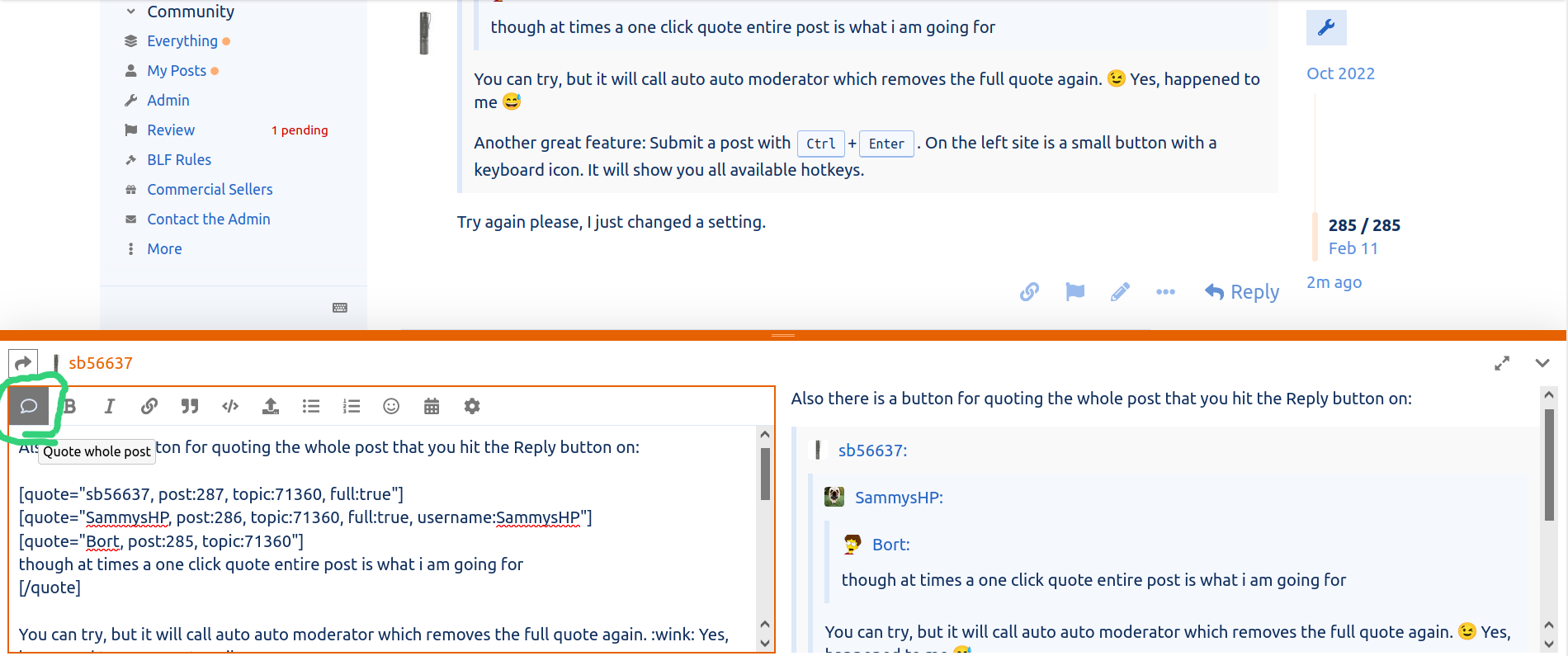
For starters the reply buttons are not intuitive, there is reply on the bottom and reply on each post. But it does not quote the post you hit reply on.
The replies show up as a separate click under who it was replied to and on the bottom, its confusing duplication.
Each post is not boxed from other posts, makes the view very busy.
The lack of recent posts, just an all posts. Recent posts was very concise and straightforward
No subscriptions page.
The confusing new posts, i get notifications but they vanish and i have to hunt each one down manually which is not as clearly marked as it was in the old software
The having to click on the top twice to get to the homepage is very confusing.
There are features i do like, the vast new collection of smilies, the auto refresh on new posts, the upvotes (i have a love hate relationship with the upvote feature).
The ability to upload pics is also a good new feature.
This new forum software is very web 2.0. I know @ToyKeeper will have a few thoughts on that as we had a conversation about it in an old BLF thread years ago ![]()
I’m also not a fan of the upscrolling to seek old replies and they load a few at a time. Pages is easier to mentally follow.
Finally i would like a go to last post button, it was surprisingly useful on the old forum. The new software seems o default to newest post but i don’t always need that, i then need to upscroll as it loads older posts a few at a time to get to where i want.
Please get rid of suggested topics (or make it optional).
I like signatures but they are not required, they are perhaps the feature i can most live without (even though given a choice i would want them back).