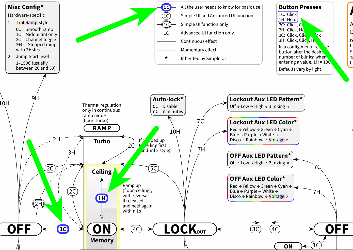
While there is indeed no entirely separate representation of Simple UI, Simple UI is integrated right into this chart. Functions that are also Simple UI functions are represented with a border around the button mapping:
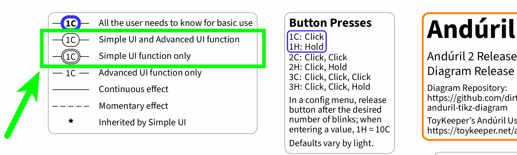
In addition to this border distinction, which is easily printable also with a basic black and white printer and thus ensures printability, Simple UI and correspondingly the Simple UI functions feature a light yellow background color, as a further visual emphasis:
For example, as Batt Check is a Simple UI function (as well as an Advanced UI function), the 3C from Off has a border around it, and Batt Check itself sports a light yellow background color:

And yes, if need be, the chart’s layout can readily be modified with any text editor via the TEX source file, and for example the Advanced UI functions can further be “dimmed”, as demonstrated earlier in this thread:
For a visual distinction between (also) Simple UI functions and (only) Advanced UI functions, you may also check out an exemplary dark mode edition (source) of this chart, on which the Advanced UI functions are blue, whereas the Simple UI functions are green, see also earlier in this thread:
I hope that this clears things up a bit. If you have any further questions or suggestions, just let me know.
Yeah, this is one issue that the chart aims to address: The brightness ramp image is placed in the very center of the page as a landmark, and basic use (1C and 1H, click and hold) is emphasized and singled out. And also the way back from the outskirts to the very center, in Simple UI, is illustrated with the connection from factory reset to Simple UI. So even if a user gets lost (hard to imagine at least in Simple UI, but I am probably completely biased here), a fresh start is just 13H from Off away.