If you’re not averse to warmer tints, you might appreciate the rosiness of the 2700k; for me, rosiness seems to work better with warmer CCT.
1 Thank
I personally like having a variety of tints. I’ve got the 3000k in the KR1AA, tempted to get the 4200k for a more rosy tint as well…but I find myself grabbing my D3AA’s over the KR1AA almost every time 
This is why in video production the monitors are calibrated. My Iphone 17 with the cam do what my eyes don’t see in colors perception
1 Thank
I like Spectrometer data more than photos
Photos change based on white balance (our eyes do too)
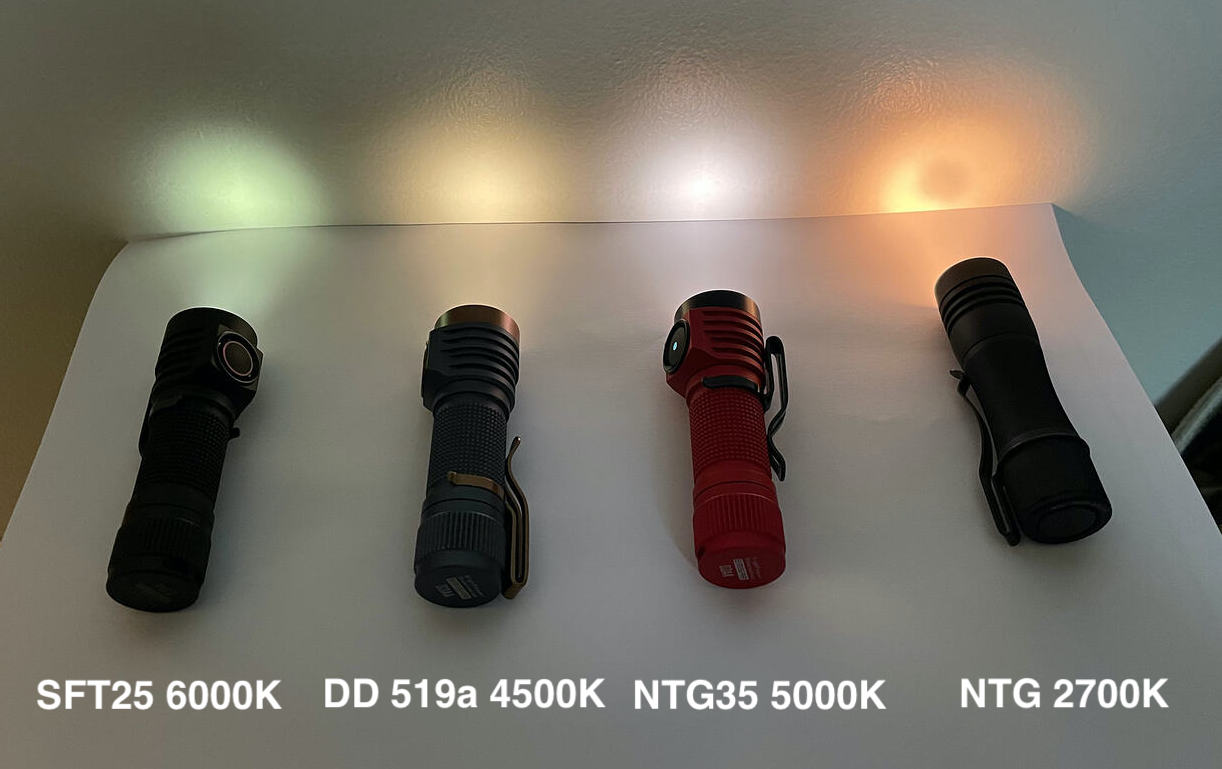
photos of two beams side by side in the same image, can be useful to compare colors:
spectrum data is also be very helpful (this is from Opple 4)
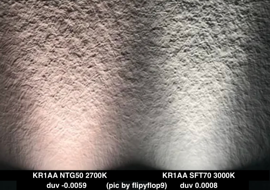
(pic from here)
note that by itself the SFT70 looks yellow, not green, not rosy
(tint comparisons show relative difference, focus on the duv data for impartial info)
Agree,
I don’t understand why with the modern technology we do 1000$ smartphone and the color from the cam is 
4000K is where it’s at for me, I can do 3000K at higher brightness levels but on low settings the light looks brown.
Curious - could you elaborate why?
I prefer the feel of the side switch on my (3) D3AA’s, which all feel slightly different from one another, over the sloppy feeling of the back switch on my KR1AA. Too many miss clicks! I know there are other options available now to make it more resistant. I also prefer the pocket clip of the D3AA’s significantly more. Since the KR1AA really isn’t very throwy, then I prefer the triple leds of the D3AA for the flood. I’ve had my KR1AA since January and the only thing I’ve come to prefer over the D3AA is how slim it is in pocket.
3 Thanks
hmm…makes me wanna try a swap to rubber button cover in the kr1aa
just received the V3. first impression on the switch pressure is that it is much lighter than my O ring mods.. I like how easy it is to use.. the O ring mods sometimes feel a bit too heavy..
otoh, the O ring mods are very difficult to turn on accidentally while pressing the light over a pocket seam.
With the new double resistance switch I will still need to be more careful, to avoid pressing the switch accidentally when pushing the light over a pocket seam.
I will use the new switch for a bit, to decide if it is resistant enough not to turn on in my pocket.. if it does not, then that would be Goldylocks.. otherwise, I have a spare tailcap w the original switch, that I could add an O ring to.
I have also bought a couple of spare new double pressure switches, in case I decide to replace my O ring modded original switches in my other KR1AA lights..
its good to have options 
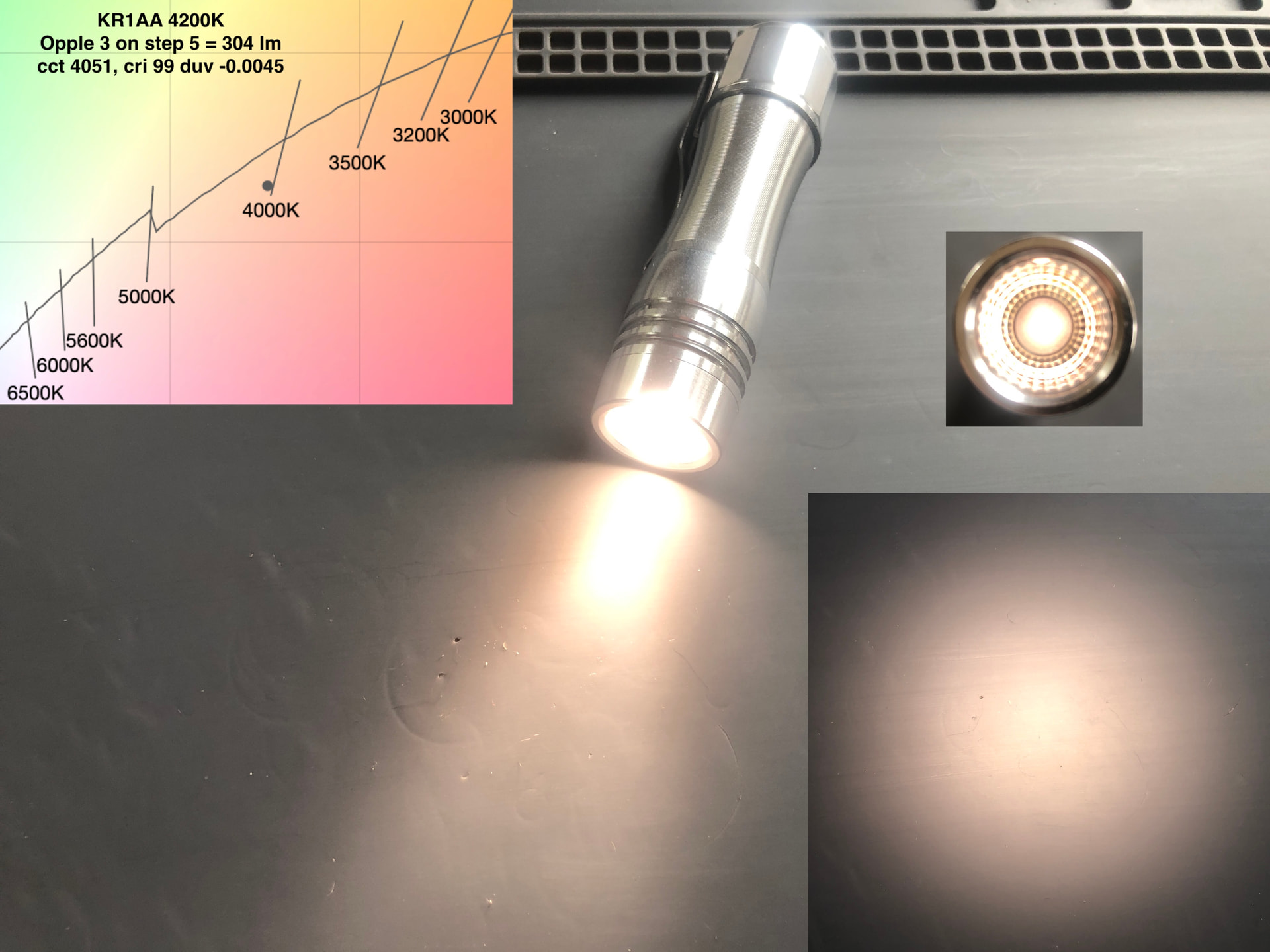
I did not expect the duv to be so high, my Opple 3 calls it -0.0045, which suits me fine.. Im happy about it. In real life it does not look excessively rosy at all, and much less than the photo. I was a bit worried that it would arrive with a DUV of less than -0.0100
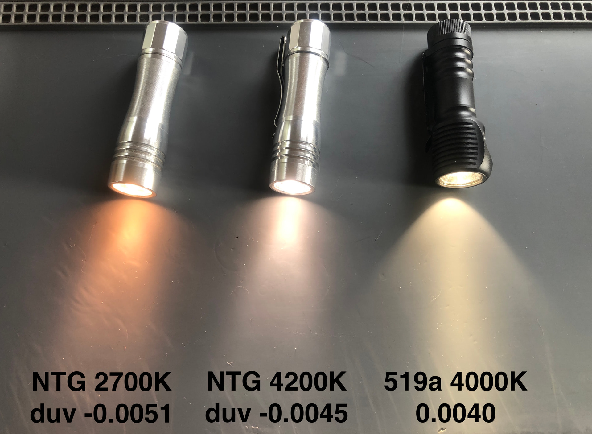
4 Thanks
What a difference a duv can make…
That 519A looks incredibly green.
3 Thanks
That just illustrates how differently people perceive colour, to me the 519 looks neutral and the NTG looks pink.
1 Thank
yes, a duv of 0.0040 looks much greener in comparison to a duv of -0.0045
quite suprising how much the relative frame of reference changes perception of duv.
I almost always prefer dedomed 519a, because I have learned I prefer negative duv. Except during the day I prefer cooler color temp, and can tolerate positive duv, so I will use a 5700K 519a, with the dome on.
This tracks with your comment elsewhere that I prefer more negative duv at warmer color temps such as 4200K and will accept higher duv with cooler color temps above 5000K.
I think our perception of duv changes depending on what our brain is adapted to as a reference. If I was using the duv 0.0040 in the same ambient light where you find it not excessively green, I would probably share your perception.
our brain seems to perceive duv differently depending on its ambient frame of reference. This is separate from white balance. It has to do with duv balance.
Also, photos oversaturate and show color differences that are more extreme than what I see with my eyes. But there is no denying that an LED with positive duv will look greener than an LED with negative duv, when compared side by side.
This is why I place higher value on duv numbers than photographs, or an individual’s descriptions of their perception of duv. A duv number does not change based on how someone’s brain is adapted.
So when someone says that different people perceive duv differently, my impression is that they are probably adapted to a different ambient duv.
3 Thanks
My perception of CCT certainly changes based on what my brain is adapted to. I’m currently carrying my Olight Baton Ultra a lot, which is cool white. Swapping to my SC65c Hi makes the Zebra look really warm, but after carrying the Zebra for a few days it just looks white.
On that basis I could probably get used to a rosy emitter if I stuck with it, I’d just need to get past the initial ick factor. Which I realise a lot of people have with cool white…
1 Thank
thanks for your thoughts.. how we respond to different color temperatures is an interesting conversation for me.
I woke up before dawn and my 2700K LED did not look orange. at that time the 4200K seemed unnecessarily cool.
but now that it is after sunrise, 2700K does look orange, and Im enjoying being able to use the 4200K instead.
I also make different choices based on activity level. I prefer cooler light when Im hiking in the dark, or working on project at night. But I prefer warmer light when Im relaxing before bed. I also prefer warmer light when I wake up in the middle of the night to use the toilet, and want to go back to sleep after that.
I like having both a warmer and cooler option for different scenarios. This is why I tend to have pairs of lights with two different color temperatures. I change which one I reach for, depending on my activity level, and also on the time of day when Im using a light.
Its good to have choices
1 Thank
I reckon camera sensors have a bit of trouble with compensating. This pic is my 3 D3AA and KR1AA, there’s no way they look like this individually.
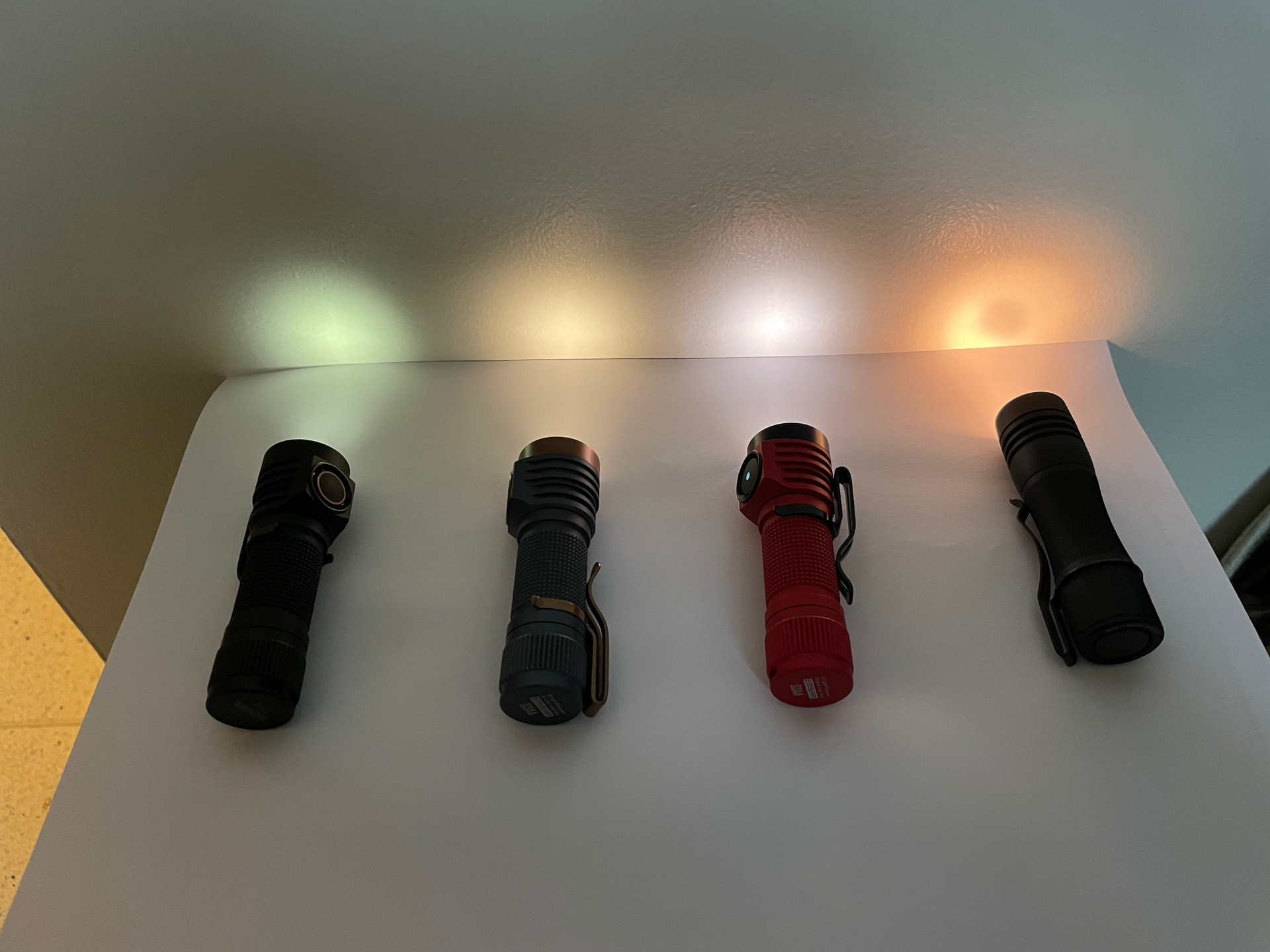
3 Thanks
Same. I have a Lumie sunrise alarm clock and I like to use that at night when I’m reading because it’s warm at lower levels. My bed-side torch is my D3AA with SST20 deep red, I like the red light if I wake up in the night. Typically anything I need a torch for in the middle of the night I only need moonlight levels and for me CCT is largely irrelevant at sub-lumen output, but I like the red light.
1 Thank
same,
We think alike, for similar scenarios.
I have a D2 w 2700K and 660m red..
I like the red in the middle of the night, and the 2700K for reading in the evening before bed
fun comparing strategies with you, thanks
1 Thank