Good thing I’m not piloting this airplane eh? ![]() It’s actually kind of neat how it applies the CSS changes live with no page reload, I don’t even know how it does that.
It’s actually kind of neat how it applies the CSS changes live with no page reload, I don’t even know how it does that.
I assume it polls the server constantly, maybe once each second?
Yeah something like that. I assume it’s via the Javascript framework that it’s built around.
Speaking of Javascript, I’m guessing no one has found a workaround for a certain member of BLF that doesn’t trust Javascript. (I hope I haven’t said too much.)
Ooof, I’m gonna be frank here: the recent change to the thread listing in BLF Theme is terrible IMHO.
Topic title and category beneath it now clash with each other and legibility took a real impact. I’d much prefer to have it the way it was before (why not make this a different theme so everybody can decide for themselves).
Hi there, could you post a screenshot? It might be a problem in a specific case.
I’d prefer to avoid that, as it gets messy for maintenance and administration. The default BLF Theme needs to have sane defaults somewhere toward the middle of most users’ preferences. The recent adjustments can definitely be improved still, but in general there were a lot of complaints about the lack of density in the thread listings, and I agree with them. That was one of the first things that I tried to improve, but I couldn’t find the correct CSS property to do so.
2 Thanks
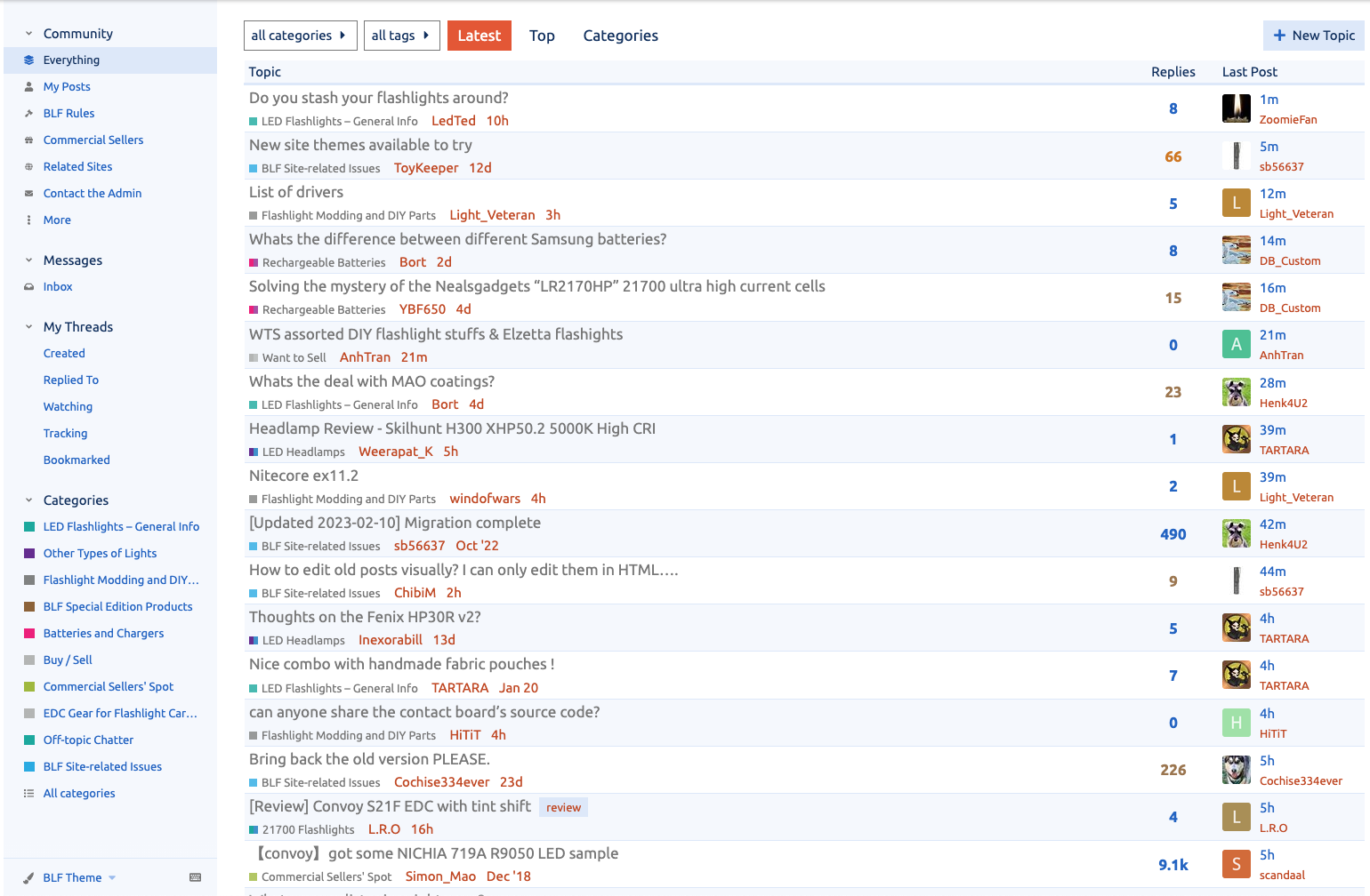
Here you go.
I think legibility of the thread topics really went down by a lot with this styling … and that’s what the thread listing is for IMHO.
It seems like a wall of text to me now → the categories under the thread topics are too large and mess with easy reading of the topic itself.
1 Thank
OK, thanks, that looks the same as what I’m seeing. Here’s a before/after:


The only thing I changed was the reduced padding between topics (above the title line and below the category/OP line). There is no change in the internal distance between those two lines:

The other change is the slight “zebra striping” similar to what we had in the old forum.
2 Thanks
Yeah, I’m not a huge fan of the reduced padding. ![]()
In TK’s themes, there is usually just one line of text instead of two, but I have my own issues with TK’s themes lately so now I’m using the BLF Dark Theme.
That little bit of distance seems to make all the difference. It’s just not as easy to see the topic anymore.
You could reduce the font size for the Categories but I’m not sure if that’s not messy in its on way, too.
Doesn’t work on my smartphone (several browsers), it’s all light blue. Works fine on tablet and PC.
Yeah there’s a good reason why Apple/Google etc. are working with what may seem as “excessive” white space, it really helps with legibility and accessibility (at the cost of information density).
By the way, the slight “zebra striping” is a good improvement, in my opinion. ![]()
1 Thank
That could be an done, it’s all within the same section of tweaks.
The original padding was 5px, then I reduced it to 2px. I just increased it to 3px, that might be a happy middle ground.
Huh, that’s weird. Which browsers?
That’s much better. Amazing what difference a single line of pixels can make.
Now the “thread creator” + “creation date” text is 1 pixel too large, I think?
Samsung, Chrome and Firefox.
Yep, the human eye is impressive. It’s actually 2 pixels of difference, 1 on the top and 1 and on the bottom.
Yep, thanks! I think it was always like that. I just reduced it a bit.
Thanks, you were right. For reasons I don’t entirely understand it handles the odd/even rows with their respective color variables differently in mobile mode. So I split those rules into specific mobile and desktop rules and it seems to work now.
1 Thank
If it’s just because of the color scheme please feel free to let me know if you have any suggestions for a fairly neutral dark color scheme. I have no idea what is desirable in a dark theme, but I just changed the magenta to dark orange. Bookmarked threads are still magenta, but that might be a decent choice to keep, since not every thread is bookmarked.
I think I figured it out, I did set the --quaternary color to DarkOrange in the previous version, and I tried to set it back for the latest version, but I think I forgot to set it here too, looks like it’s defined twice:
/********** defaults copied from parent theme **********/
    --scheme-type: dark;
    /* --primary: #dddddd; */
    /* --secondary: #222222; */
    --tertiary: #0f82af;
    --quaternary: #ca4b92;
1 Thank
Does this also break on the “TK’s” themes?
I only have one mobile device to test on, so I wouldn’t be surprised if some things break on other devices.