Yes it works.
It looks OK.
Yes it works.
It looks OK.
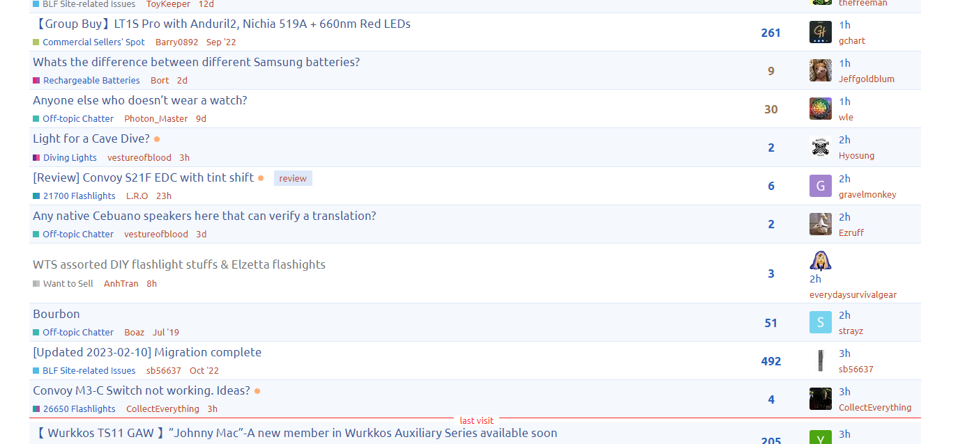
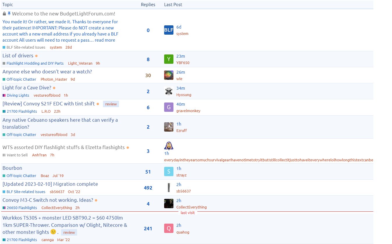
I was scrolling the main thread list and noticed @everydaysurvivalgear has taller post than the others
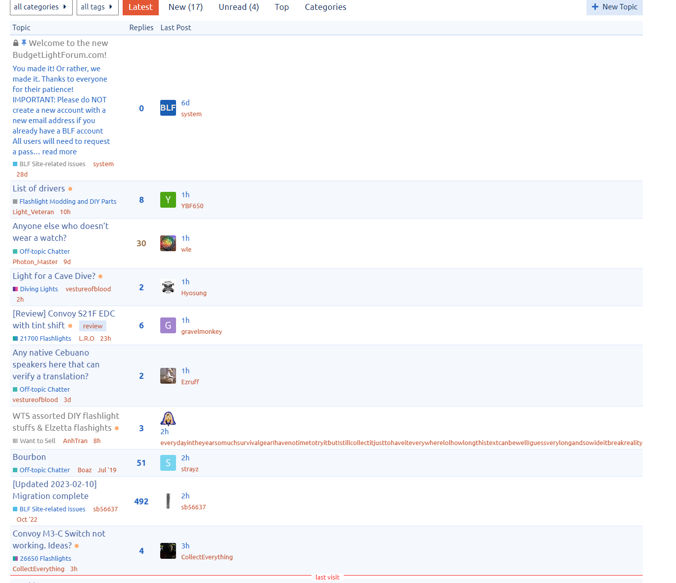
And it made me think: what if someone makes his name really long? Like this:
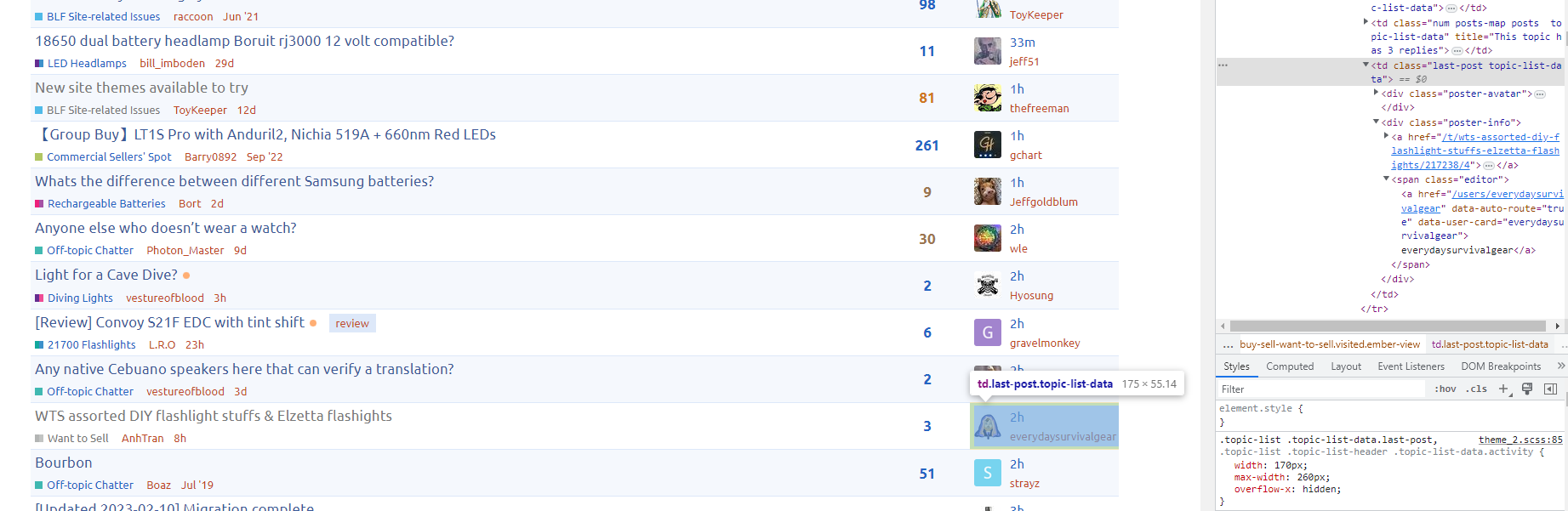
I found out making the name cell 10px wider (160px to 170px) fixes the problem and adding max-width and overflow property prevents anyone from taking advantage from using long names.
That’s a good idea. I think I’ll also, uh, ellipsivize, that. Elliptify? Ellipsinate? Elope?
Words are hard. 
Hi everyone,
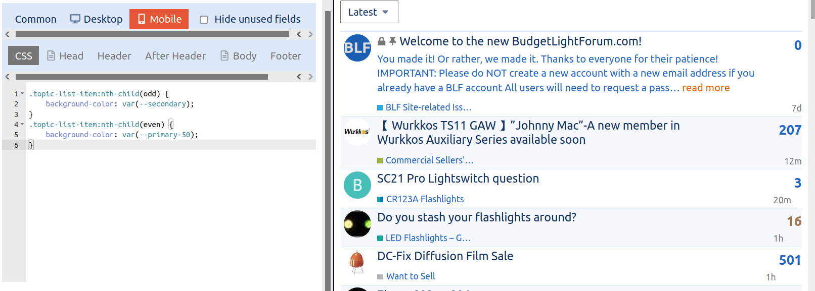
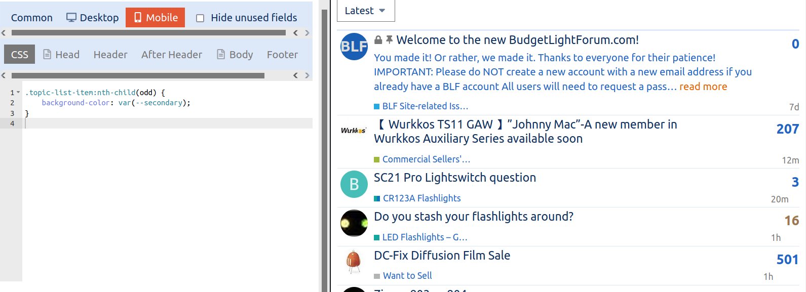
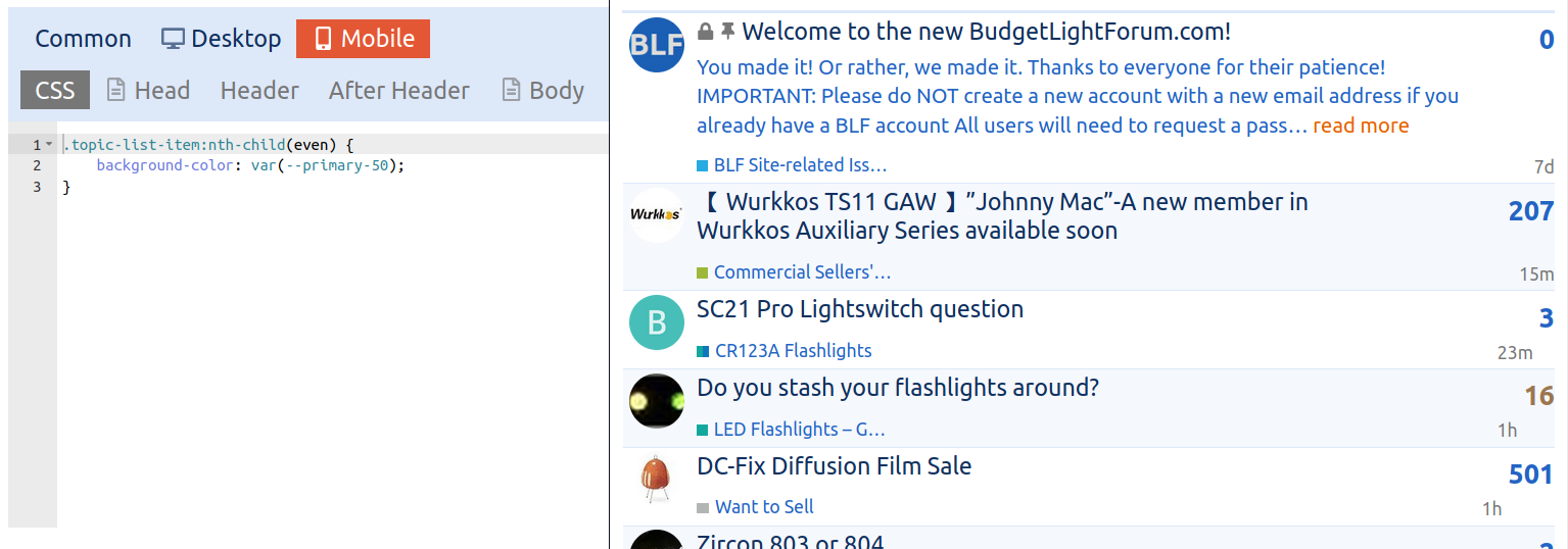
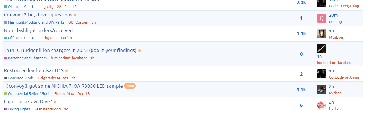
Yep, the first thing I did was check @ToyKeeper’s implementation of the zebra striping, it works well in mobile mode, I think because you implemented the odd/even code from scratch. I don’t quite understand how it works, but it seems to be a better solution than Discourse’s default. But to keep the implementation simple for the default BLF Theme using Discourse’s built-in odd/even row markup I ended up using this:
.topic-list-item:nth-child(even) {
    background-color: var(--primary-very-low);
}
.topic-list-item:nth-child(odd) {
    background-color: var(--secondary);
}
.topic-list-item:nth-child(even) {
    background-color: var(--primary-50);
}
I like @Mocarny’s suggestion of truncating the long names with elipses, thanks for that! I tried this, but no elipses and it still overflows when I add the text-overflow: line:
.topic-list .topic-list-data.last-post {
    width: 170px;
    max-width: 260px;
    overflow-x: hidden;
    text-overflow: ellipsis;
}
This works to truncate the super long username, but no ellipsiseses:
.topic-list .topic-list-data.last-post {
  max-width: 260px;
  white-space: nowrap;
  overflow: hidden;
  text-overflow: ellipsis;
}Something like this might work in both light and dark mode…
.cooked tr:nth-child(odd), /* tables inside posts */
.d-editor-preview-wrapper tr:nth-child(odd), /* tables in editor preview */
.modal-body tr:nth-child(odd), /* "view table" widget */
.topic-list-item:nth-child(odd), /* topic list rows */
.category-list tr:nth-child(odd), /* category list rows */
.directory table tr:nth-child(odd), /* user list rows */
.summary-category-list tr:nth-child(odd), /* user info page "top categories" */
foo {
    background: #80808040 !important;
}
The even rows don’t really need any special styling. They can inherit the table background, while the odd rows are shaded toward medium grey (so, lighter in dark mode, and darker in light mode). The 40 at the end controls how shaded the rows are.
For the username ellipstrification, I used…
.topic-list .editor { /* abbreviate last-post author name, if necessary */
    white-space: nowrap;
    overflow: hidden;
    text-overflow: ellipsis;
    max-width: calc(100% - 1.5em - 7px - 2em);
}
I assume you would need to change the max-width part, but I think the rest should probably work. I had to subtract the size of other float elements and some padding.
The .editor part was the best selector I could find to limit the effect to only the name of the last person to post a comment.
They shouldn’t right? But for whatever reason this is the behavior:
Oh well, at least it seems to work now, mobile and desktop modes, light and dark modes.
Edit:  Oh, of course, it’s because the secondary color is white, plus there’s no “Topic, Replies, Last Post” header row in the mobile mode, so the first topic is odd in mobile mode but even in desktop mode.
The change/s that you made are good.
(Orange works better for me than magenta.)
Now I’m using TK’s Theme again.
If you could make the orange even darker on BLF’s home page, that would also be helpful.
The dark orange from BLF’s Dark Theme would be nicer, for example:

Thank you! 
(I don’t currently bookmark threads, so that color choice doesn’t affect me.)
My names always been to long even on the old site, I can change my name if need be i use often use EDSG.
I am still trying to work the new site out, took me 30 mins to find this thread lol.
No need to change your name, it’s great
If you delete width property, the last post name section will be all over the place, as short as the longest name available. So one day it will be 120px and the other 180px because someone with longer name posted.
I think if names are one word then the white-space or wrapping is not needed, or it can have the property of overflow-wrap:anywhere if I remember correctly…but it won’t look very pretty
Sounds good, how’s it look now?
Hey there @everydaysurvivalgear , no problem at all, sorry we ended up using your username as an easy example to pick on just because it was there in the Latest posts list.  These are just minor details that geeks like me like to obsess over.
If you’re having any specific trouble please do let me know and I’d be glad to give you some pointers.
Ah, that makes sense. Thanks!
it’s looking better and better!
@luminarium_iaculator I’m looking at you
And I found this thing when in main thread list you right click on last editor’s name and open in new tab or mouse wheel click (is it the right term?) to open it in new tab it seems to start opening but then shows error this profile is private - but when you click on name, then in new small window click on name again it if fine
Nice catch, thanks! I found the error in the upstream Discourse theme, and I submitted a pull request to fix it.
I think it’s usually called a middle click.
I use the middle mouse button a lot since I’m using Linux. Historically, Apple computers had 1 mouse button, Windows had 2 buttons (left + right), and Unix computers had 3 buttons (left + middle + right). That has changed so most now have 3 or more, but the deeper history means the 3-button design is more deeply integrated on Unix-based systems.
For example, doing a copy+paste in Windows requires highlighting some text, pressing Ctrl-c, moving the cursor to a new window or location ,then pressing Ctrl-v. It’s 4 steps. But the same thing in Linux is 2 steps: Highlight text (with keyboard or mouse), then then middle-click where you want to paste it.
Anyway, in terms of how things are implemented, the buttons have assigned numbers:
Some systems swap the numbers for buttons 2 and 3, so for clarity they are usually referred to as “middle” and “right” instead of “2” and “3”.
… and this concludes today’s episode of ToyKeeper’s Excessively Long Answers To Simple Questions. 
I think I reported the same issue… getting an error page sometimes when clicking usernames, because sometimes it links to /u/foo and sometimes /users/foo. Thanks for looking into it. I hope they’ll fix it upstream soon.
I really don’t like changes and I really liked old BLF so 50% of time I really don’t know what I am doing but I am trying 
Perfectamundo! 
Is it possible to get the BLF dark theme added to the theme switcher? I like TK’s themes but I’m also coming around to the stock theme especially after some of the recent updates. Having some themes in the switcher but having to go back in the menu for the BLF dark theme seems odd.
The themes, as currently configured, have a 2-tier structure… themes and palettes:
To make BLF Light and BLF Dark both visible in the switcher, if I understand correctly, sb would have to install a second instance of “BLF Theme” and remove one of the palettes for each. This would also require keeping the sources for both themes in sync whenever he makes any changes.
Exactly, that’s the reason why it’s not there in the quick theme selector.
@jasontheguitarist Do you frequently switch back and forth between light and dark themes? Like between day and night hours perhaps?