I think I figured out what caused it. I used a hardcoded size in one spot, since that’s how the parent theme worked… but that size probably was 2px too large on my system (and thus fine), and 2px too small on yours (and thus it wrapped).
So if I’m right, I think this should fix it. It should, at least, be more robust and less sensitive to per-host display settings. It’s included in the latest batch of changes:
Really well done! I just need to figure out how to best tweak the color scheme. Still not sure yet if I’m going to try to use the Discourse color scheme variables in your main color variables where possible i.e. --primary: var(--primary-high); or if it would be better to use absolute values in the CSS overrides. The easiest would be to for me to just change some of the absolute color values in your CSS (mainly I would adjust the light theme, I have no experience or taste in dark themes) and then install two copies, one for “ToyKeeper’s Dark Theme” and another for “ToyKeeper’s Light Theme”, and the colors would change with the theme name. The other option would be for me to to use the Discourse color scheme variables in your CSS color definitions. The advantage there is that it would maintain the Discourse paradigm of allowing users to select a Discourse Theme for layout and design elements and then select an independent Discourse Color Scheme for Light/Dark mode. But I’m not sure if that will work well with the granularity of your colors.
Also I’ll probably add a global font rule for the TK themes to switch the default to something a bit more common like Arial, since users looking for a more traditional layout will probably want a more traditional font.
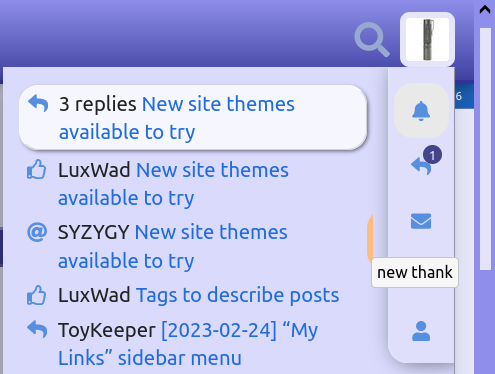
There’s one small bug that isn’t important, but here’s a screenshot just so you know about it. I see it in Firefox when the mouse cursor is placed exactly in that vertical region for all of the notification popup items:
Interesting. I tracked down what causes that, and it was a pretty easy fix. The menu shows more items than can fit, and uses a “flex” layout with overflowed items hidden… but “hidden” in this case really just means they’re in an invisible column to the right of the visible items. But that column had no gap, so if you put the mouse in just the right place, it would technically be over a hidden item, and would highlight it.
Fixed by giving it a column gap. Now the hidden items are actually offscreen instead of peeking out a little.
That’s up to you, but it’ll be difficult. The upstream color schema didn’t really fit, so I eventually stopped trying to use it.
Aside from the not-so-hidden menu items bug, I also noticed yet another relatively large widget which hadn’t been styled, so I added that too. It’s the “onebox” thingy, which is used for link previews.
Thanks for all the hard work firstly! However I must be doing something wrong as I can’t seem to get it to work - but it doesn’t matter.
My question is, will this ultimately be a ‘theme’ selectable on this website rather than using stylus?
@ToyKeeper I’ve added all of your updates and merged them with a few minor additions to that allow for custom hover and active colors for the sidebar categories and timeline scrollbar. I also just used seperate variables for the Firefox scrollbar since it was easier to get the colors I wanted in the flat themes.
By this point everything is looking awesome! These alterations have honestly done a lot to make this site more readable for me, I now quite enjoy the new discourse format
Thanks! I thought I was going to have to merge all that. Anyway, I merged in your branch and updated a few things… like applying your new vars to my themes.
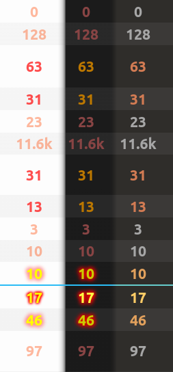
But also, you added styling for the heat map, which I guess is a thing the topic list widget uses to indicate how “hot” a topic is. You had 2 (or 3) levels though, while Discourse seems to have 4. So I added support for all 4 levels, and put it into the themes.
This is just a first pass, but here’s how the heat map affects the topic list in 3 themes:
Also, it looks like the flat-dark and reddit themes haven’t been updated, so I didn’t try to do so. Do you plan to update those, or is it okay to leave them as-is?
Lol sorry, it wasn’t organized very well, I hope I didn’t make too much work for you.
The expanded heatmap looks really cool! I didn’t realize at first what those variables did but it’s a pretty neat feature of the Discourse forum.
I will probably update the other two themes a bit when I get the time since there are more options now, but they should be fine as-is, aside from a couple variable changes to match the recent updates you did in the header.
Relatively small update today. I fixed the colors of the tracking button (before, it went blank on hover), and generally made more clickable elements respond to hover.
Looks like the user info page changed since I last looked. Will have to update the style for that soon. I could have sworn it was different yesterday, with navigation as a menu on the left, but now it’s tabs along the top.
Ah, yes, sorry about that! I updated the system, and that new change came with it. I had noticed it on Discourse Meta and I couldn’t figure out why they had horizontal tabs while we had a vertical list here, looks like they were testing that branch on Discourse Meta and now they released it for everyone.
The Reddit and flat-dark themes have been updated and adjusted slightly, I’ve used them all and haven’t noticed any issues so everything should be good to go now.
Awesome, thanks so much! Hopefully some time this weekend I’ll have time to apply the new stylesheet and also work on implementing your suggestions here:
TK’s Dark Theme seems to have a lot more pink/purple/magenta on budgetlightforum.com 's home page.
It doesn’t bother me, but I think it’s new since yesterday.
EDIT:
I changed my mind.
I don’t really care for the magenta.
Was it orange before?
Well, whatever it was before, I liked it more before.
Yes, I think sb changed something back to the colors I used. Previously, he had replaced a desaturated purple with a bright orange, or maybe something fell through to the parent theme… not sure what happened exactly.
I think the colors are probably still somewhat in flux as he decides what colors he wants things to be. Personally, I like blue+purple combo, but not everyone has the same taste.
As a programmer I’m probably biased, but I’d definitely recommend installing Stylus and messing with the colors yourself, to customize things to your liking.
Edit: Looks like sb is actively trying things right now on the server… I keep seeing things change color (like the topic list rows).