At first it was like another old friend is gone . But I’m getting the hang of the change ! ![]()
Yep, that’s right. The homepage (“Latest”) is the exact same thing as the Recent Posts. It has additional features too that the old forum didn’t have to help you keep track of which threads you haven’t seen at all yet, and of those that you have seen which have new posts.
Thanks a lot for giving it an honest shot! I think the key is to just use the site like you would normally from day to day to search for and read both old and new posts and engage with others to see how it works in practice.
![]() ell,my final feeling of the new forum is that i hate it…I have to search for all functions…dont orientate here anymore…Lost interest,it makes me really nervous…Sorry…
ell,my final feeling of the new forum is that i hate it…I have to search for all functions…dont orientate here anymore…Lost interest,it makes me really nervous…Sorry…![]()
My most beloved forum is gone
@VrestoTaylor Sorry to hear that. However it’s important to distinguish between comfortable familiarity and good design, which are often not the same thing. I used to receive multiple private messages every month on the old forum from new users asking “How do I post?”, so they obviously found the basics of the old design confusing because they were new. So I would encourage you to please describe exactly what you can’t find or don’t understand about the new design so that we can help.
Well, I know this thread’s initial purpose was one, but I will post here anyway.
It was a bit of a shock when the new site format “appeared”, but I’ve been trying to learn and adapt to the new features and format. For 6 years I was used to one thing, well defined (specially visually) and now I have tons of different stimuli to deal with.
Even if I am not an “OG” I like to have things “stable” and well defined and it makes some confusion to have so many things on the screen when I open it, and to have a different modus operandi, comparing to what it was. Some things are better, other not so much, but IMO it is not a critical reason to leave the forum.
I’m still on the learning curve, I’ve been editing some old posts to make the photos/videos fit as they were initially supposed to, and I haven’t posted any review yet to see how the new functionalities work. I hope I can do it soon.
I also want to say that I do understand what some members say about the new vs old format, and their position. I also recognize the need to have a change and that this was/is probably one of the good/best options to change to.
And last but not least, although not going through every thread/post related to this change, I guess SB is probably doing the best to keep us here in the best way possible, and other members are also helping with “tips”, recommendations and layout changes to make our stay on BLF the best possible.
So, thanks for keeping the forum alive, SB and BLF members, and about the new challenge…we adapt, we communicate, we experience, we learn, we survive, we live, we thrive ![]()
@sb56637 I just noticed some of the sidebar info is no longer present, such as the polls and extra site links. Are there plans to bring any of those back?
Hi @LuxWad , thanks for mentioning those.
The poll module on the sidebar won’t be coming back, and frankly I won’t miss it. It was by far the the most buggy and troublesome aspect of the old site, as explained here:
Anybody can add a poll now, either as the first post in a new thread, or even farther down in a comment/reply. Just click the gear icon in the post editor and then “Build poll”.
The Related Sites section would be a bit difficult to implement well in the new sidebar, but I’m considering adding a single link for Related Sites in the sidebar and make that go to a locked thread with the same list of links we had before.
Thanks a lot @MascaratumB for giving it a chance and trying to adapt! And yes, you’re absolutely correct, I’m trying as hard as I can to accommodate user preferences as much as possible so as to keep you all here. I understand that some user preferences aren’t the same as technical needs and requirements, but from an objective standpoint Discourse is designed to work well as a forum even for high traffic forums and heavy forum users. I carefully analyzed Discourse before making the jump to make sure it would meet our needs as a community as well as the technical requirements for sustainability on the server end.
@ sb56637
I think you are doing an admirable job and showing great patience with the process and obviously working your ass off to get it done!
I for one am grateful. Thank You !!
It took a couple of days to get used to the new format, but now I know how to do everything that I need to do and am even learning new stuff to make things even easier going forward.
Heck, I can even help others out a bit now. ![]()
As for people leaving over the changes, I don’t get it. I come here for the content and comraderies of like minded people. I have found it quite worth the time and minor frustrations to get to know this new place. I just hope that others give it a chance. It would be a shame for them to lose what is offered due to the initial unfamiliarity.
Thanks so much for the encouragement @Mandrake50 , well said!
Mandrake50, I couldn’t have said it better myself. Sure there was a learning curve with the new site and the way its controls are laid out, but as with any other site, you learn to use it. SB56637, you have been very accommodating for the users here, thank you. I’m sure with time it will get even better. I already like it better than the old site. I find myself reading it on my phone more often since I really didn’t like having to pan left to right on the old site.
Thanks again,
Bob.
I just logged in to BLF and found that the site got a new interface. I am not the biggest fan of this forum software. I have seen it before; OpenWRT seems to use the same format. I will grow accustomed to it but boy do I miss the pagination. I do not like endless scrolling at least on desktop. For mobile it is acceptable.
Hi there @anonymous_user , good to see you here. Thanks for giving the new forum engine a chance. I understand that the familiarity of the old design was comfortable for many, but there are many advantages to the new forum engine too. I’m not here to defend the developers of this new forum software, but overall it was the best option for the long term. You can read more about the reasons for the decision here:
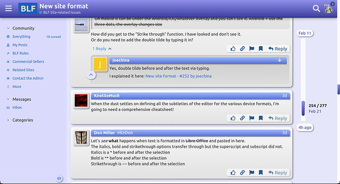
I have gotten used to the date slider on the right side of a thread (desktop). I find that is is easier to find a date range or post number using it, rather than clicking on a page number and then scrolling. It also makes it easy to get to the last post quickly. If you play with it a bit, you may find you even might like it… At least I do.
BTW, this format makes searching much easier…
The date slider makes all the difference. Hardly much need for mouse wheel scrolling to move forward or back a span of weeks or months. I like this new way now that I have gotten used to it.
Interestingly enough, the other day now searching for something on another site, which uses the traditional page system, I found myself wishing I could have a date slider like here.
Thanks to everyone for their comments. And here are mine regarding why I agree that the lack of pagination isn’t a bad thing:
It’s a useful widget. The appearance bothered me though, so I changed it to look more like an actual scrollbar…
I do like that better. Easier to see where you are and easier to find with the mouse pointer.
Undoubtedly using a finger on a touch screen would also be much easier.
I use at the moment the dark BLF theme.
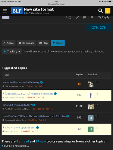
What is the meaning of the white backgrounds?
It is random
Edit: Solved from @quahog It is a bookmark

