Very nice, thanks @joechina , I need to add that information to a “Discourse tips” thread I’m planning.
Thank you for providing these additional options.
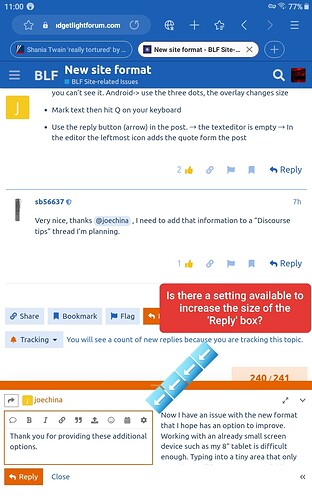
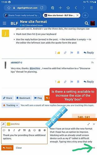
Now I have an issue with the new format that I hope has an option to improve. Working with an already small screen device such as my 8" tablet is difficult enough. Typing into a tiny area that only provides 3 full lines of room available for an already small font size is that much worse. So I’m wondering if there is a way to increase the size of the ‘Reply’ box?
BTW, I already have my browser text size set to 110%, which works well for me.
You can make the textbox full screen. The icon is below of the 240/241 in your screenshot
Fantastic Joe, thanks so much!
![]()
Another option is to resize the post editor pane by dragging its border up or down.
And/or you can hide the post preview side pane:
Also, notice that on tablets it uses the same mode as you would normally see in a desktop computer browser. But you might prefer the mobile view that is optimized for smaller screens; to use it open the “hamburger” menu and in the sidebar at the very bottom tap the icon that looks like a computer monitor.
Weird thing, on android, the autocorrect autofill doesn’t work on the text box, also when when typing ”:” it shows smileys, then if you press enter to go to the next line it autofill the first smiley from the list instead, it also does that on desktop and it is quite annoying.
It seems that the text box has its own autofill that overrides the keyboard autofill.
with firefox on ipad…
1 test:
2 test ![]()
1 if word[no space]colon, return: no smiley
2 if word[space]colon, return: smiley
Well finally i got my account back…But i dont like it here too…Too many annyoing things…Would like to get the old forum too…Is not possible to switch to the black layout? On the old fori´´um it was possible…![]()
I’m on Android and using the Gboard keyboard to write this and my autocorrect and colon key are behaving normally. Typing a colon does bring up a smiley menu, but if I hit enter, it disappears and I’m left with a colon.
Yes!
- Click on your avatar.
- Click the icon that
resembles a person - Click Preferences
- Click Interface
- Select the BLF Dark color scheme
Tricks for the Editor
Hence the textedior understands Markdown and HTML use both.
Strikethrough Text in Markdown
~ ~ Text ~ ~ gives you Text
Write Markdown formatings as help
Use HTML formatings to display e.g. double tilde
Cheat Sheet for Markdown
How to make headings, etc.
https://www.markdownguide.org/cheat-sheet/
Hacks for Markdown
Also some interesting stuff.
https://www.markdownguide.org/hacks/
The two boxes below are from this:
https://www.markdownguide.org/hacks/#admonitions
It is > for the box : an emoji ** Text ** for bold and the text without empty lines
Edit Note:
Interesting, when I mouse-over on a markdown headings I get a link within a post.
(on a PC, not on iOS.)
Copy that link and you can direkt to a subsection in a long post. Nice!
Tip: @sb56637
That can be usefull for a “Discourse tips” thread. You can pack everything in the first post and link direct to a headline.
Links to headings
Links to headlines simply copied show only the thread title.
Is there a way they show tread title + linked headline?
You can add it with angle brackets, < > , for example:
<https://budgetlightforum.com/t/new-blf-forum-engine-faqs/217457#how-to-add-headings-9>
…produces…
https://budgetlightforum.com/t/new-blf-forum-engine-faqs/217457#how-to-add-headings-9
I’ve noticed something similar on the desktop, it would autocomplete an emoji when I would end a line with a colon to add a link after it:
http://example.com
It’s because the : triggers the searchable emoji list. I just tweaked a setting that seems to improve things. Now the emoji selector won’t appear until you type the : plus one additional character, i.e. :+ or :shr to get a list of emojis that include those characters.
Thanks for reporting!
Hi @VrestoTaylor welcome back! Glad you made it.
If you have any specific examples we can give you some tips and/or try to tweak some things.
Actually it wasn’t on the old forum. Some users applied a set of customizations in the browser, and some operating systems and browsers were possibly capable of basically inverting the colors of a website, but it wasn’t an official dark theme that you could choose in BLF. Now there is one:
https://budgetlightforum.com/my/preferences/interface
How did you get to the “Strike through” function. I have looked and don’t see it.
Or do you need to add the double tilde by typing it in?
When the dust settles on defining all the subtleties of the editor for the various device formats, I’m going to need a comprehensive cheatsheet!
Let’s see what happens when text is formatted in Libre Office and pasted in here.
The italics, bold and strikethrough options transfer through but the superscript and subscript did not.
Italics is a * before and after the selection
Bold is ** before and after the selection
Strikethrough is ~~ before and after the selection
Yes, double tilde before and after the text via typing.
I explained it here: New site format - #252 by joechina
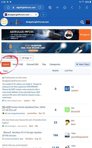
What settings will result in the closest thing to the old “recent posts”?
Thought so but wasn’t sure. Thanks.


