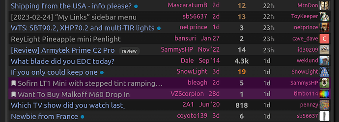
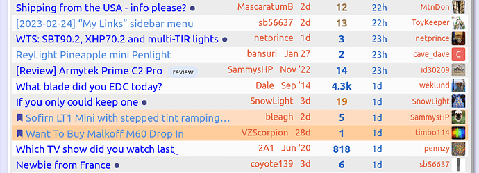
You have a bookmark to that post (or a reply on that post). There’s a bookmark icon right to the left of the post title.
AHHH, now I see it.
Thank you!
Hi @joechina , yep that was a quick tweak I made to make bookmarked topics stand out a bit more prominently in large lists. If most find it annoying or unhelpful I can revert it.
Lol, I had exactly the same question this morning. I didn’t know that feature existed until I saw it in my unread list. So I added some CSS for it and now it displays bookmarked table rows in a theme-able color. It’ll be part of the next code I upload, and should be included when sb updates the themes on the server.
The white background on the dark thread is quite jarring. I thought it was an unintended bug that would get sorted out as the theme modifications progressed. It looks better in the light theme, I think as a yellow-ish background.
I’m trying to make the transition so I hope this comment shows up ok. I want to begin by saying thank you to SB and ToyKeeper. I know you all have put in a lot of work helping people and I greatly appreciate it. I am currently using one of ToyKeeper’s themes and I find it much more intuitive. I’m not tech savvy and it took a couple of tries but I finally got the theme working.
To me the transition to the new site seems like giving a grandmother a fancy light with Andruil. You have given her one of the best lights you could and serious improved her flashlight collection. But she’s just confused. From what I gather, the new version is superior to the old version and an update was necessary. Us “grandmas” are just having trouble. I think if everybody could look at it like that it would help everyone understand where people are coming from.
Thanks again SB for upgrading things and keeping everything running. Thanks for all you do behind the scenes. And thank you ToyKeeper for coming up with some new formats.
Thanks a lot for your kind post. That’s a pretty apt comparison with Andúril. And I would say that like Andúril, this new forum software can still be used in a more basic way by users that prefer to keep things simple, while also offering some important features that other users needed. But it could be that some features present themselves with unnecessary complexity and/or are somewhat hidden, so please let me know if you have any specific observations. Thanks a lot for giving it an honest shot and for adapting.
How do I preview a reply or post?
I am using my pc and I only see at the bottom left of the screen, the “Reply” and the “Close” options.
The preview should be directly to the right of the area where you input info.
You don’t click on anything to see the preview, just look a little to the right.
I just tried it, including testing it with a photo preview, and it works great. Thanks!
The more I slowly learn to how use this “new” BLF, the more I see it’s really a good leap in the right direction.
It’s only a matter of time when I really get to know the hang of this new format (and how to post/upload, etc.) that eventually I would believe the old one was well, old.
Hey @tatasal , great to say Hi to you here on the new site. Thanks a lot for using it and adapting, I really hope that you’ll grow to like it.
Hallo.I dont know where iam posting this cos iam totally confusing here nowaydays-but try to ask-how to delet all my pm? Also how to delet notifications from threads and topics where i posted? thanks
Hi @VrestoTaylor , could you please send me a PM to help you out there?
I notice another thing…wonder if it might be worthy of changing if possible. When you visit a user’s profile and look at their created topics, the list comes up in order of last-reply (by any user). I think it would be best if sorted in descending order of the date the topics were first created. For example, looking at users like muukka, djozz, Texas Ace, etc. for emitter tests, and given how many topics they created back in the day (and how many replies some of them have), it takes more scrolling and reading to find what you might be looking for.
With the absence of signatures here, where some would list their tests or a separate thread that contained all the links, the only thing we’re left with is the profile.
I suppose this is default sorting, which seems to be that rather irritating modern trend of popularity/hotness rising rather than a more linear chronological approach. ![]()
Hi there @Correllux , that’s a valid point. I don’t think that sorting behavior can be easily changed. But it is possible with a search on a user’s topics like this:
https://budgetlightforum.com/search?expanded=true&q=in%3Afirst%20%40sb56637%20order%3Alatest_topic
With the absence of signatures here, where some would list their tests or a separate thread that contained all the links, the only thing we’re left with is the profile.
Keep in mind there is a user profile that can be filled out with free-form text and links, as well as the user’s website and also a selectable “Featured Topic”, and it will appear on a popup when clicking on the user’s name or avatar –
https://budgetlightforum.com/my/preferences/profile
Thank you. I’ll make note of that search parameter…probably start up a bookmark list as well for ease of reference.
I know the old forum was quite old in appearance. But it was quite functional, for me.
This new style makes it difficult to quickly read posts. It takes much longer to discern where one post ends, and another begins. Attachments, links, & quotes, become very messy. I also prefer pages over endless scroll. It’s simple enough to have a preference option for users to choose # of posts/page loaded. Such as 25 posts/page, or 100, 200, etc. Makes it easy to search as well.
Thanks for making the attempt to update the forum. For me, it is an update for the worse.
My number one complaint is the separation between posts. Everything blends together into a mess.
*Thanks TK for the custom themes. And for everything else you’ve done as well, of course.
Hi there, thanks for the comment.
My number one complaint is the separation between posts. Everything blends together into a mess.
Please give TK’s themes a try, you can switch to them in the bottom of the sidebar.
I’m also testing a slightly thicker divider line between posts.
It’s simple enough to have a preference option for users to choose # of posts/page loaded. Such as 25 posts/page, or 100, 200, etc.
It’s worth mentioning that we didn’t have the option to change the number of posts per page in the old forum because of technical limitations, and also because that made a mess with users’ links to specific pages when everyone had a different number of posts configured. Here are some more thoughts in detail as to why I consider the current infinite scrolling method to be an improvement:
I’m like you in that sense, I tend to have old school preferences in technology and yet I’m primarily a mouse user for most things. Sorry if I’ve missed something, what is the glitch related to jumping to the first or last post by clicking the first or last date/time in the time slider? In general terms I totally understand complaints about pointless change in technology, especially deletion of useful features or “dumbification” of the UI just to make it look clean or trendy. But in this spe…
Also, here are some tips that might not be obvious at first glance, as well as an explanation about why this migration was necessary:
Hi everyone, I finally found some time to summarize the answers to the most common questions about the new BLF forum engine. Why? The forum engine that powered the original BLF was not actually a forum engine, it was a bare-bones framework for creating generic websites, and to make it work like a forum it required tons of third-party modules and custom coding by me. The version of the site engine that BLF used was running on borrowed time, as the creators of that software have moved to a new…
Thanks, I’m using the TK dark theme & it makes the individual posts much more discernible.
For example, for me, it’s much easier to load a page of 25-100 posts, and quickly scroll down the page, skimming text, in a, b&w, times new roman, essay format. Or, hit ctrl-f, find where a long discussion/topic may have a few relevant posts clumped together. Or quickly scroll through, looking for a relevant image/link. Takes a few minutes. Personally, I’d rather have 1 long thread about a topic, than 5 disjointed ones. It’s a lot easier/faster, imo, to reference, “back to page 5”, or, “post 57”, etc.
There’s no way I’m going to sit here for 10 minutes and wait for 299 posts to load, in 20-comment-clumps, (or whatever it is), and try to wring out whatever information has been discussed here, just hoping that something of value may have been said. Especially when combined with the aesthetic. I will never read this thread. By the time I get to post 50, I’m going to want to scroll back and reread something. Then I’ll lose my place, and decide the information wasn’t worth looking for anyway.
I’ll use the search bar, and I’ll use google site search. This update has killed reading long threads, for me. And, imo, long threads are 90% of what BLF is for me. For example, if I want to catch up with what’s been going on with Nichia 219’s, or D4’s, Osram, or what someone like Virence is up to, I’ll pull up a thread, and read the last 6 months worth of info. I’m never going to bother with that now. Gone are the days of multi-tab or multi-window reading. Like, having a color rendition post up in one tab, and another tab with the relevant post of an IRL picture review, etc.
It feels like I’m in the facebook comments section of a pop-news website.
Again, thanks to the people who run the site, for all of their work, and to the OG’s. I’m sure the new format is nice for some people. And I’m sure there were reasons for the change. For me, it seems to have removed what I enjoyed about BLF - having a huge collection of information posted by very intelligent people, which was easy to follow along with and learn from.
![]() Just thought about “old” threads to me, like the Q8, narsil/anduril. Hopefully there’s some change to BLF in the future, and those threads will be easily readable once again. It’s hard to know what the audience is- I wish I knew how many lurkers stumbled across something like that & took the time to browse through it. It’s a really unique exhibit of how strangers with various special skills can come together & design a great product, in the open, on full display.
Just thought about “old” threads to me, like the Q8, narsil/anduril. Hopefully there’s some change to BLF in the future, and those threads will be easily readable once again. It’s hard to know what the audience is- I wish I knew how many lurkers stumbled across something like that & took the time to browse through it. It’s a really unique exhibit of how strangers with various special skills can come together & design a great product, in the open, on full display.
(I guess you can’t even ctrl-f “q8”)

